Waitly
Good things come to those who wait
Client: Waitly
Key Focus: Brand, E-commerce
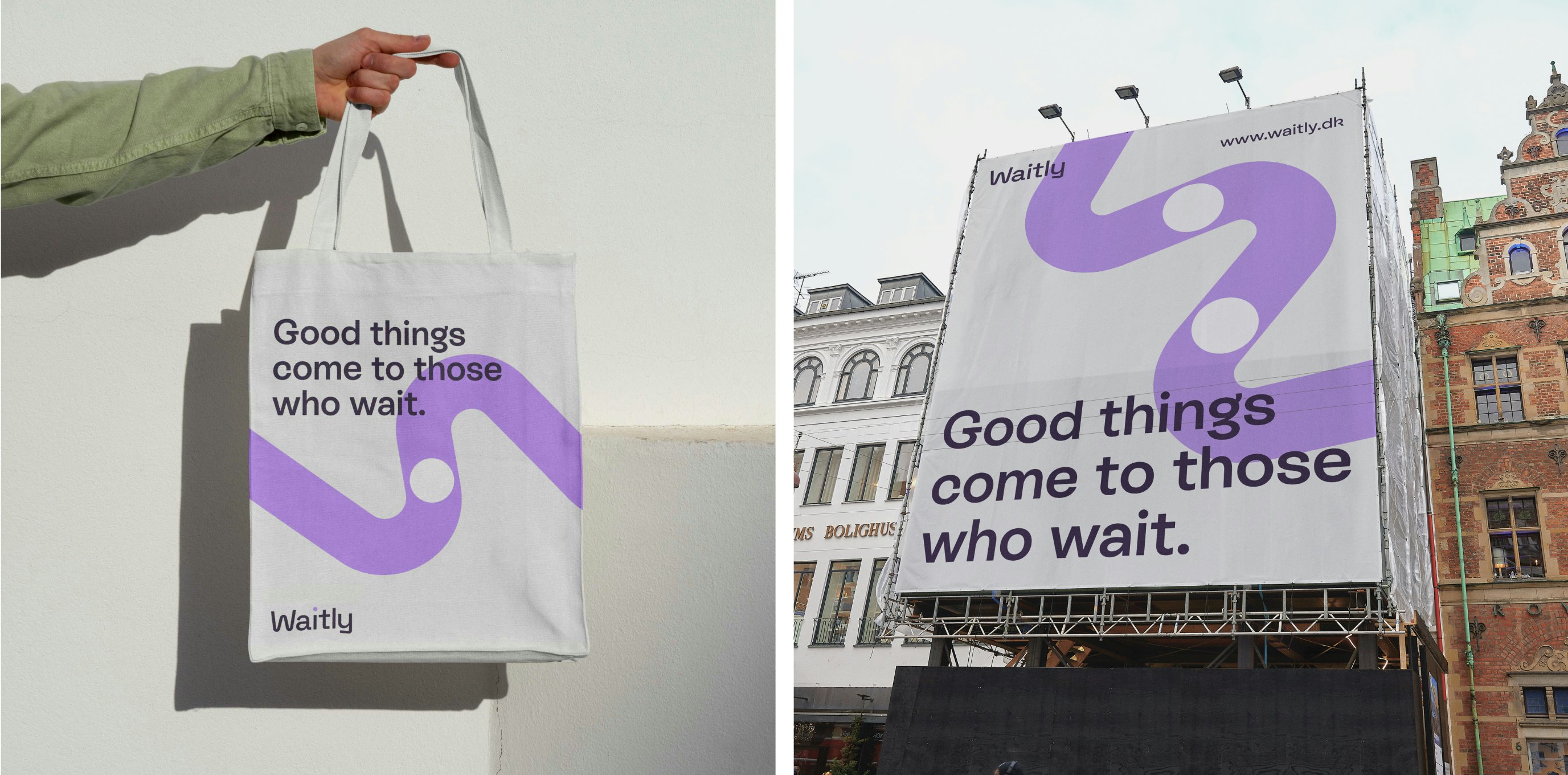
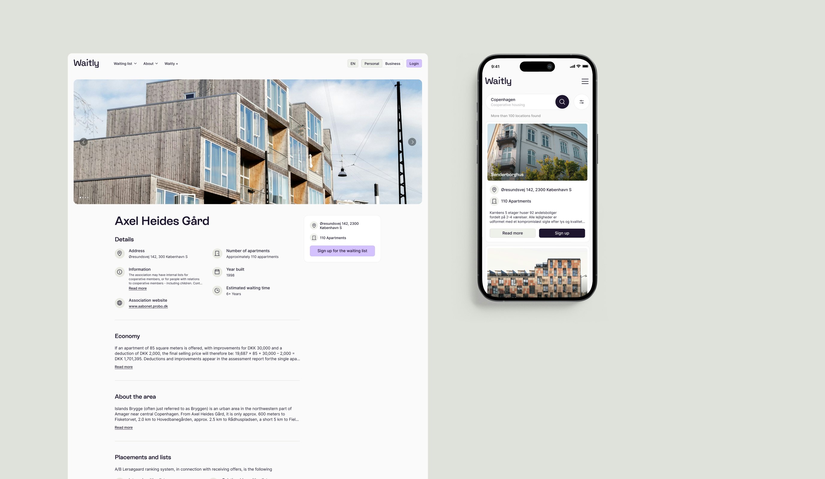
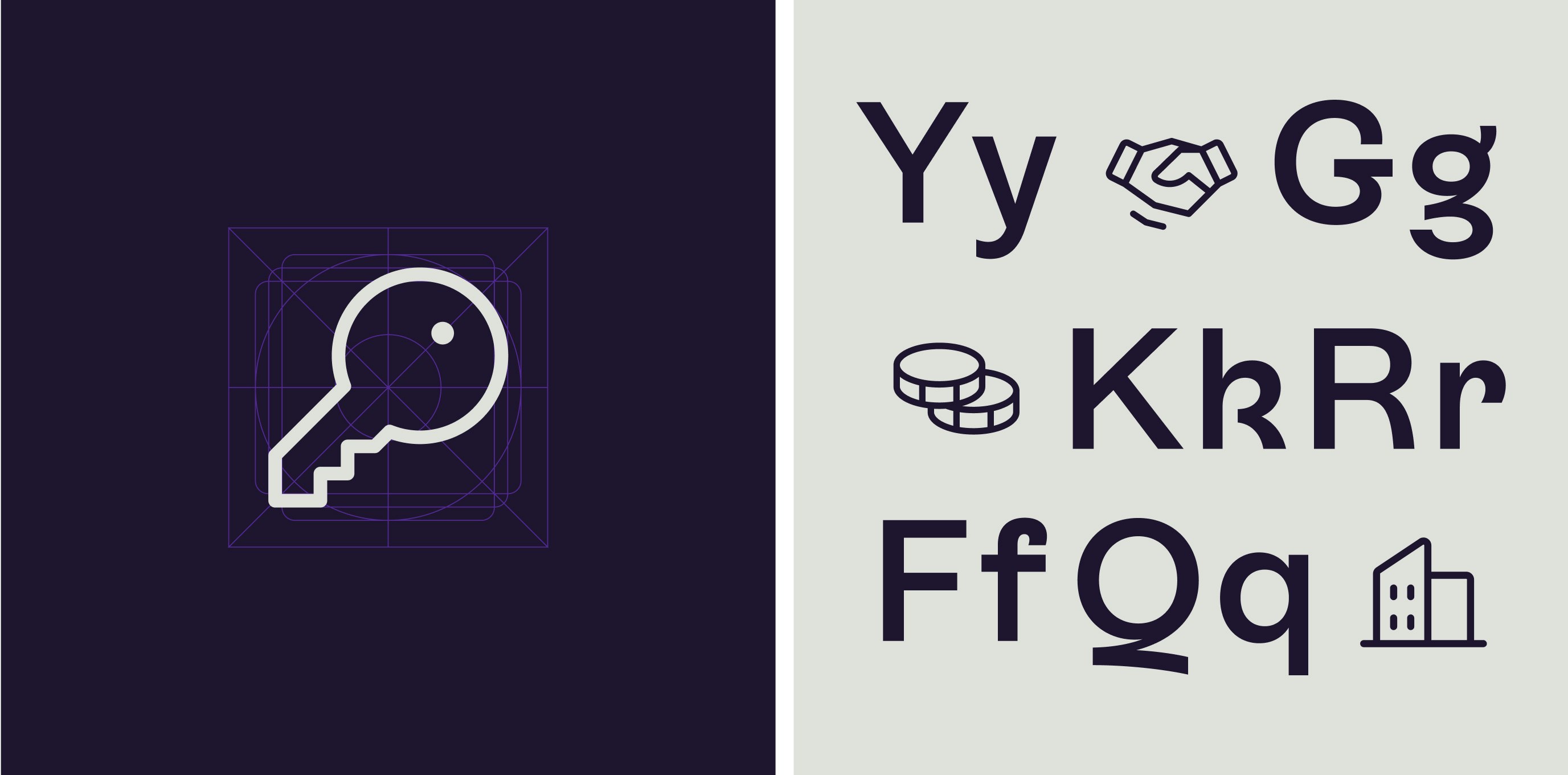
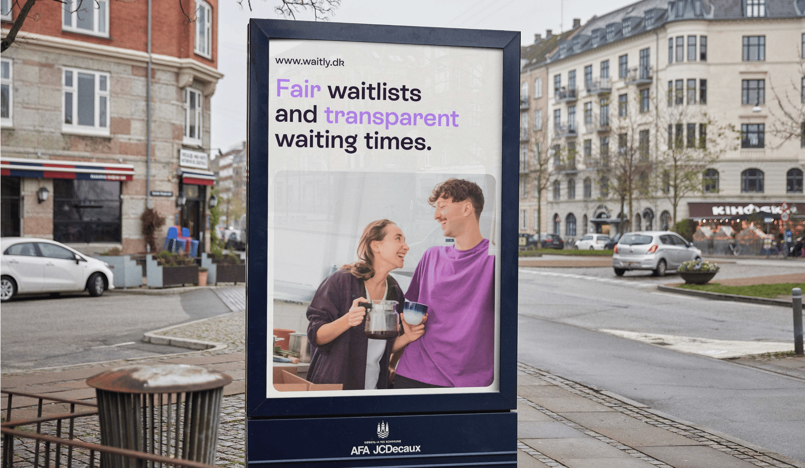
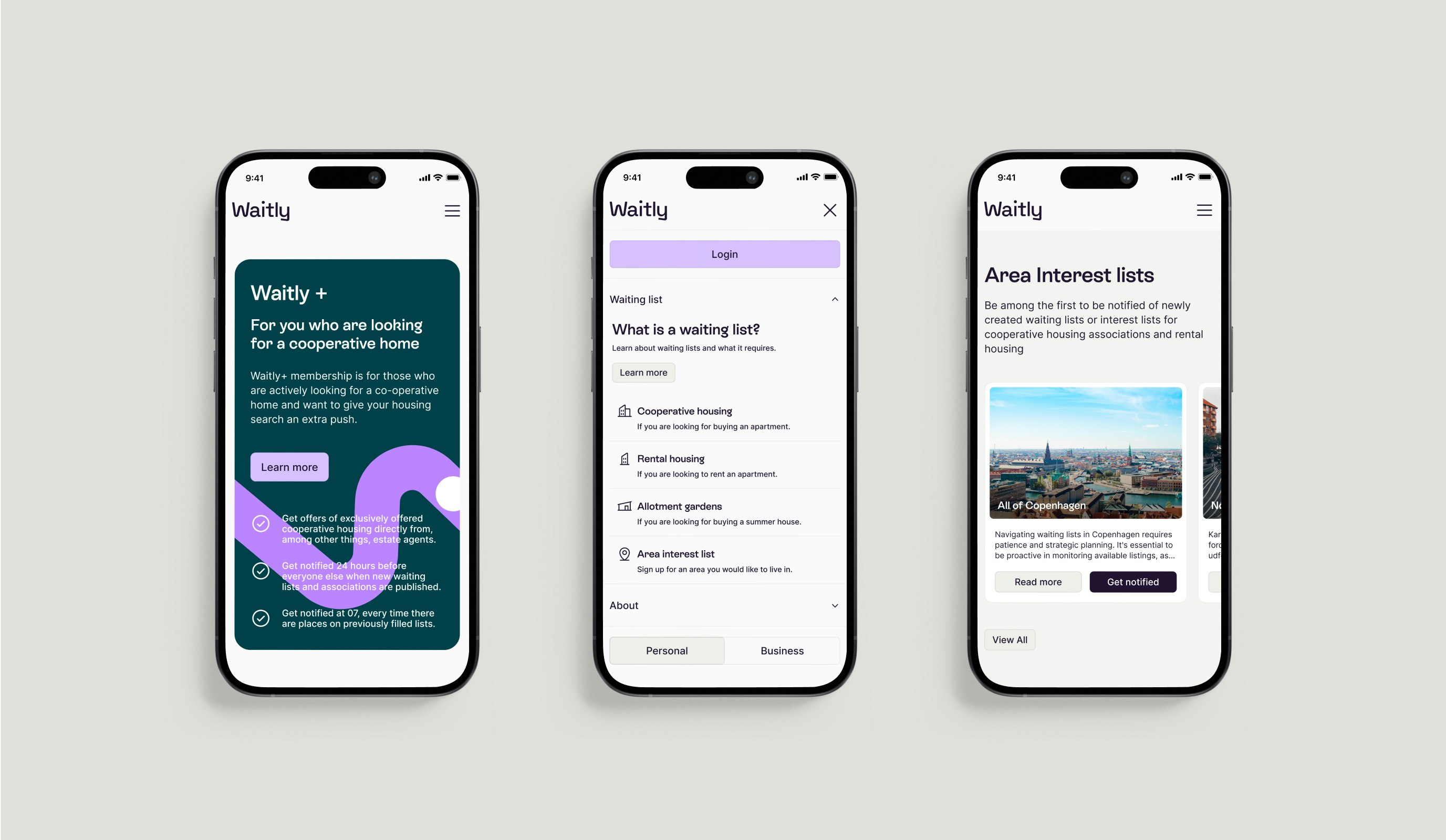
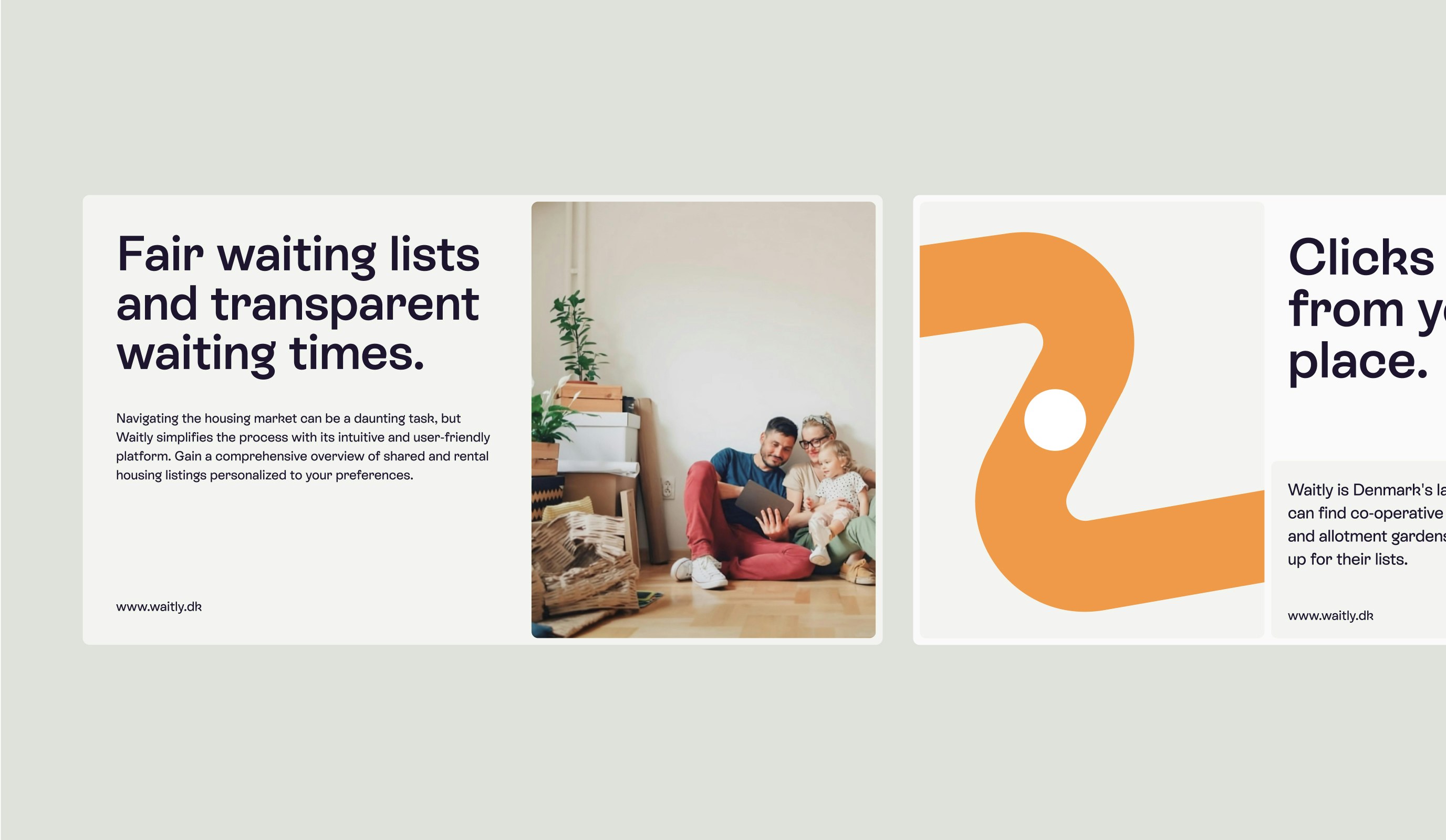
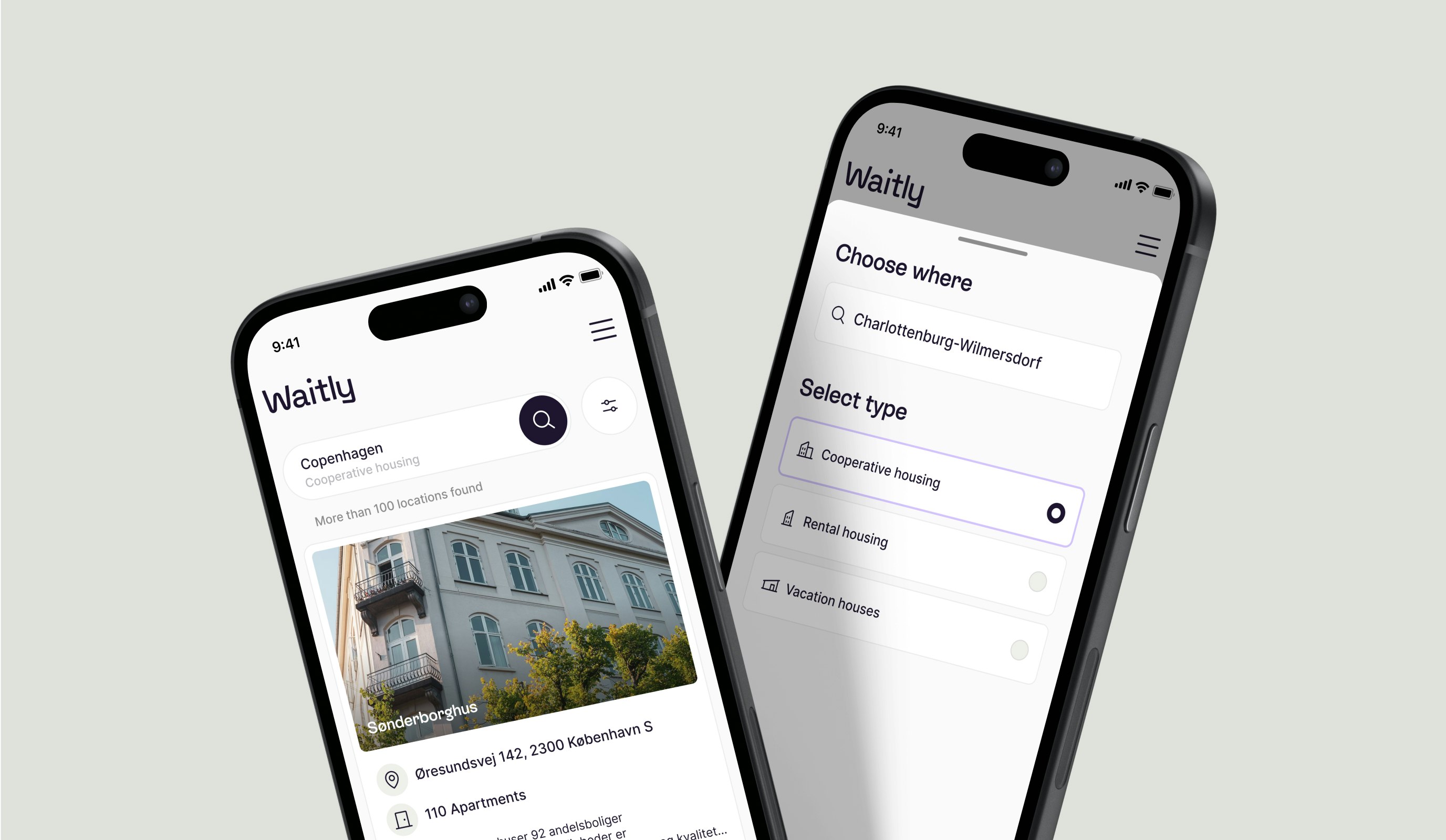
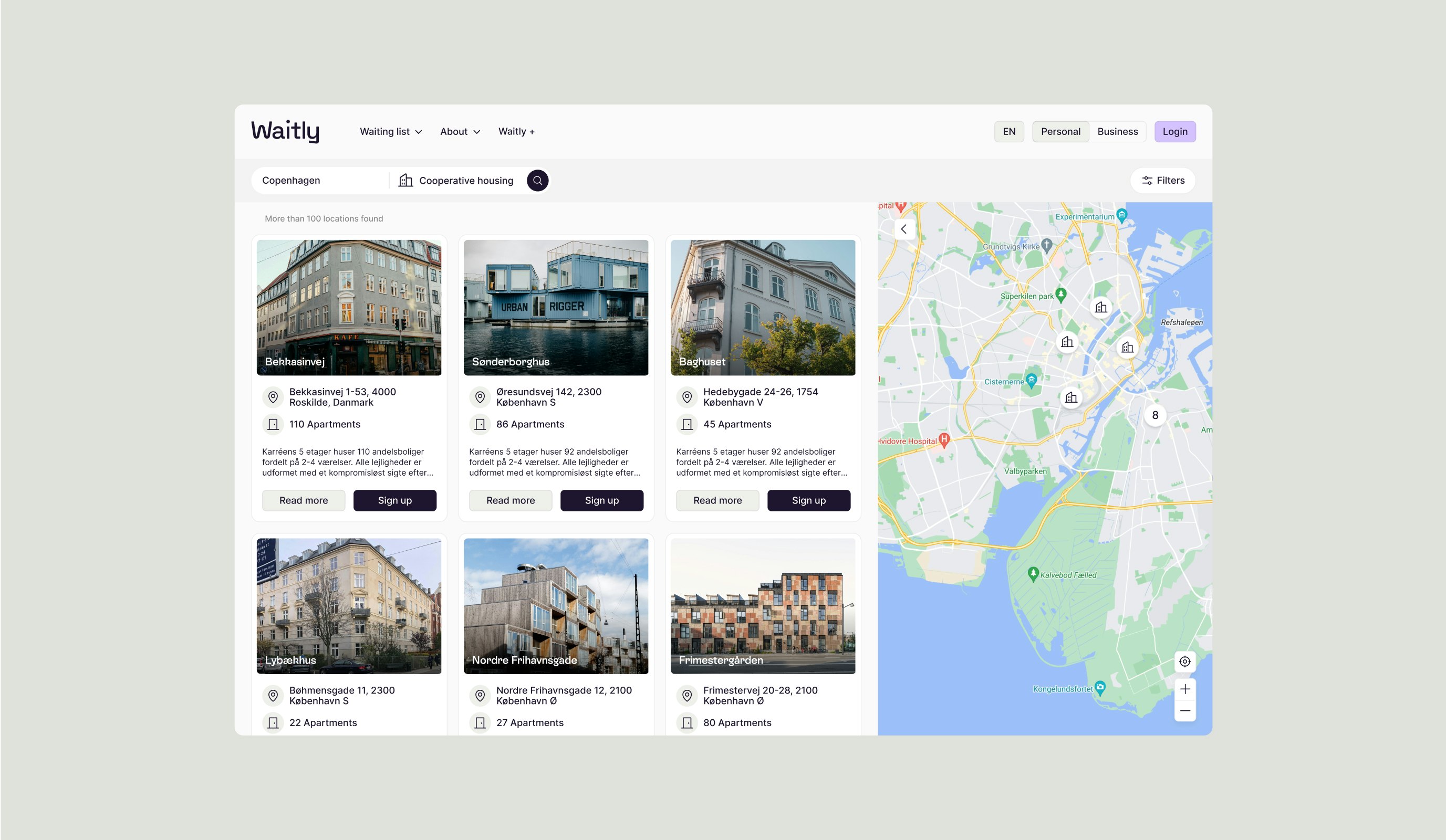
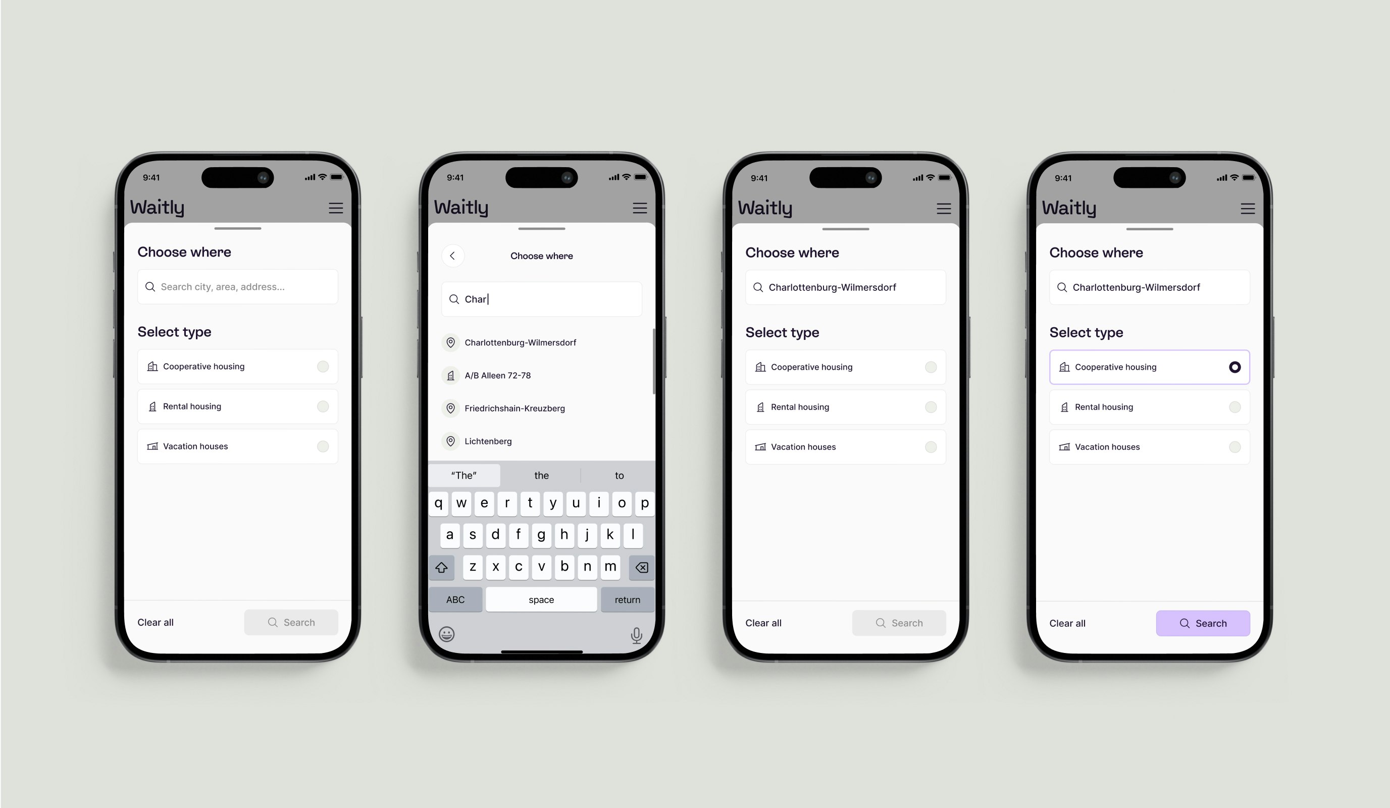
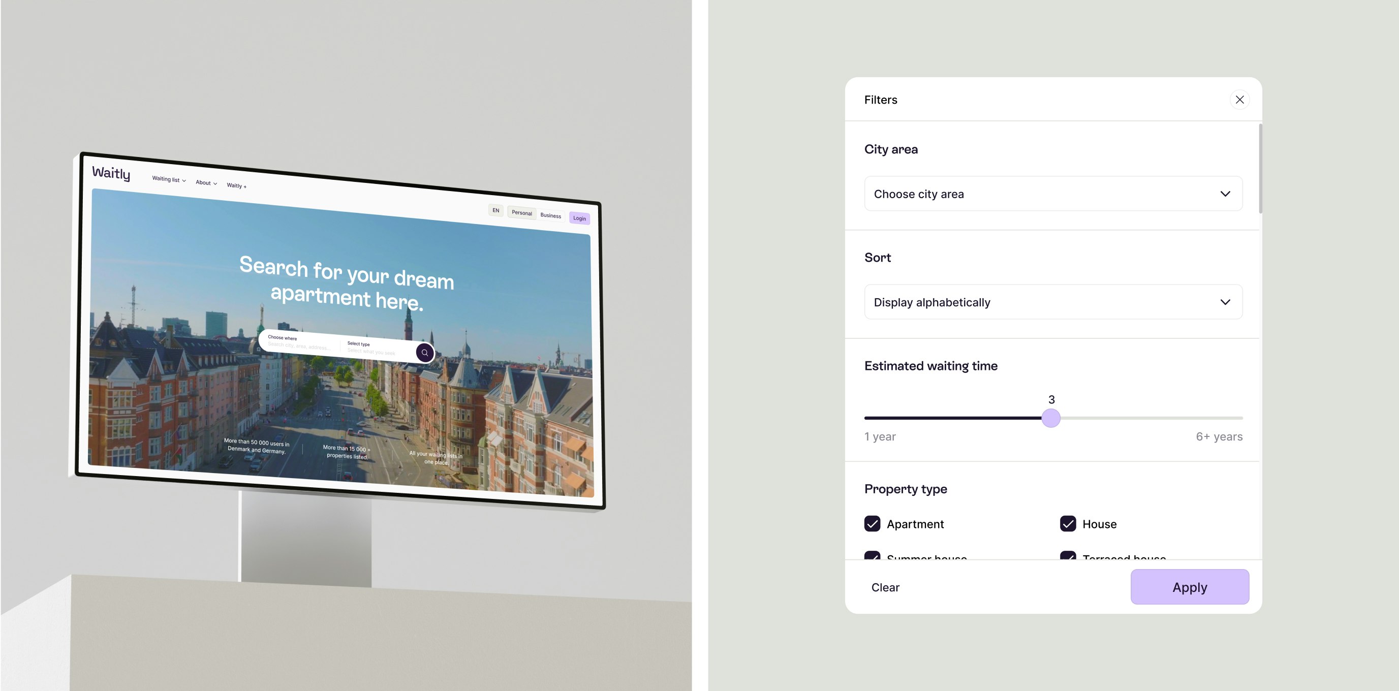
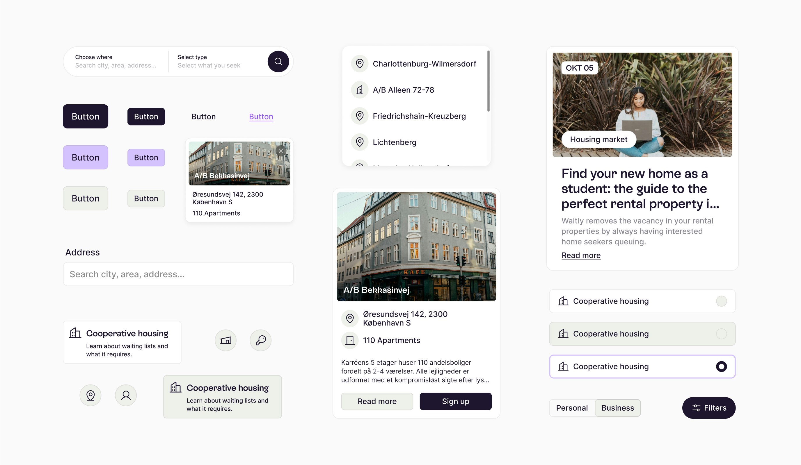
Waitly is a pioneering SaaS company specializing in digital waiting lists, initially focused on the housing sector in Denmark and expanding into Germany. Recognizing the importance of adapting to diverse markets, Waitly began a journey to redefine its brand identity, aiming to appeal to its youthful audience while improving the digital user experience.
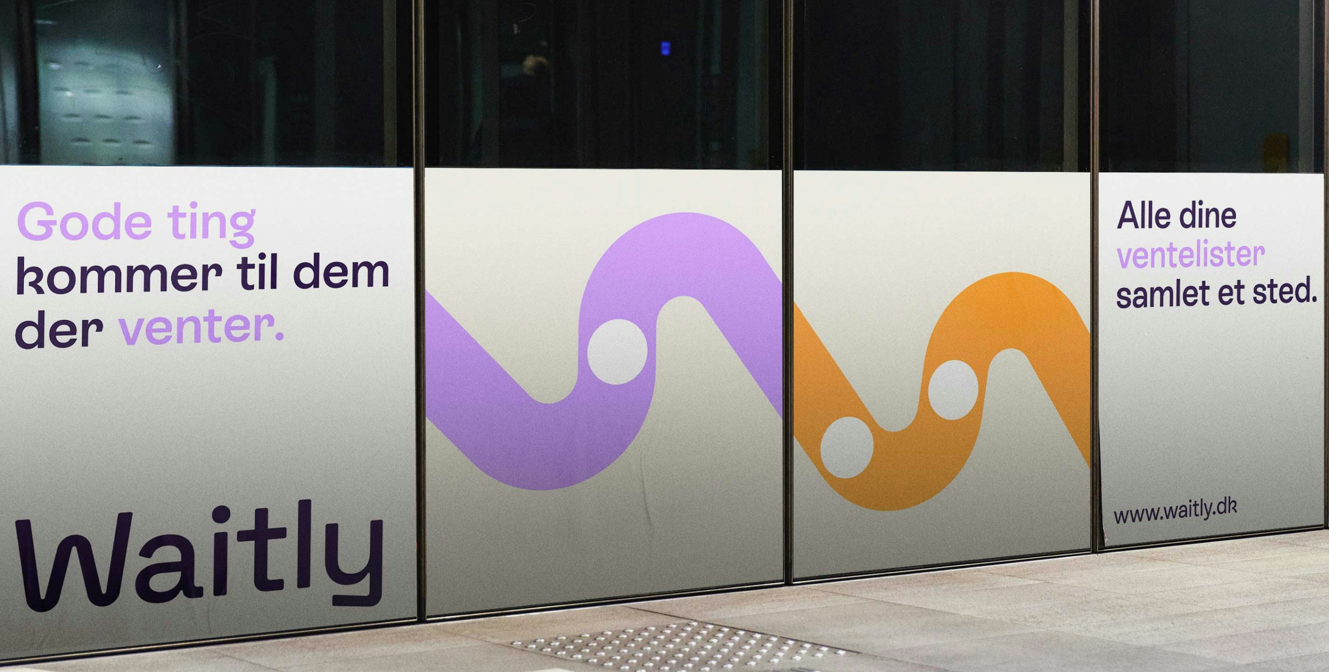
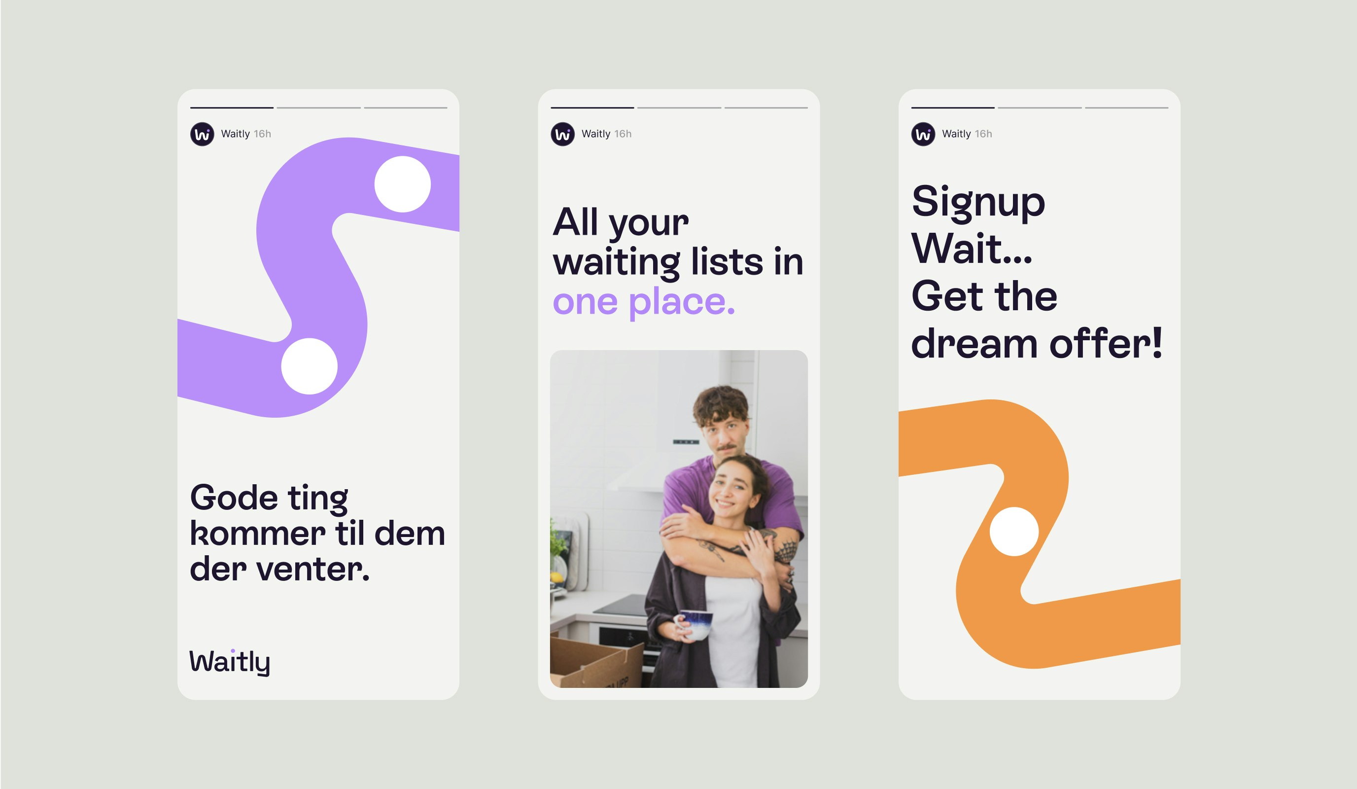
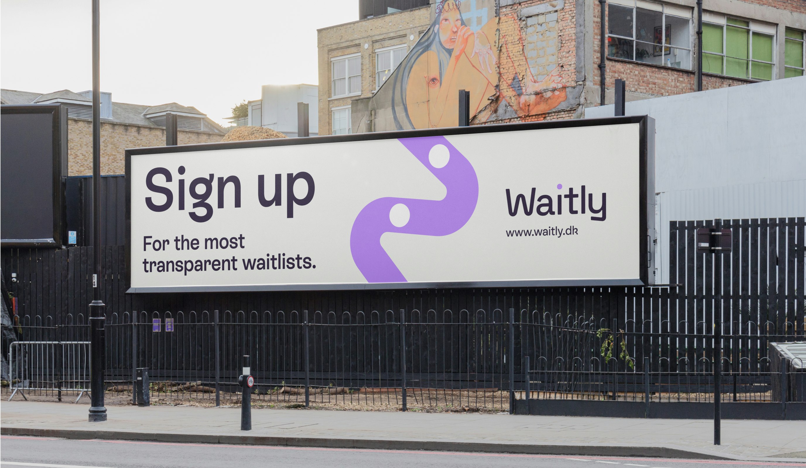
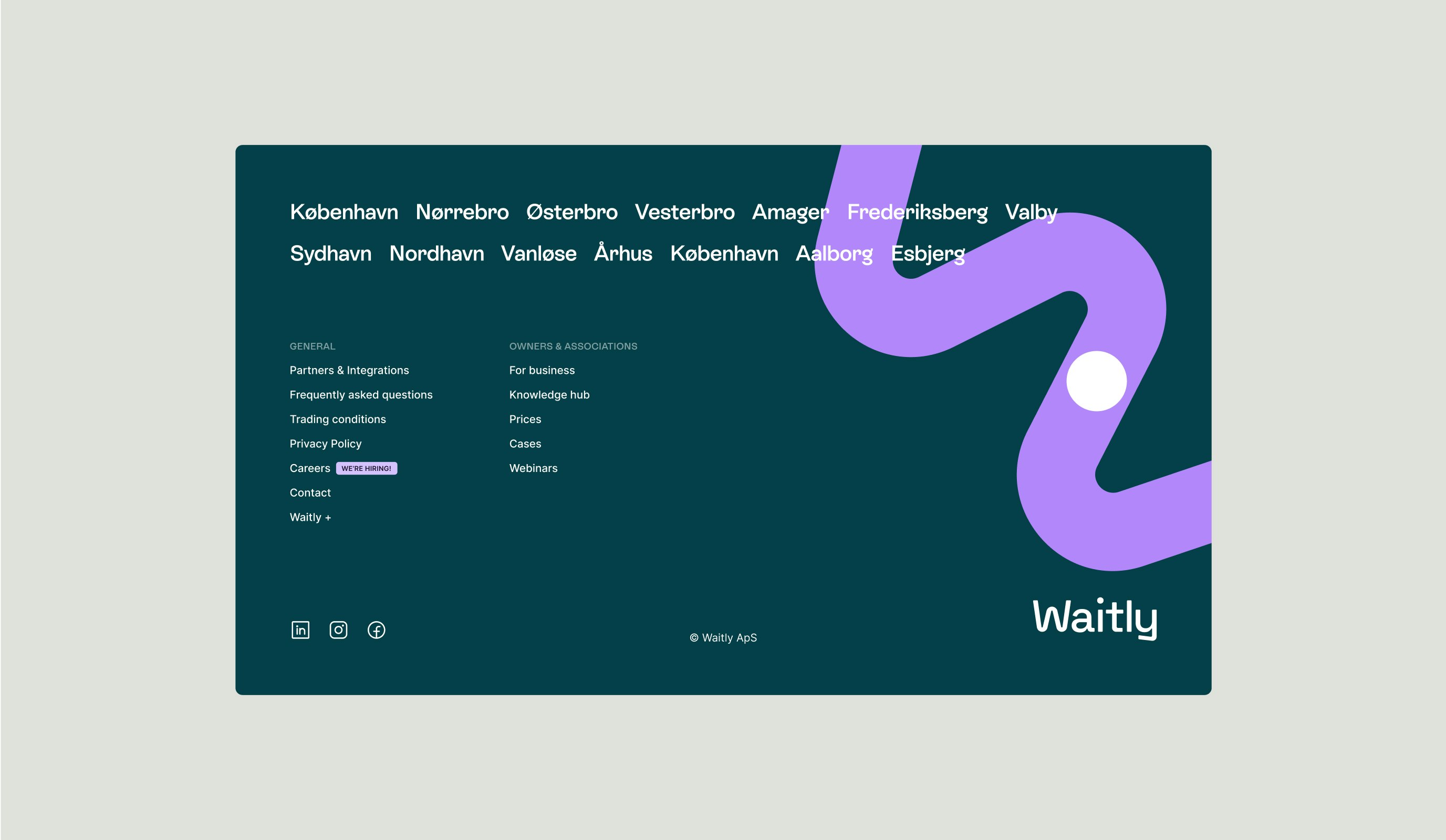
The outcome is a vibrant and playful brand identity. Waitly’s dedication to transparency lies at the core of its identity, exemplified by its new visual symbol: the “worm.” This straightforward yet meaningful graphic portrays a line of waiting with a dot representing an individual, capturing the essence of the company’s mission.
Kudos to
Project Manager / Jana Erichsen Opsahl
Project Manager / Sara Pallesen
Designer / Lukas Jurcik
Copywriter and Strategist / Gabby Olivas
Copywriter and Strategist / Sara Pallesen
Creative editor / Nikolaj Trane
Photographer and film editor / Lukas Gottlieb
Creative Producer / Nana Skak
Front-end developer / Junhwan Im
Tech Support / Christoffer Skytte Wielsøe
Growth Support / Laura Herrera
Related work
Fleet
Next stop. New adventures.
Client: Fleet
Partnership Lead: Mathilde Ive & Patrick Rønning
Key Focus: Platform design & brand ID
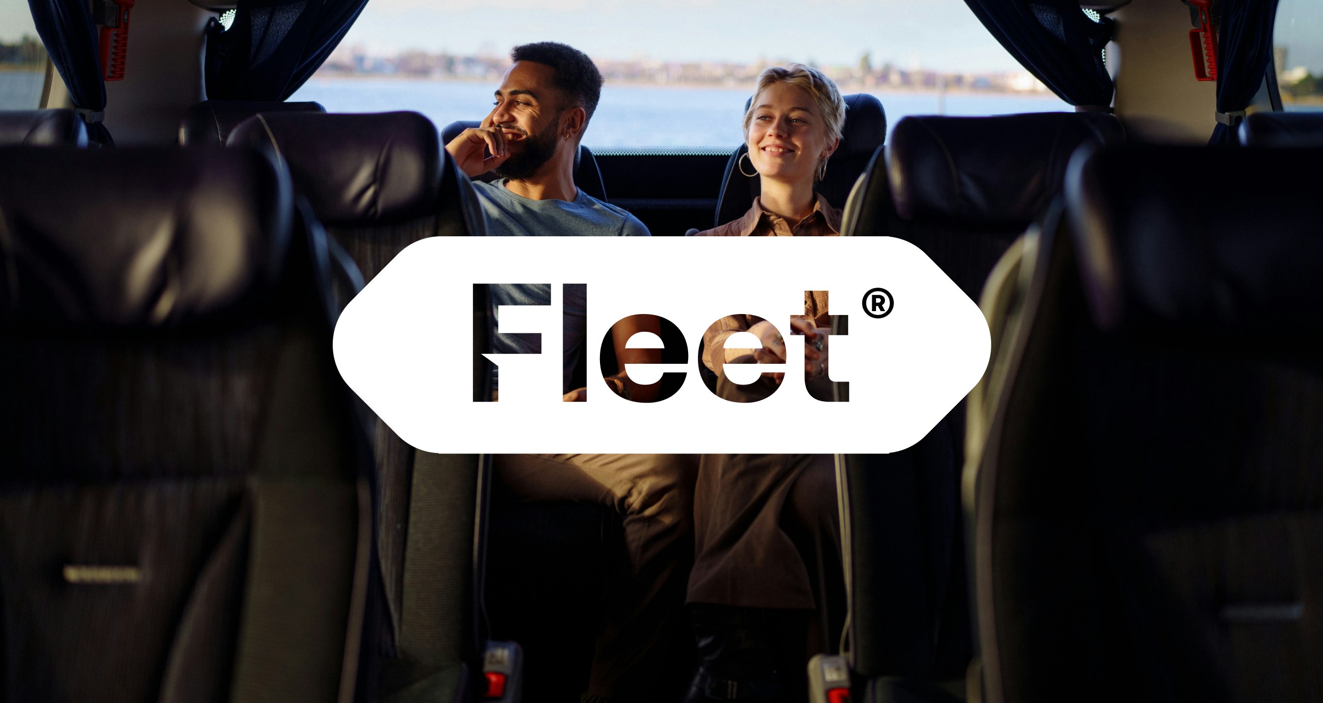
VIKINGBUS, one of Denmark's biggest bus companies, had the ambition of creating a new and ambitious direct-to-consumer bus service meeting the needs of a modern audience with a more spontaneous approach to traveling. They were looking to craft a completely new and autonomous brand fueled by a smooth, elevated digital experience.
The result is a completely new brand built from the ground up - Fleet. With a bold and distinct brand identity at its center, Fleet is a cohesive brand experience that runs seamlessly between its physical and digital manifestations, fit for a modern consumer.