Waitly
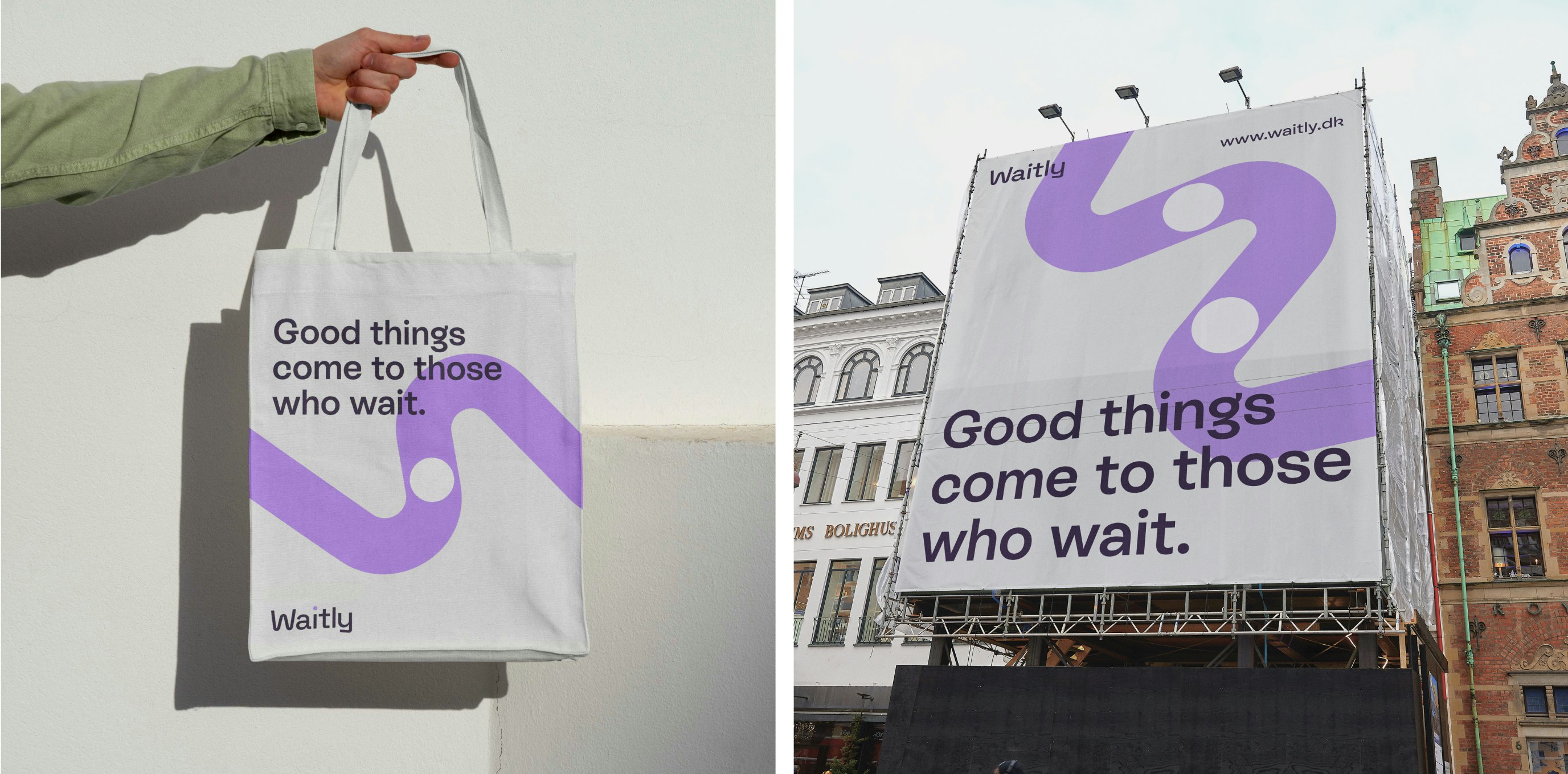
Good things come to those who wait
Client: Waitly
Key Focus: Brand, E-commerce
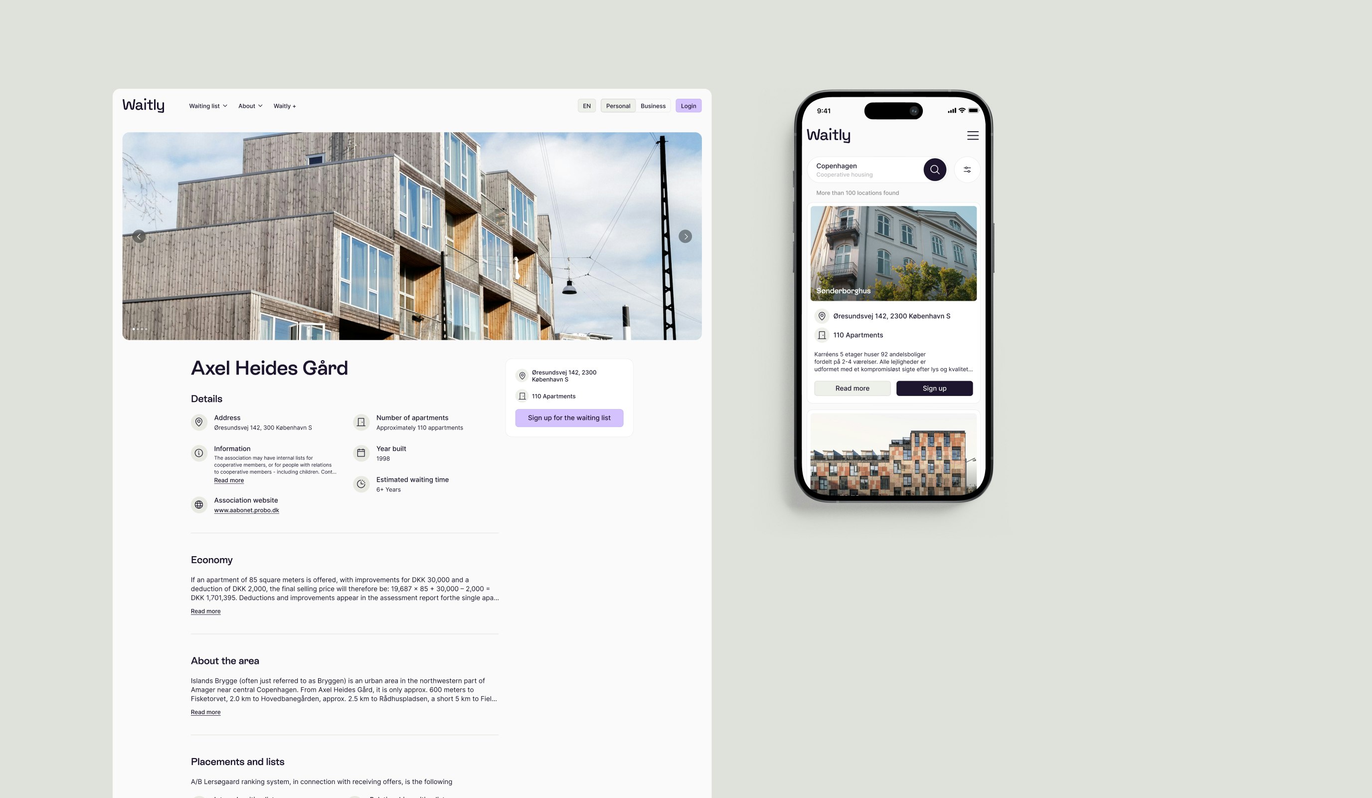
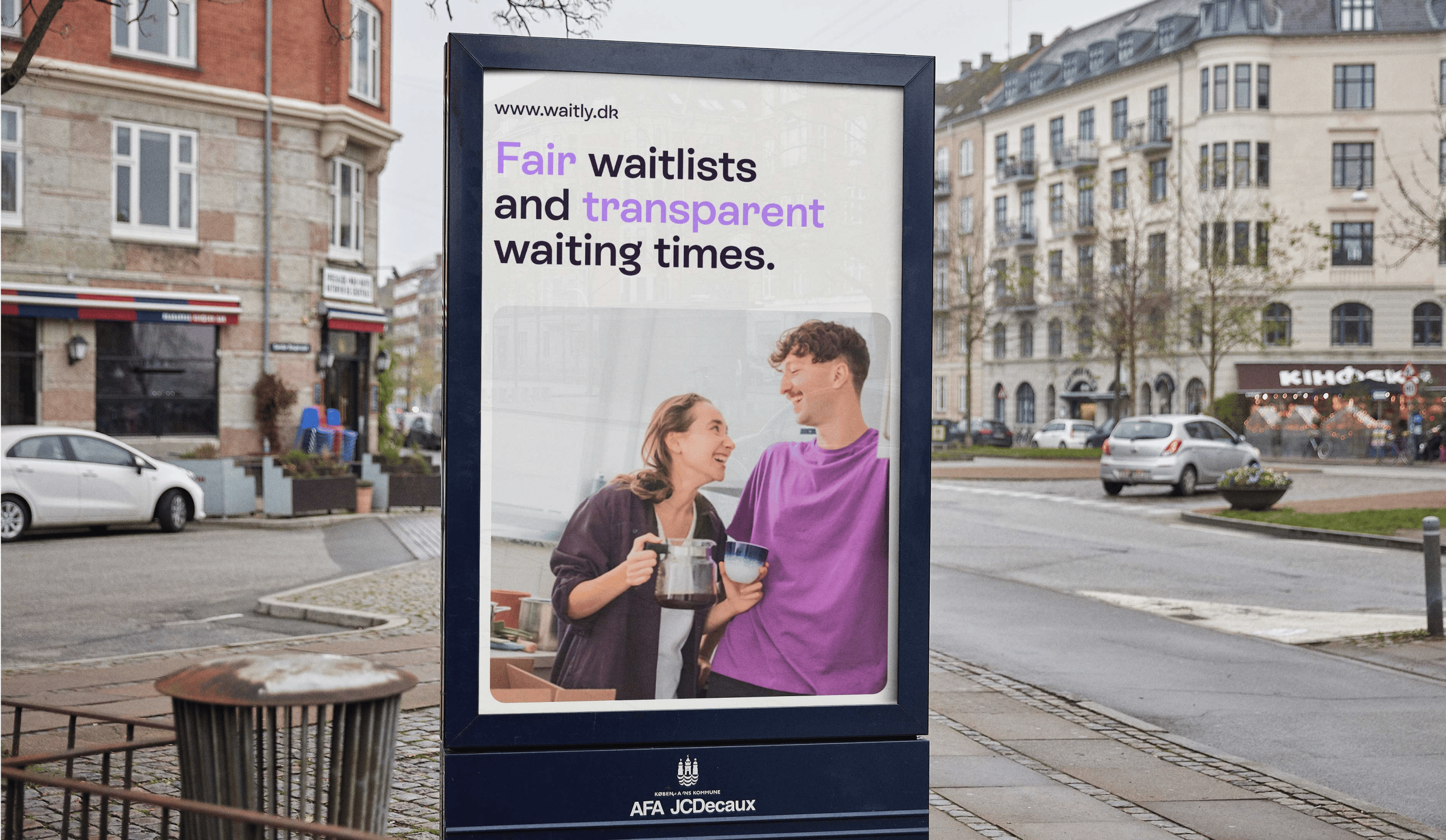
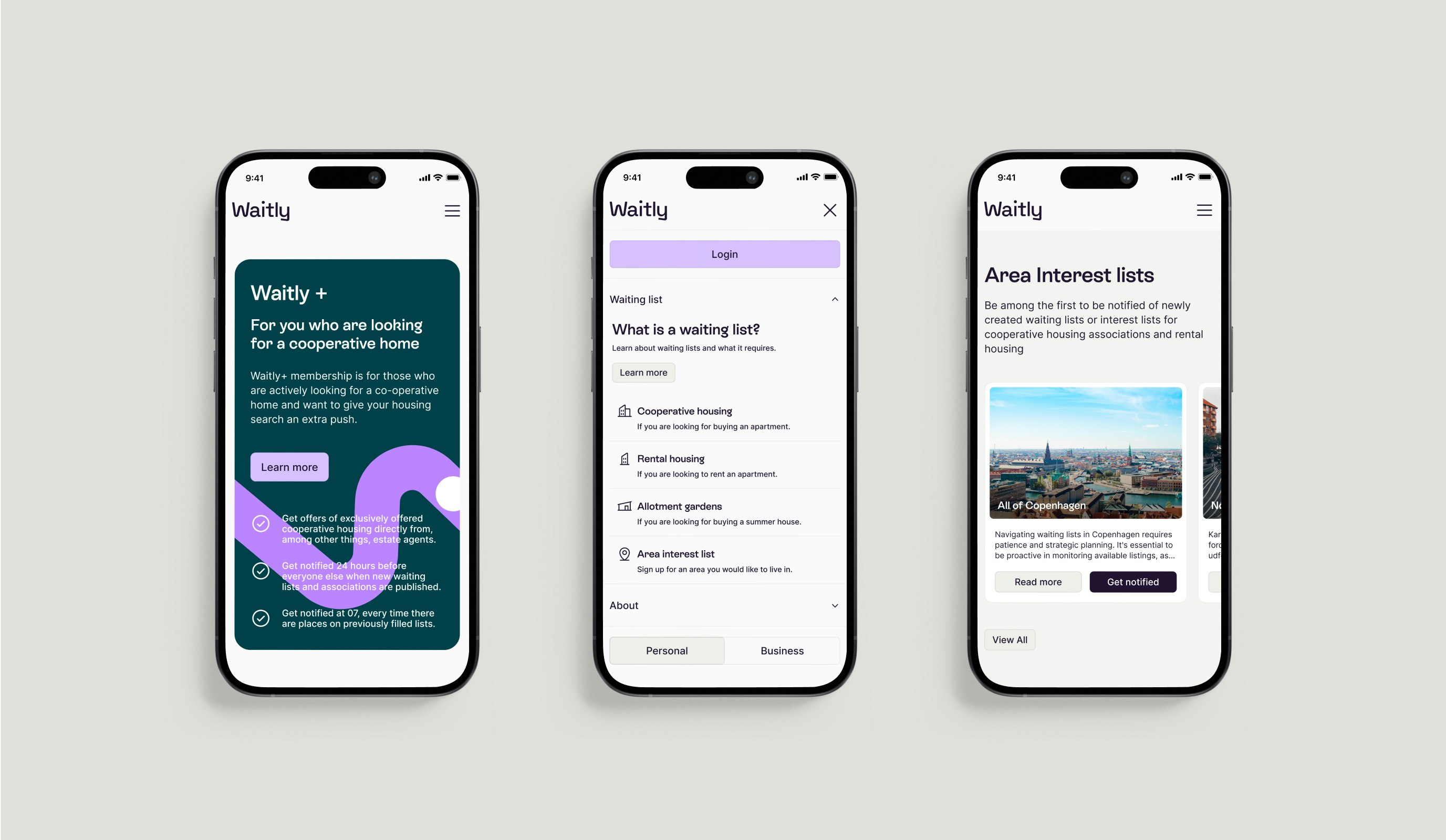
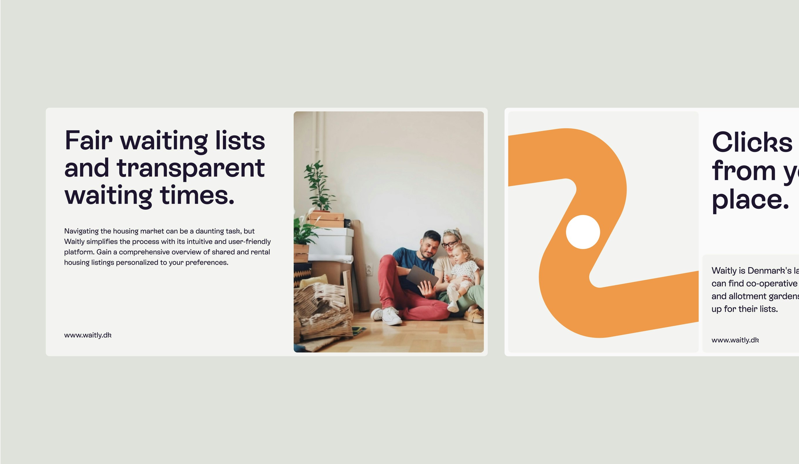
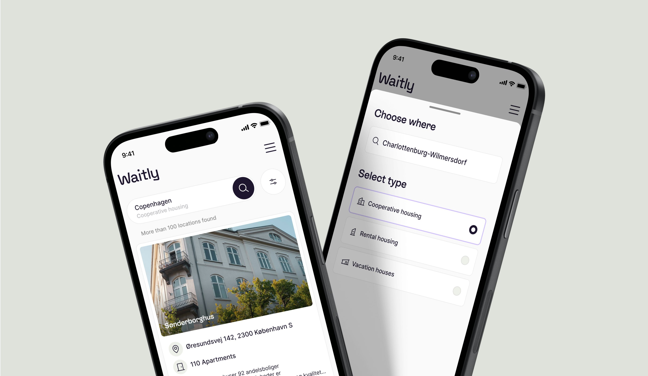
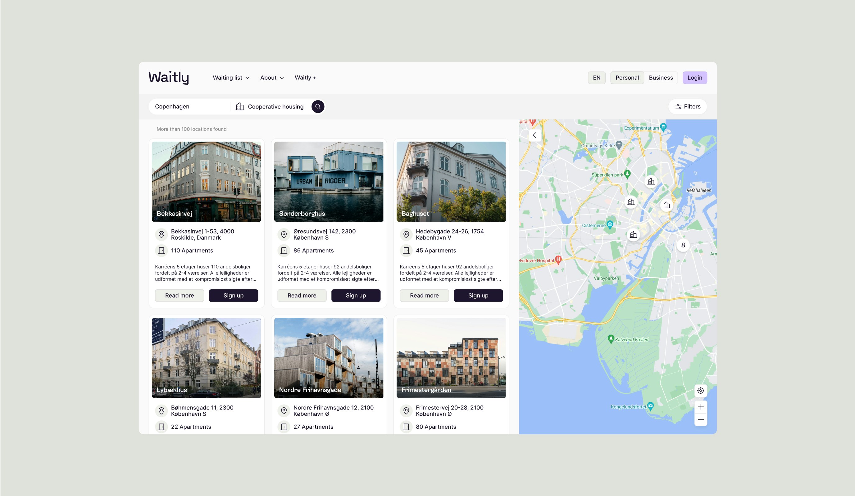
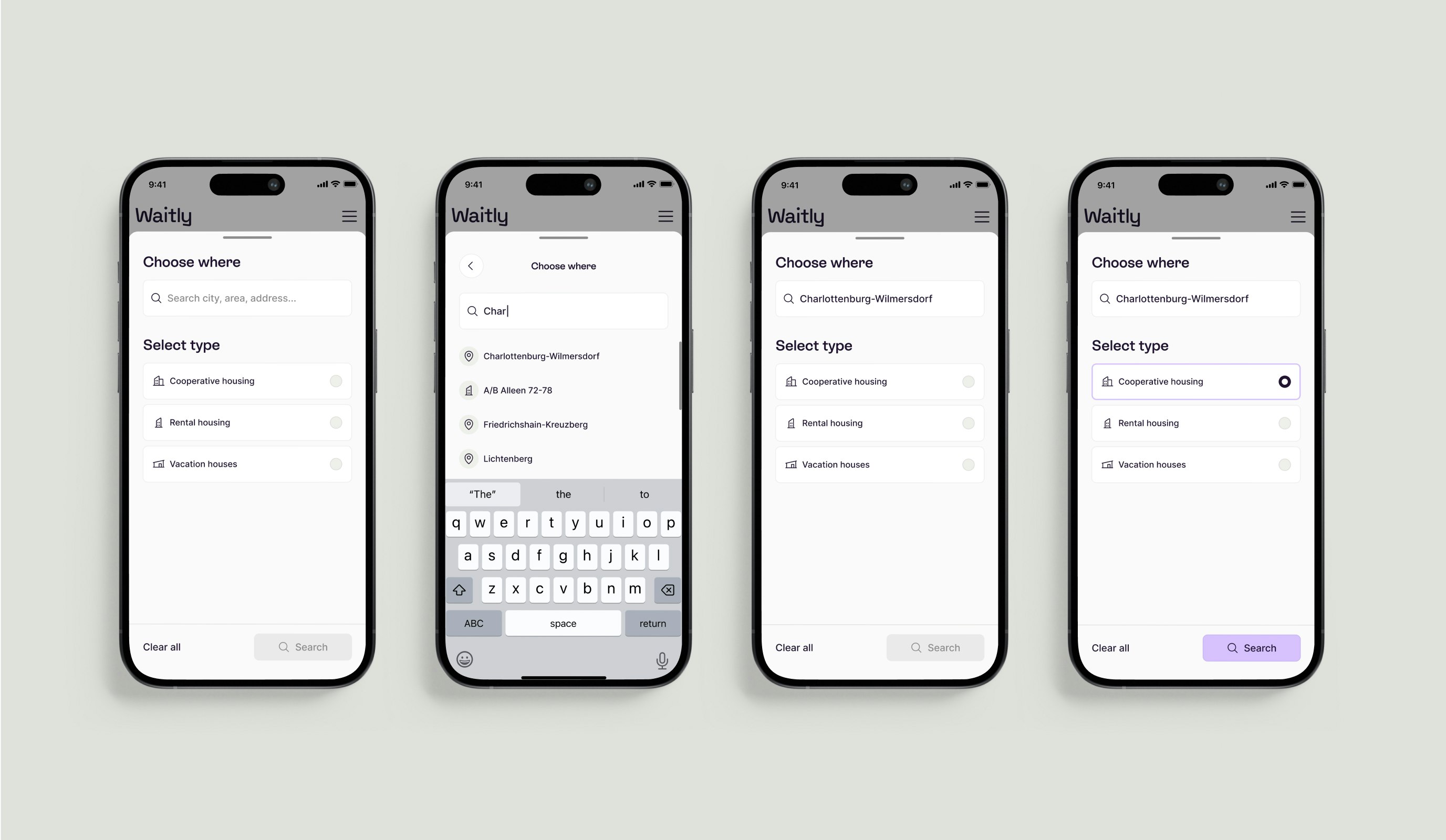
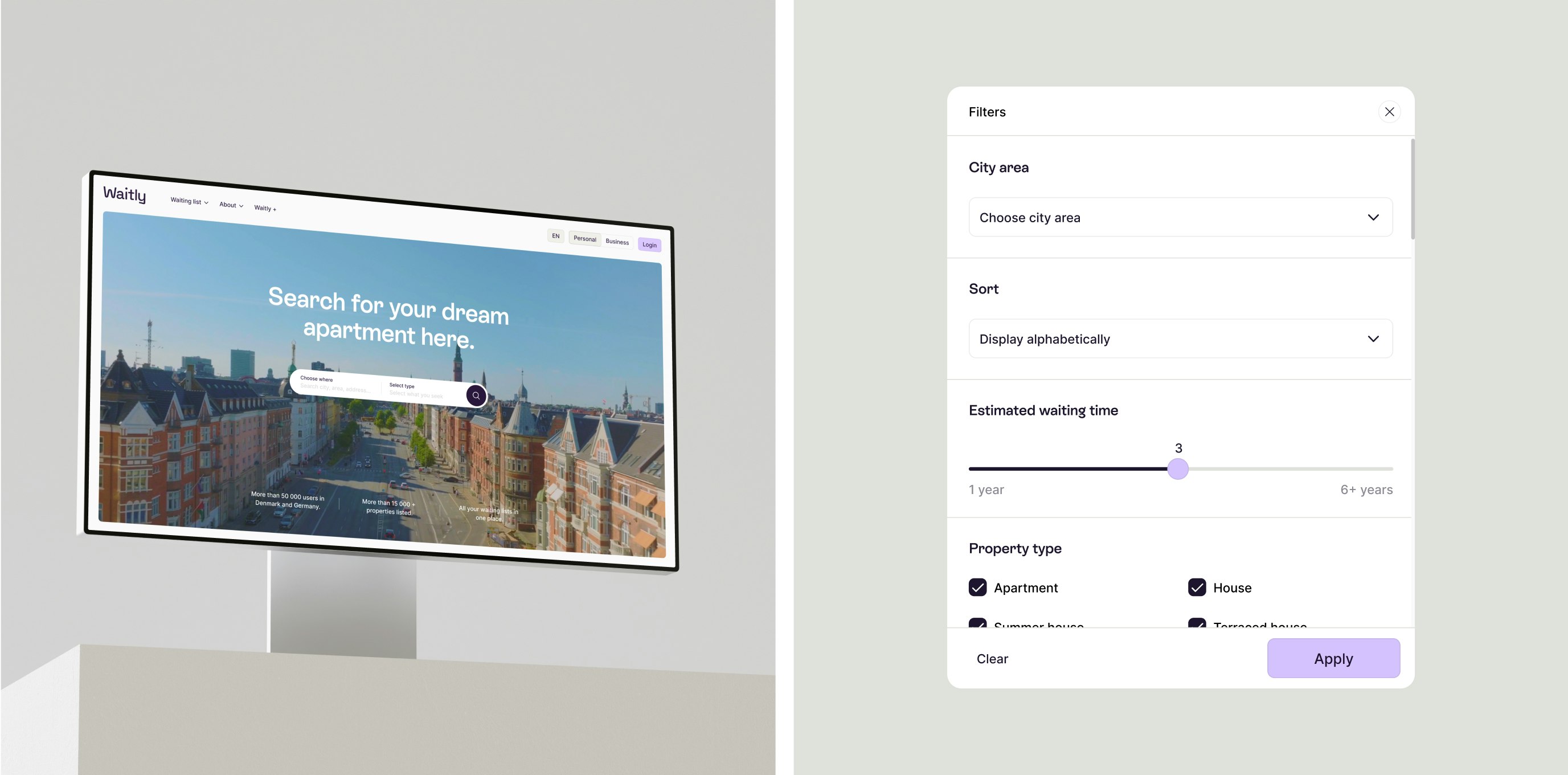
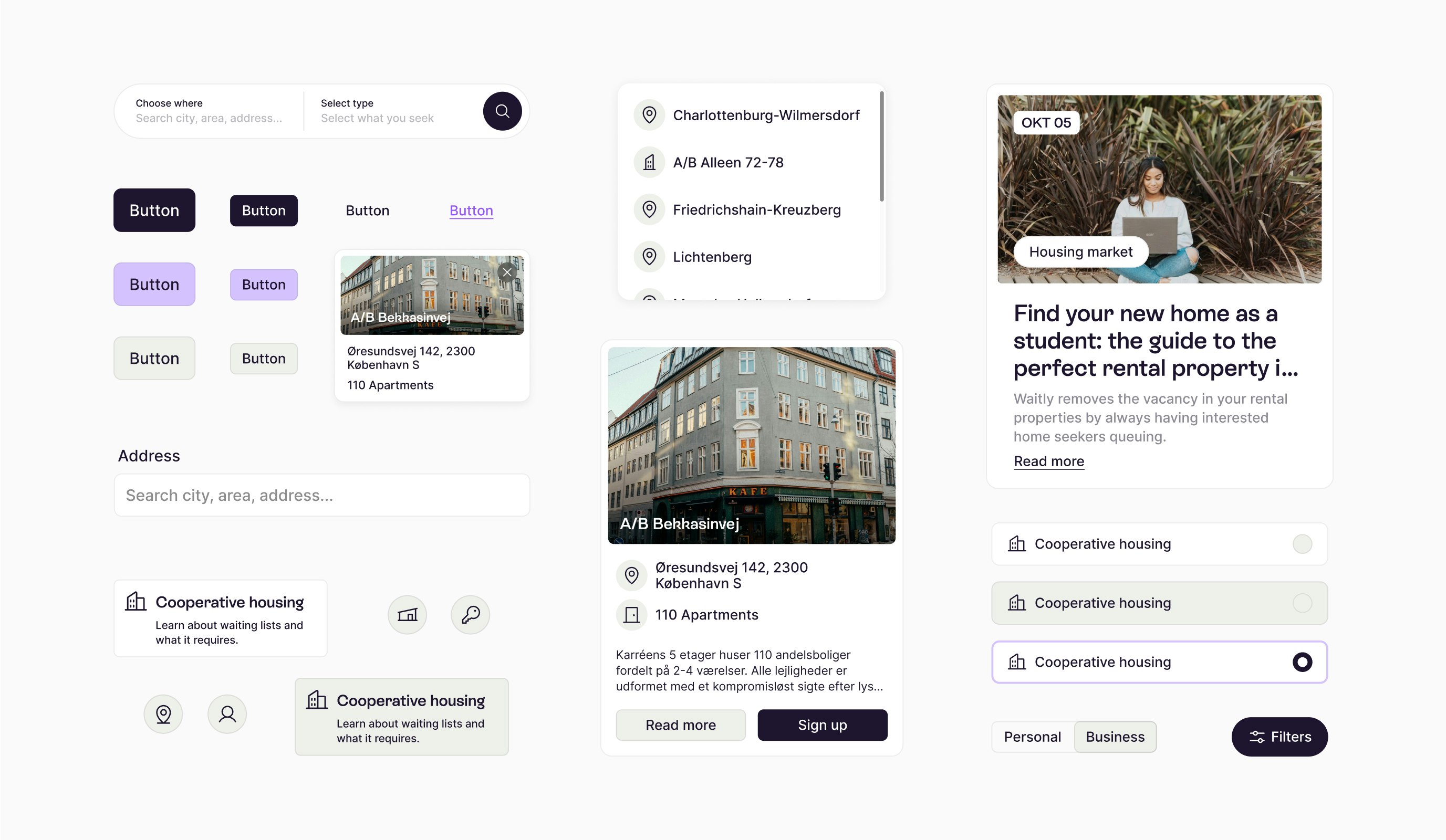
Waitly is a pioneering SaaS company specializing in digital waiting lists, initially focused on the housing sector in Denmark and expanding into Germany. Recognizing the importance of adapting to diverse markets, Waitly began a journey to redefine its brand identity, aiming to appeal to its youthful audience while improving the digital user experience.
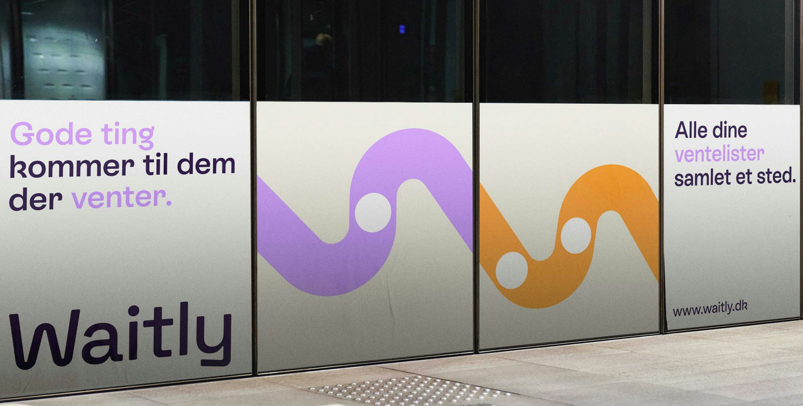
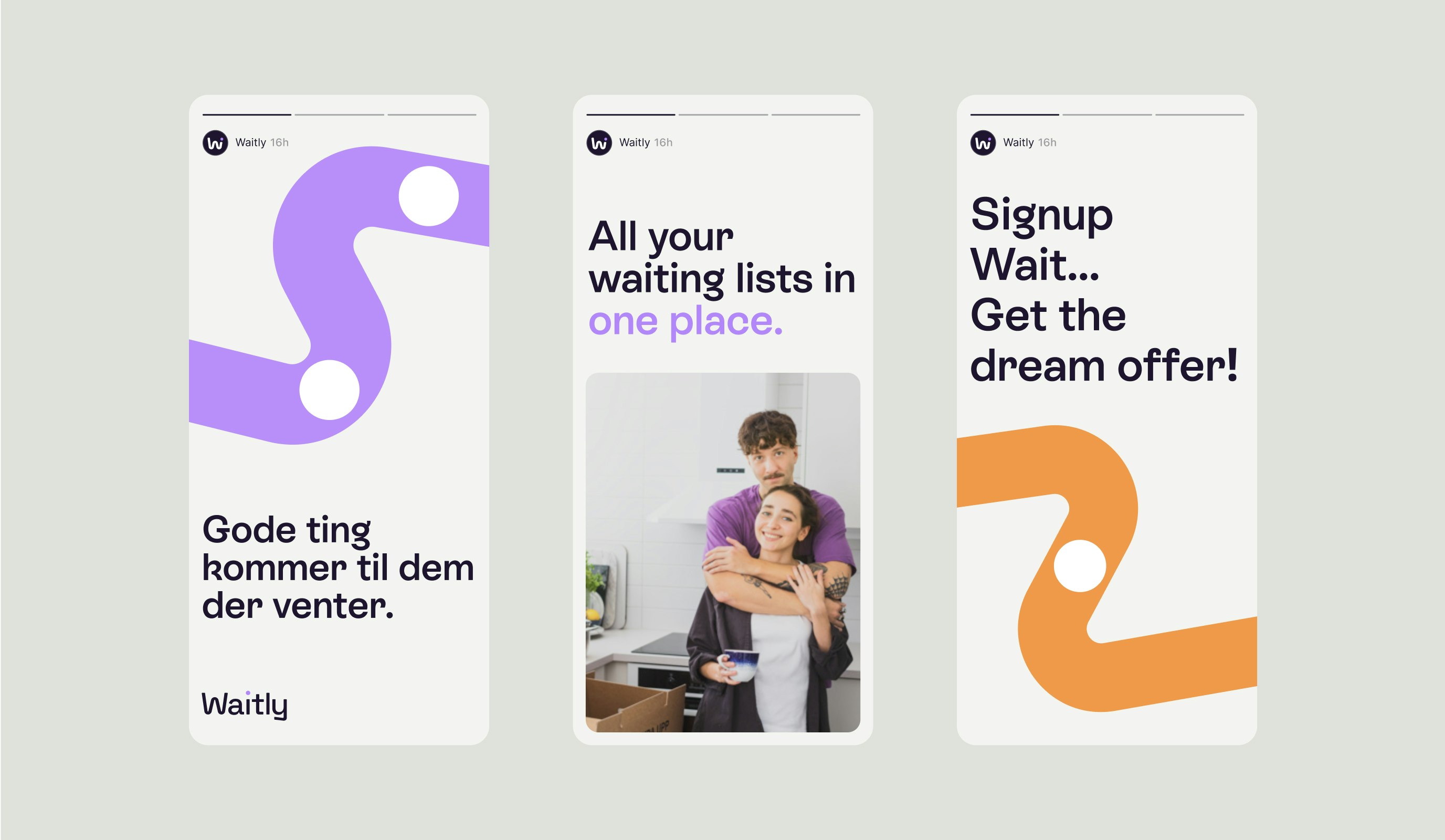
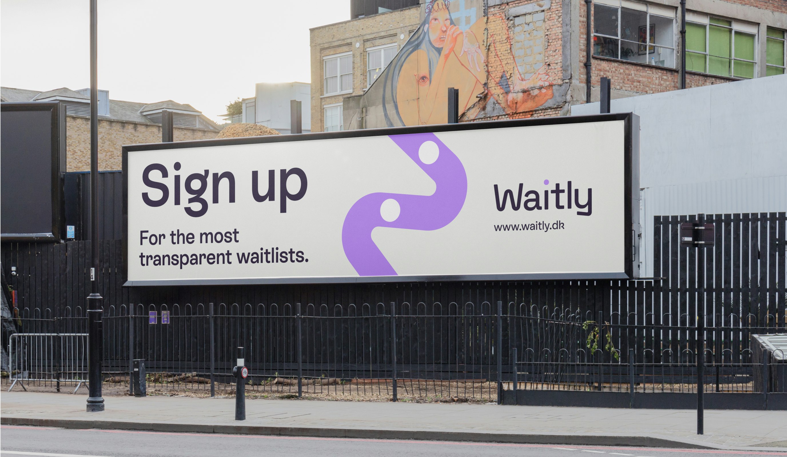
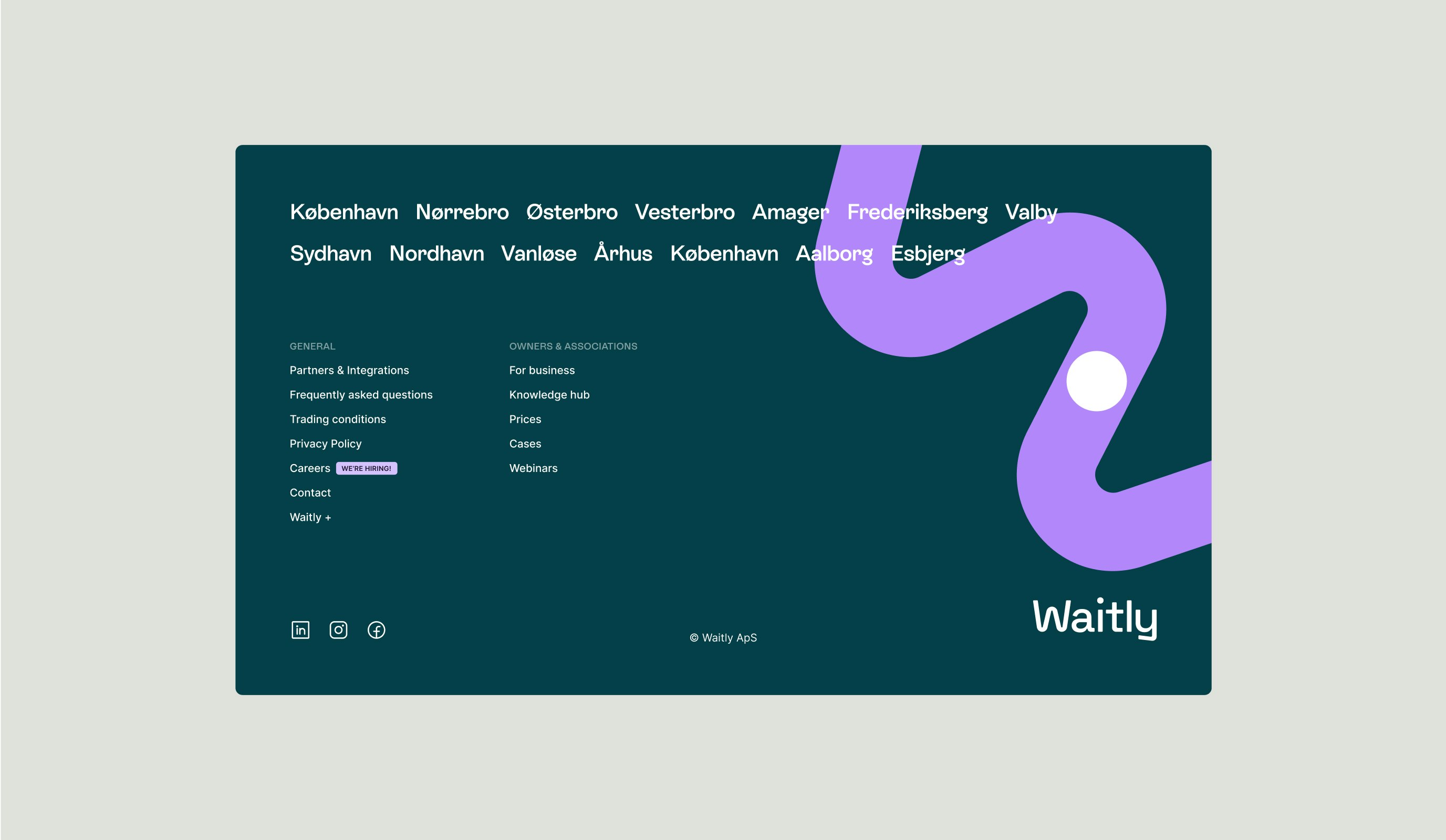
The outcome is a vibrant and playful brand identity. Waitly’s dedication to transparency lies at the core of its identity, exemplified by its new visual symbol: the “worm.” This straightforward yet meaningful graphic portrays a line of waiting with a dot representing an individual, capturing the essence of the company’s mission.
Kudos to
Project Manager / Jana Erichsen Opsahl
Project Manager / Sara Pallesen
Designer / Lukas Jurcik
Copywriter and Strategist / Gabby Olivas
Copywriter and Strategist / Sara Pallesen
Creative editor / Nikolaj Trane
Photographer and film editor / Lukas Gottlieb
Creative Producer / Nana Skak
Front-end developer / Junhwan Im
Tech Support / Christoffer Skytte Wielsøe
Growth Support / Laura Herrera
Related work
Fleet
Prochain arrêt. De nouvelles aventures.
Client: Fleet
Partnership Lead: Mathilde Ive & Patrick Rønning
Key Focus: Conception de la plateforme et identité de marque
VIKINGBUS, l'une des plus grandes compagnies d'autobus du Danemark, avait l'ambition de créer un nouveau service d'autobus direct au consommateur répondant aux besoins d'un public moderne avec une approche plus spontanée du voyage. Ils cherchaient à créer une toute nouvelle marque autonome alimentée par une expérience numérique fluide et élevée.
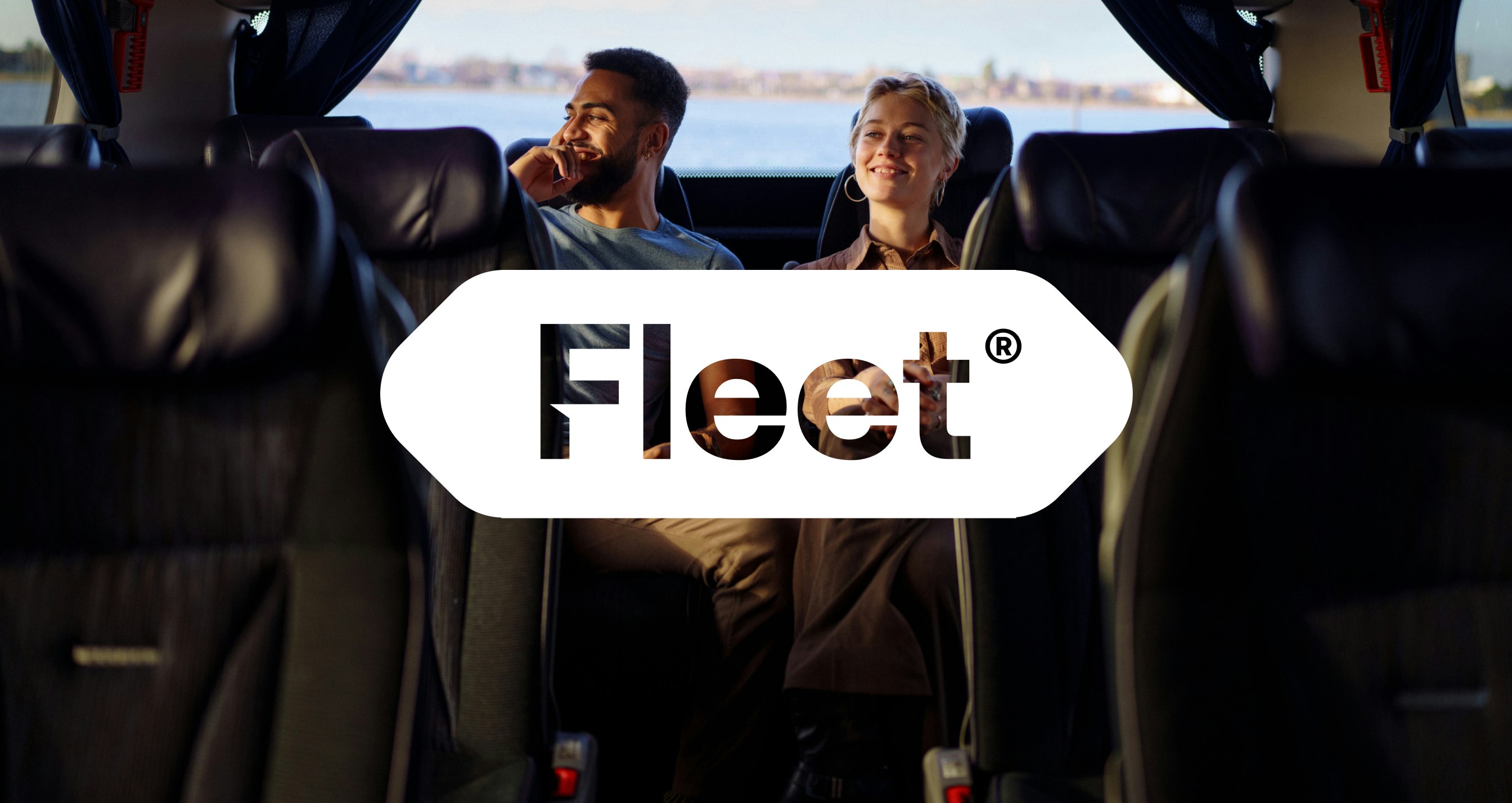
Le résultat est une toute nouvelle marque construite de zéro - Fleet. Avec une identité de marque audacieuse et distincte au centre, Fleet est une expérience de marque cohérente qui s'étend de manière transparente entre ses manifestations physiques et numériques, adaptée à un consommateur moderne.