Datekin
Guilt-free snacking
Client: Datekin
Key Focus: Brand
Datekin's Branding
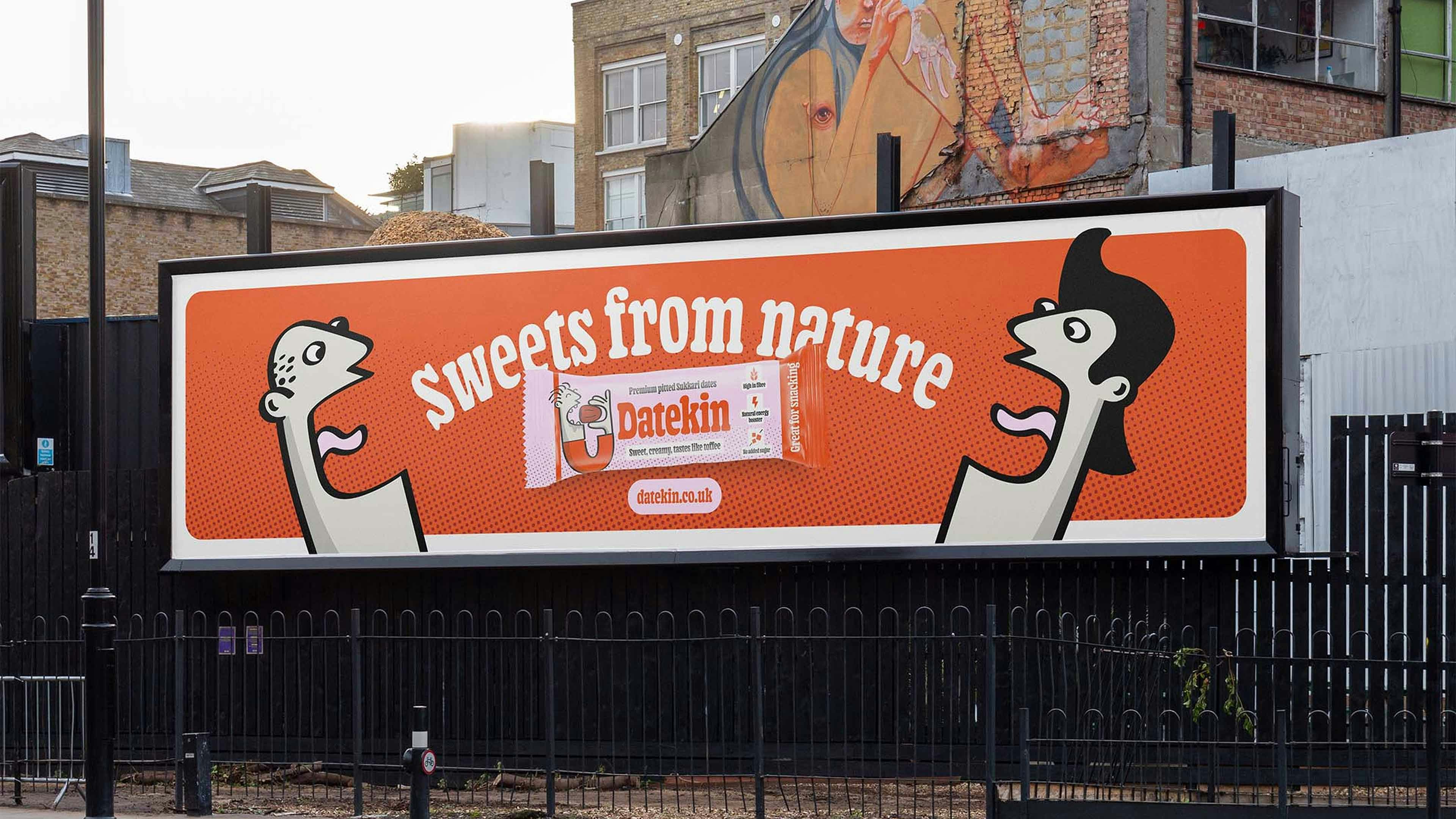
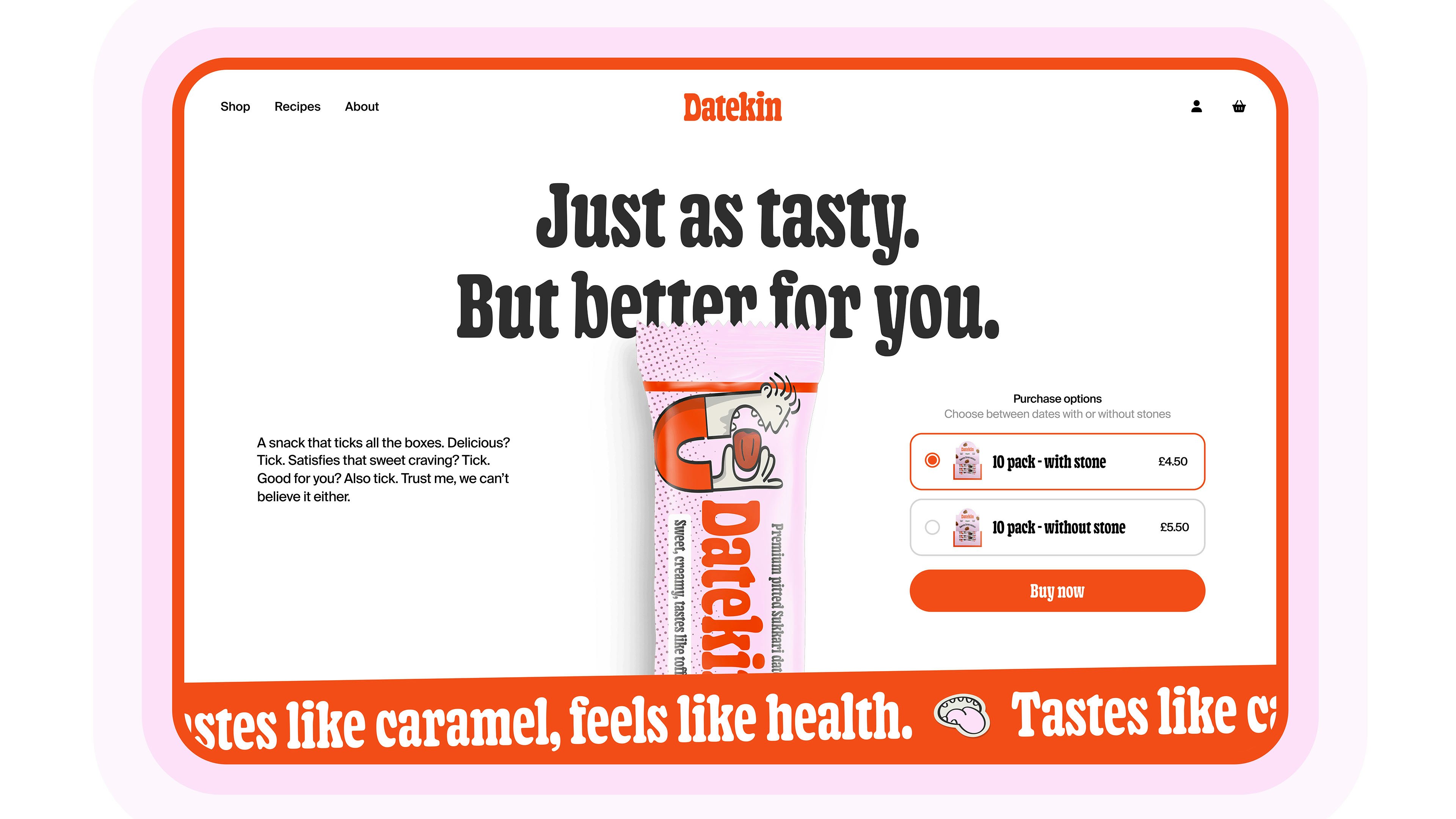
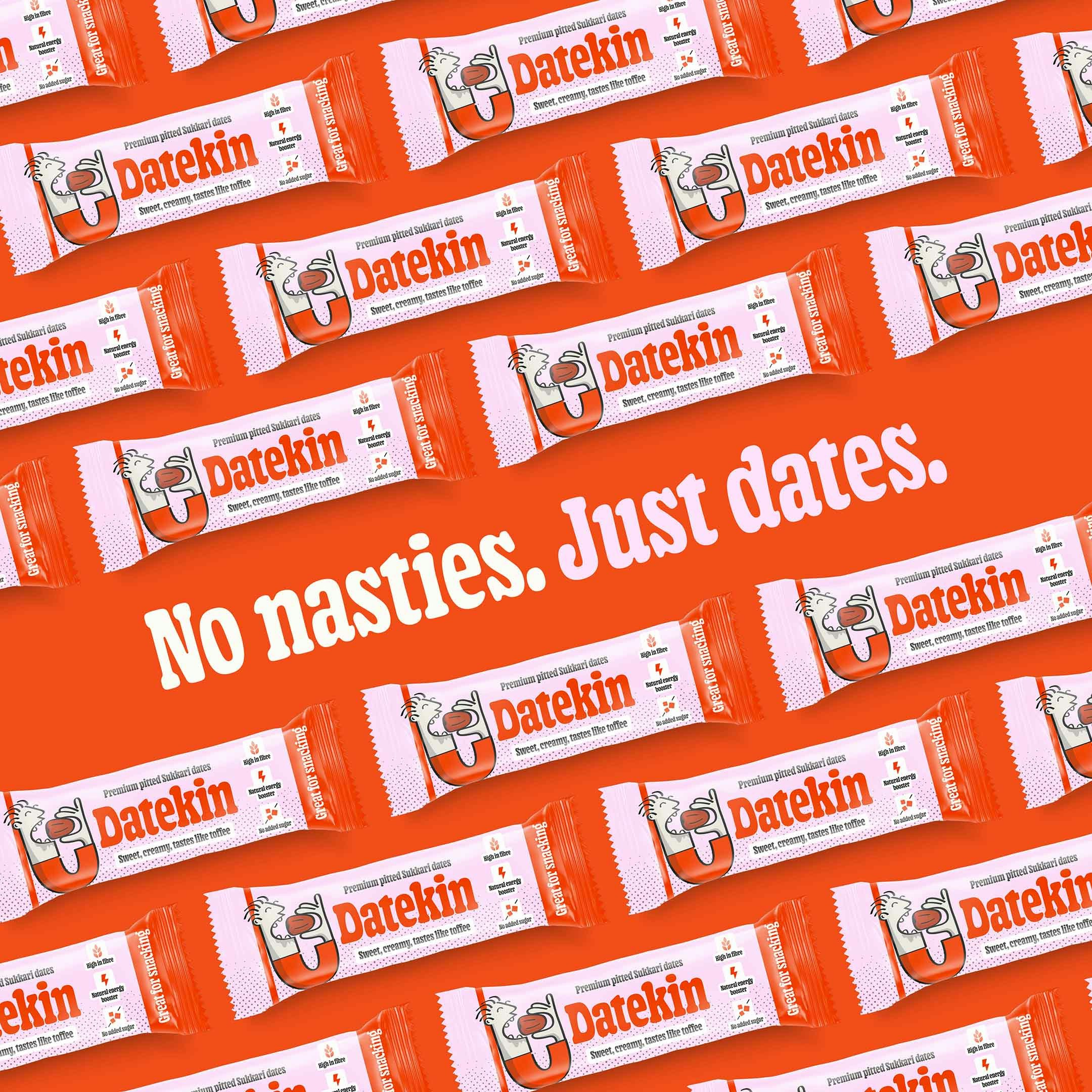
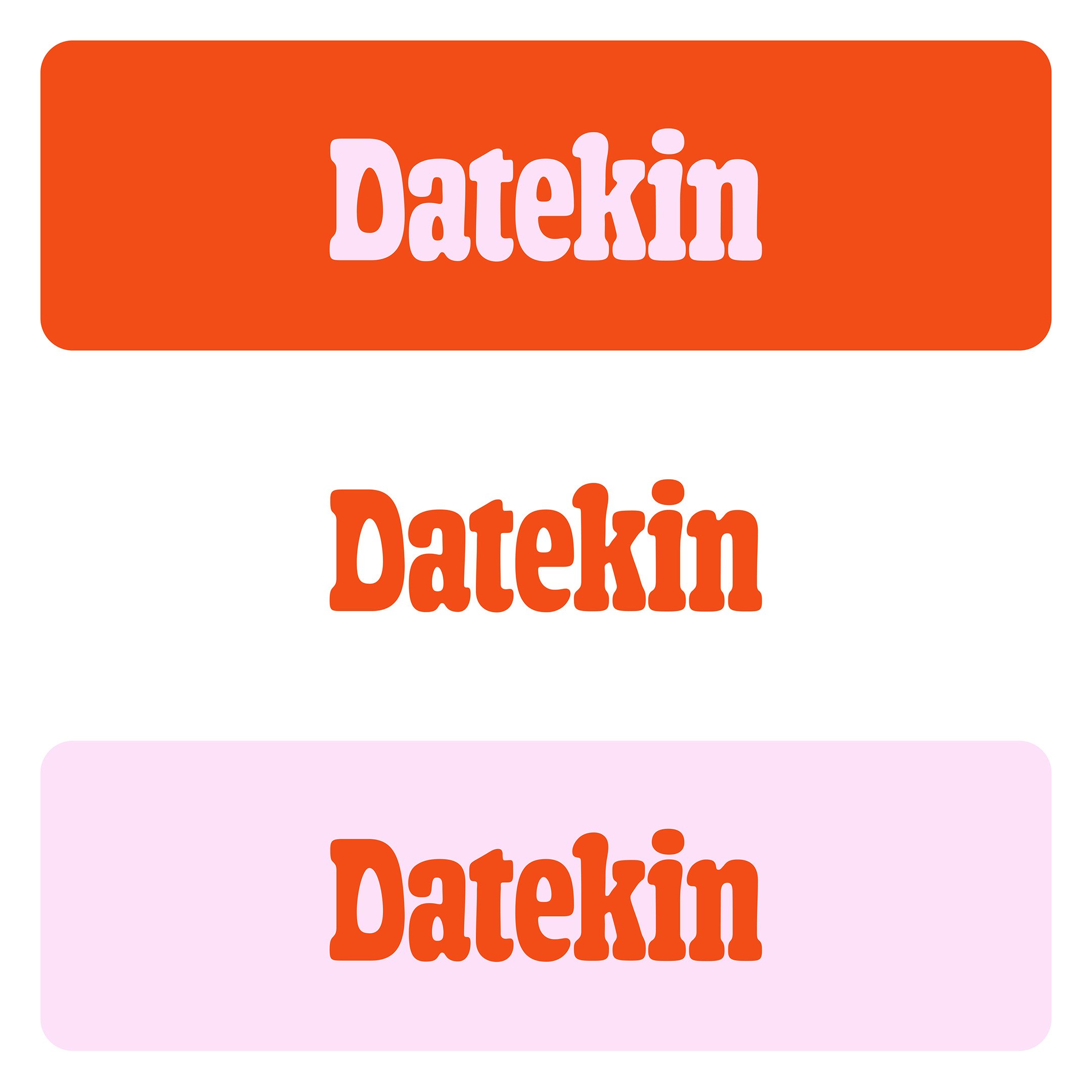
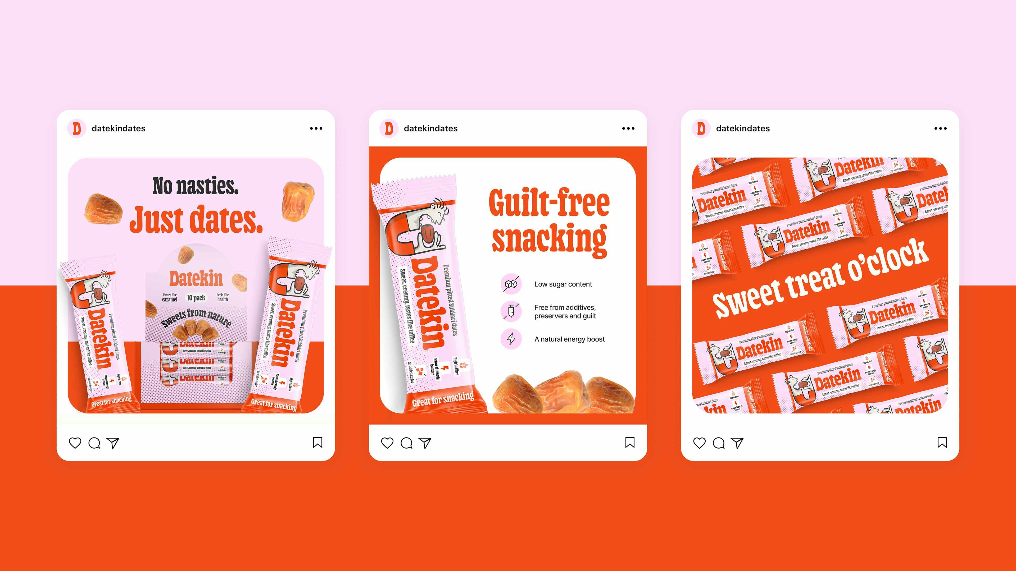
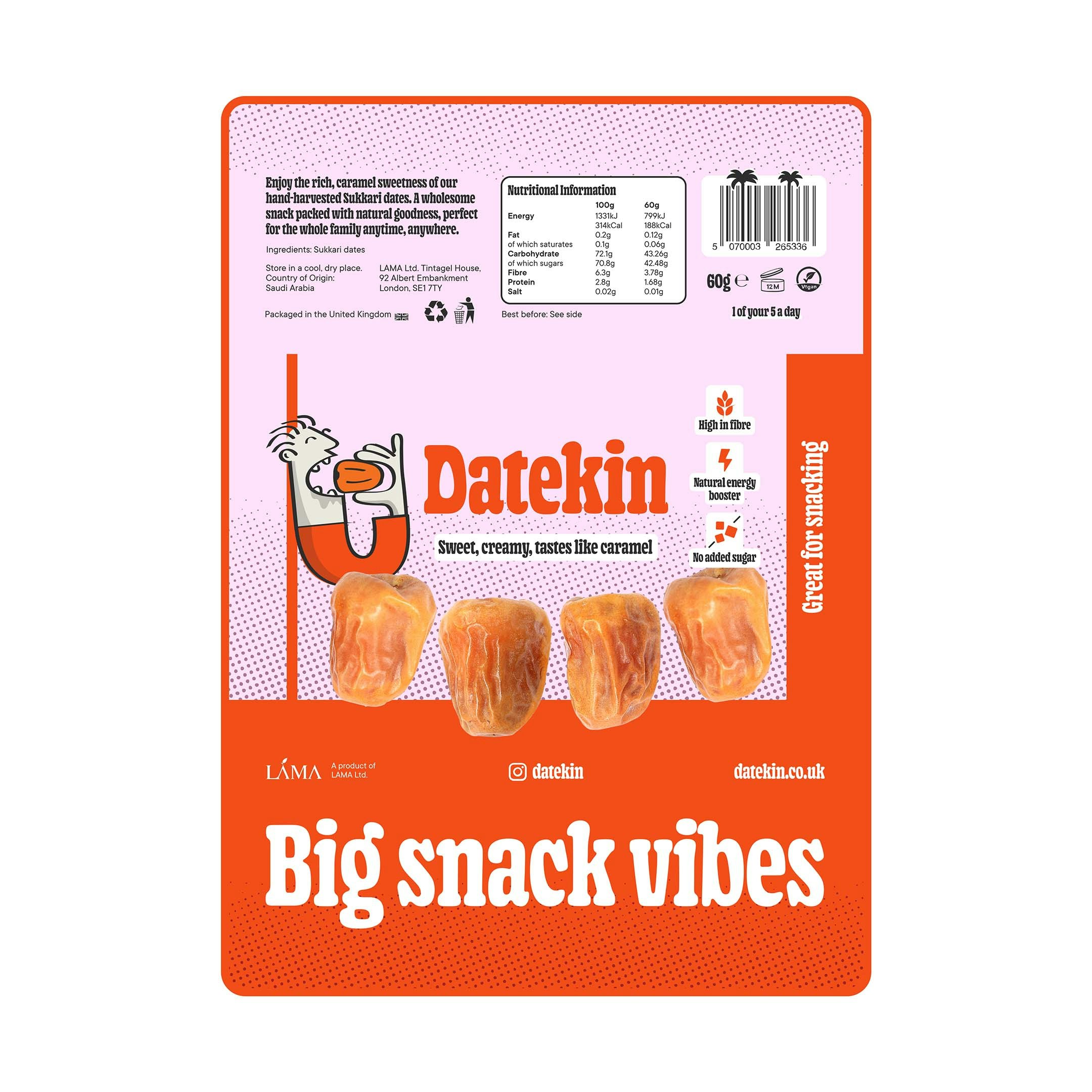
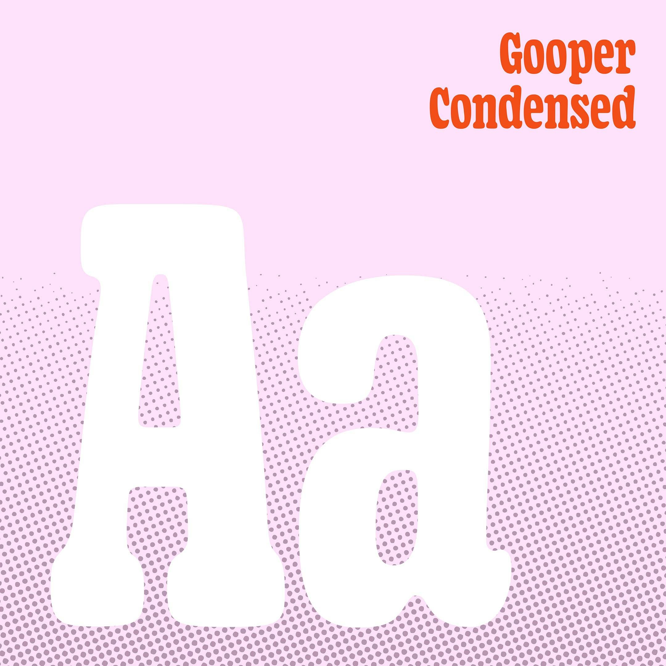
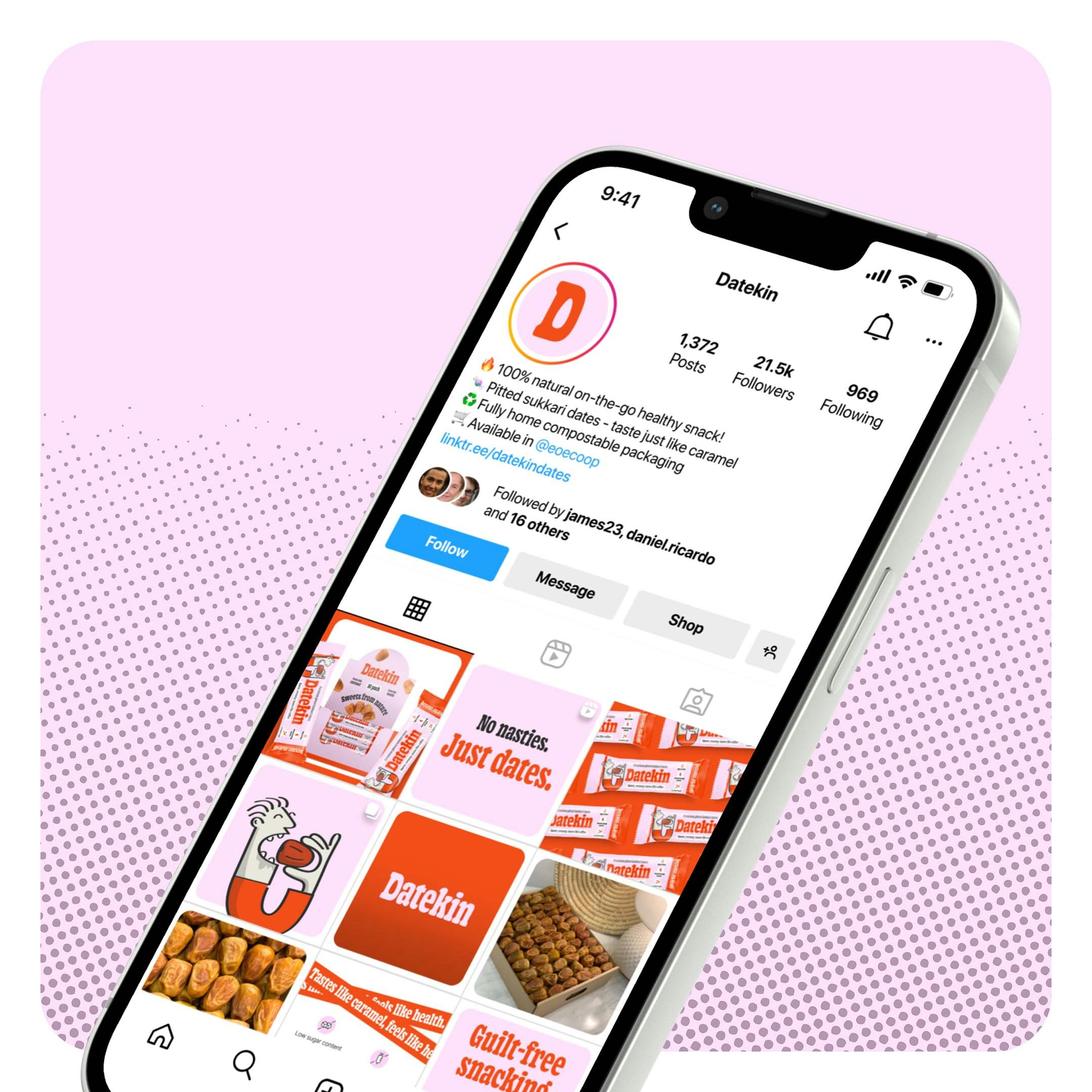
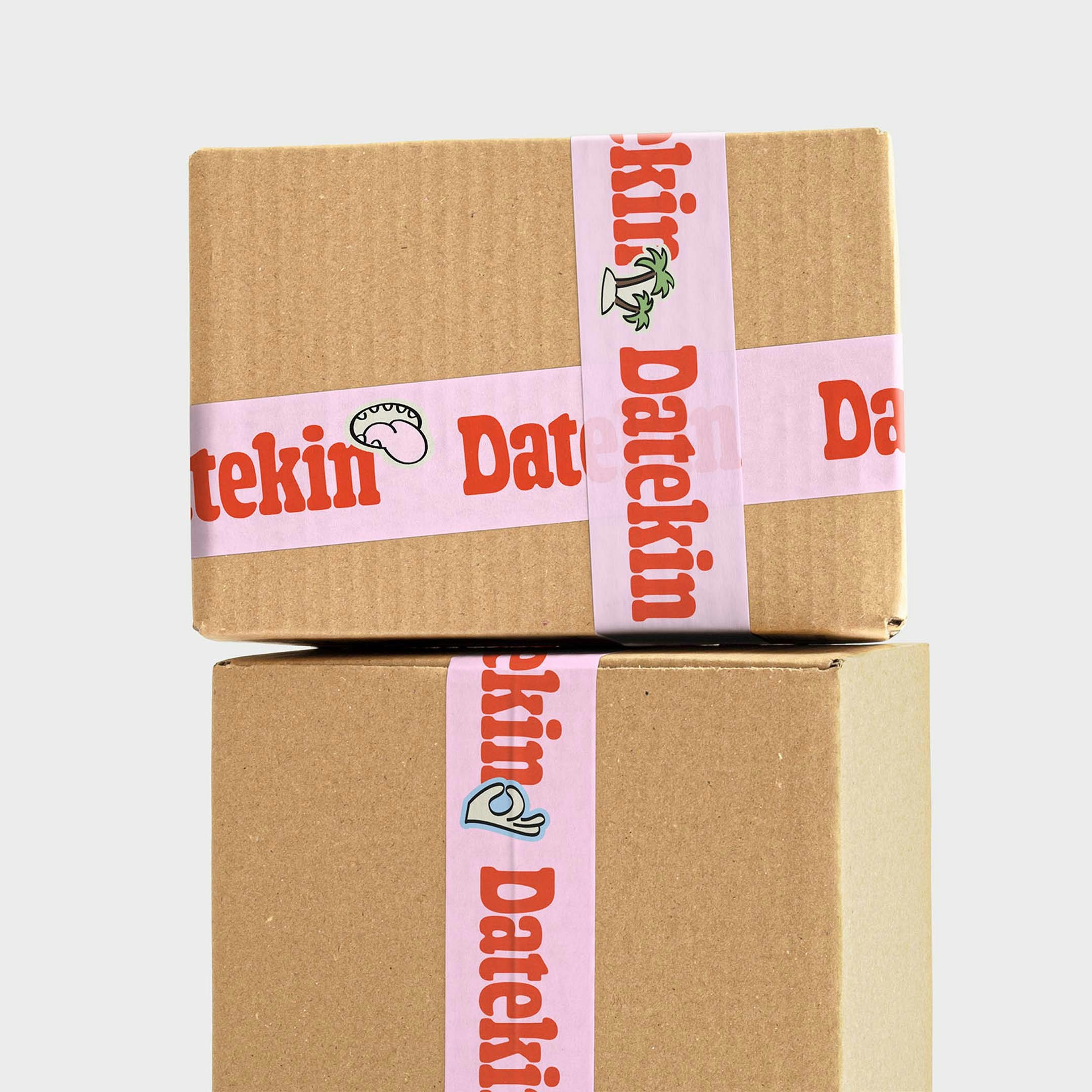
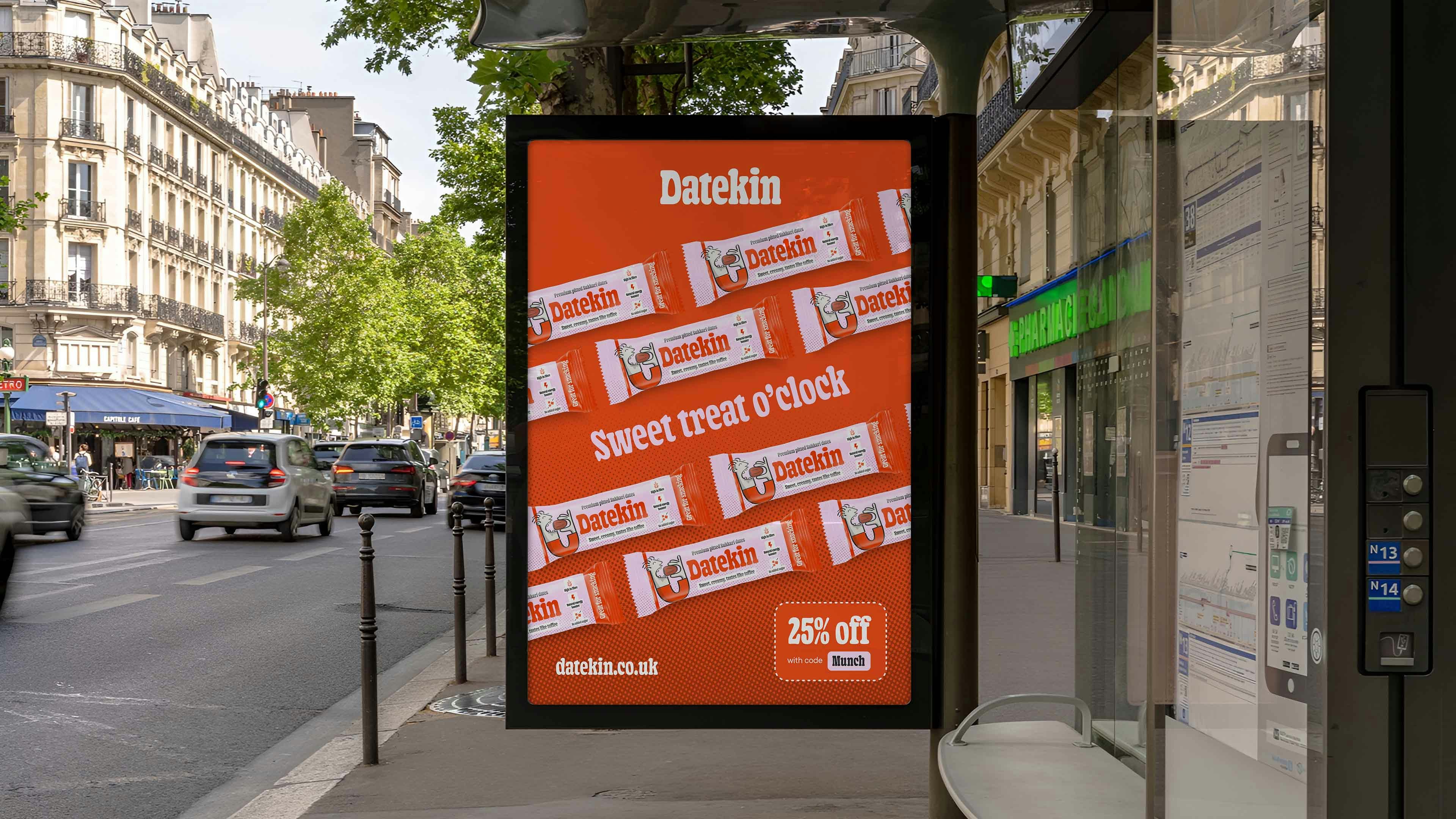
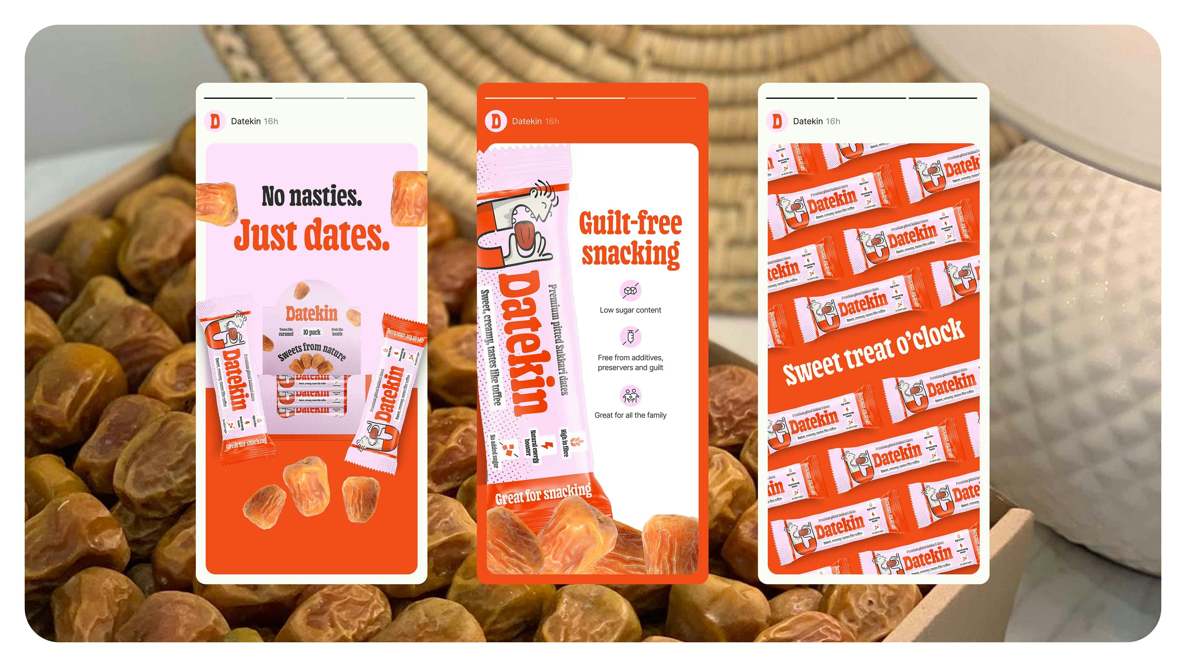
To bring this to life, we crafted a brand that feels as joyful and unpretentious as the product itself. The name “Datekin” is warm, friendly and a little cheeky - and the visual identity follows suit. Think playful nostalgia, candy-shop energy and tiny illustrated characters celebrating the magic of a really good date. Colour pops, charming packaging details and intuitive messaging make the experience feel fun, inviting and refreshingly straightforward. Every touchpoint leans into the idea that snacking shouldn’t require decoding - it should feel natural, vibrant and honestly delicious.
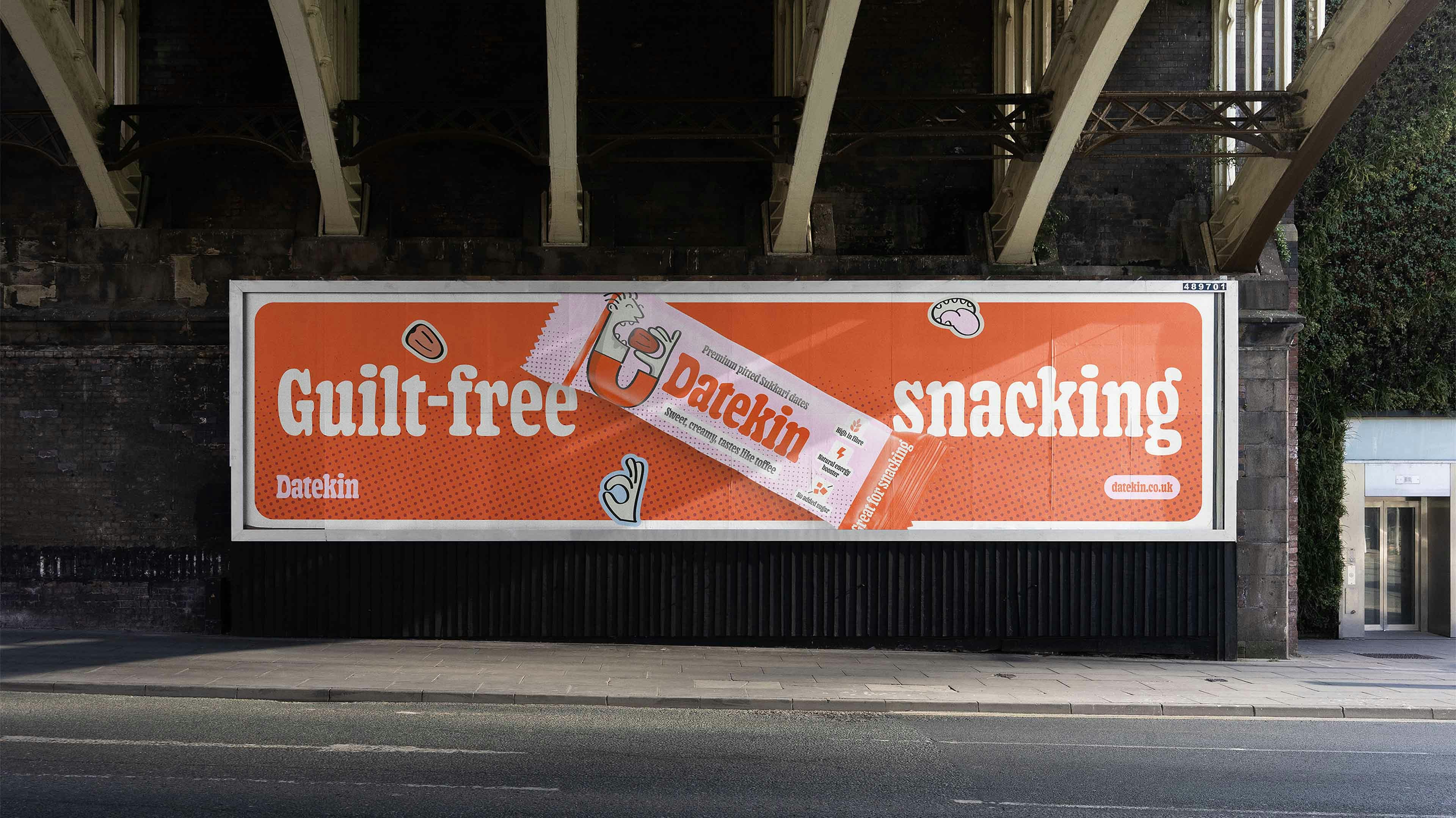
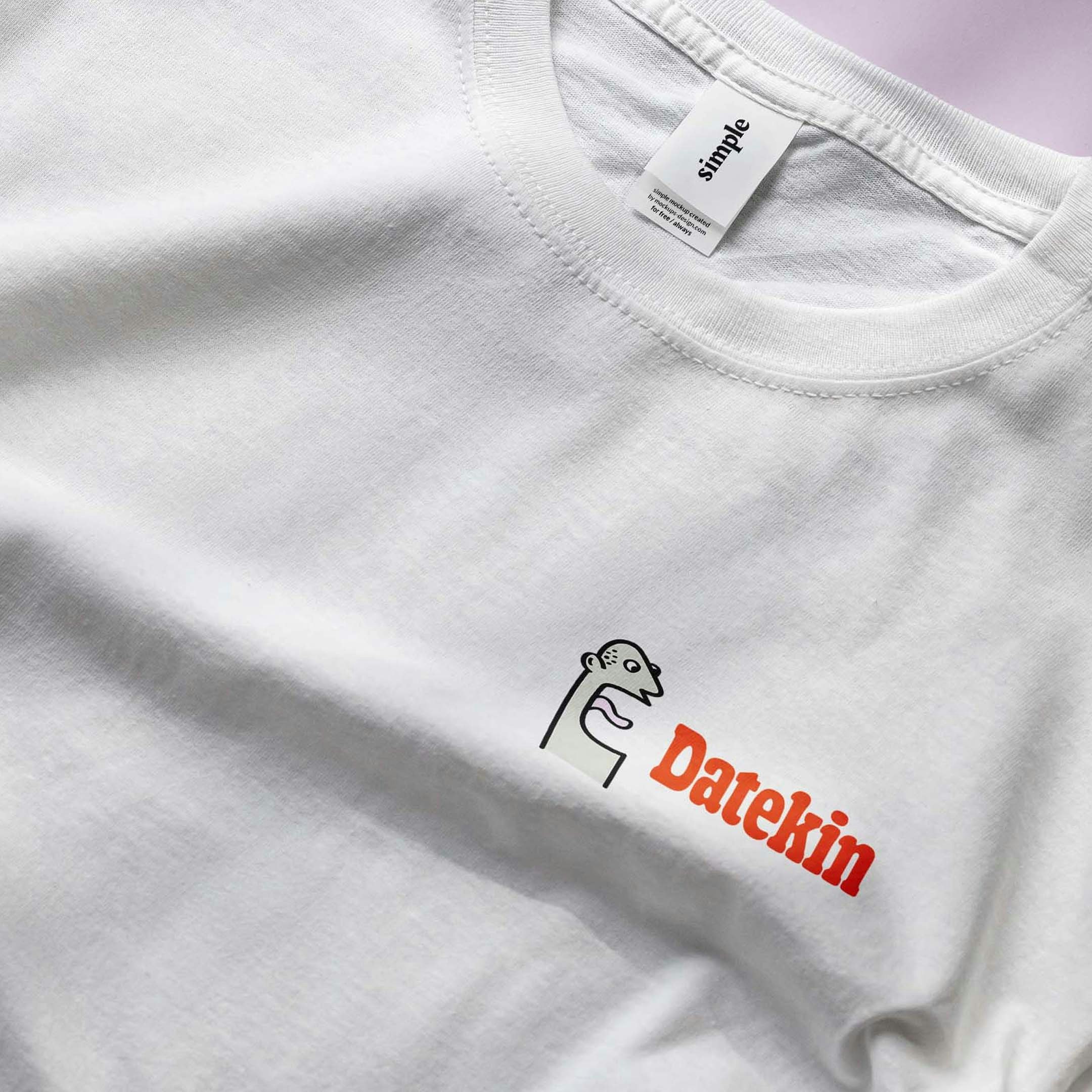
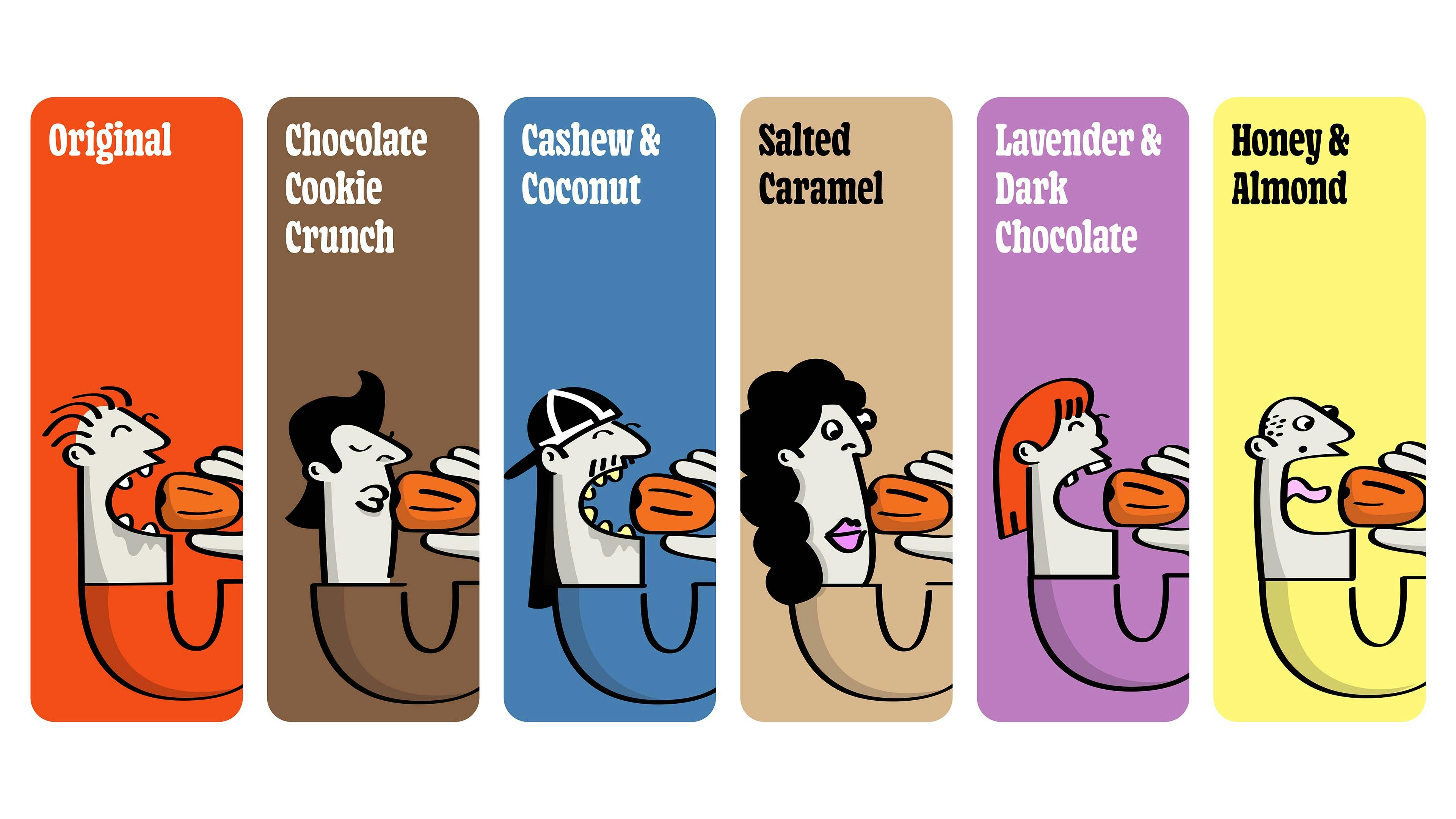
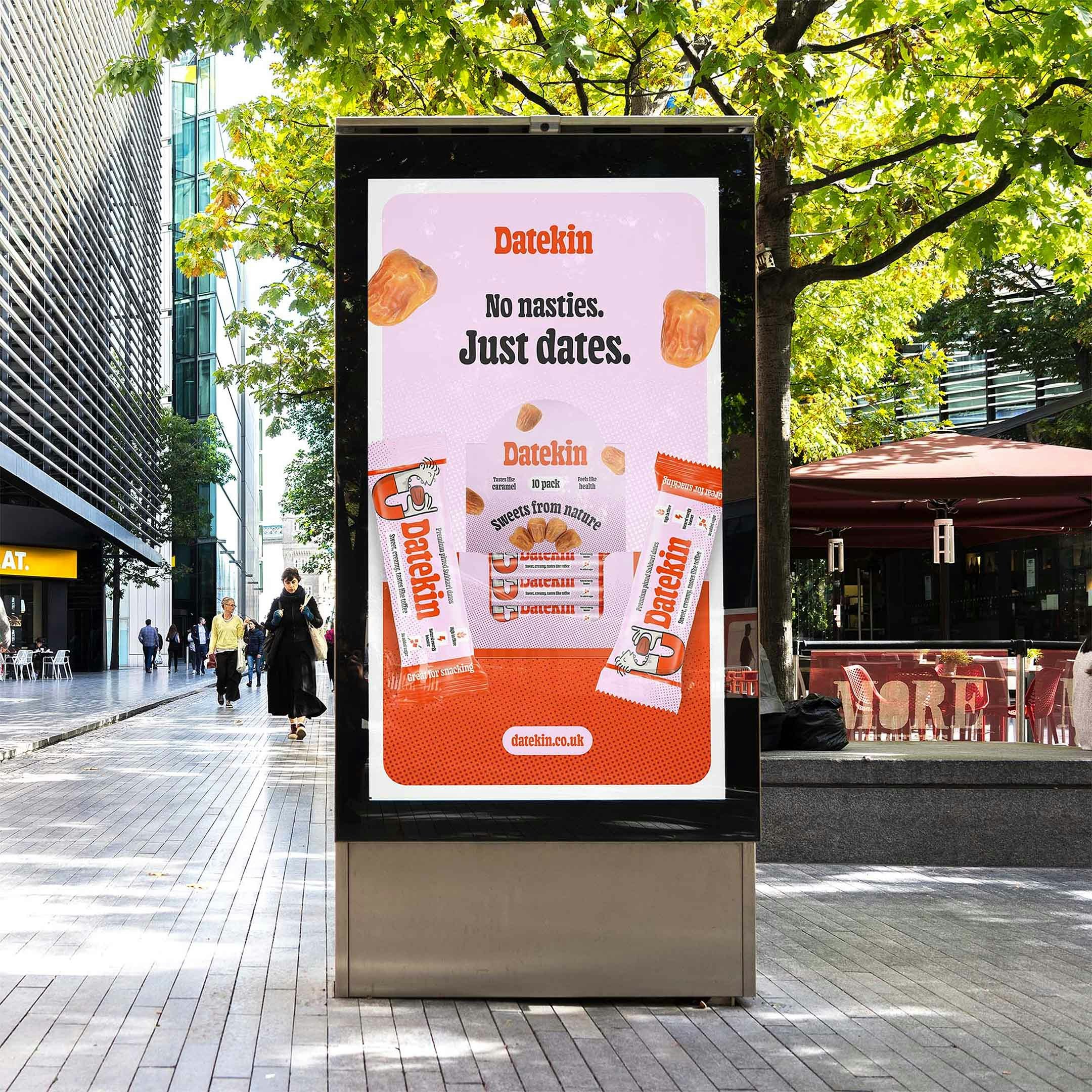
Datekin stands out in a category desperate for a breath of fresh air, proving that sometimes the boldest move is stripping things back. It’s a brand that cuts through clutter with charm, clarity and a whole lot of flavour - reintroducing nature’s original sweet treat to a world that nearly forgot it. More than just a snack, Datekin is a gentle rebellion against overthinking your food: a reminder that true indulgence is simple, real and already growing on a tree.

Kudos to
Client Lead / Dženita Džindo
Designer / Christopher Ashton
Strategy Lead / Kathrine Elvira Boysen
Junior Strategist / Gul Cheema
Signal Mining Strategist / Ellie Valentine
Related work
Nutramino
Fuel meets focus
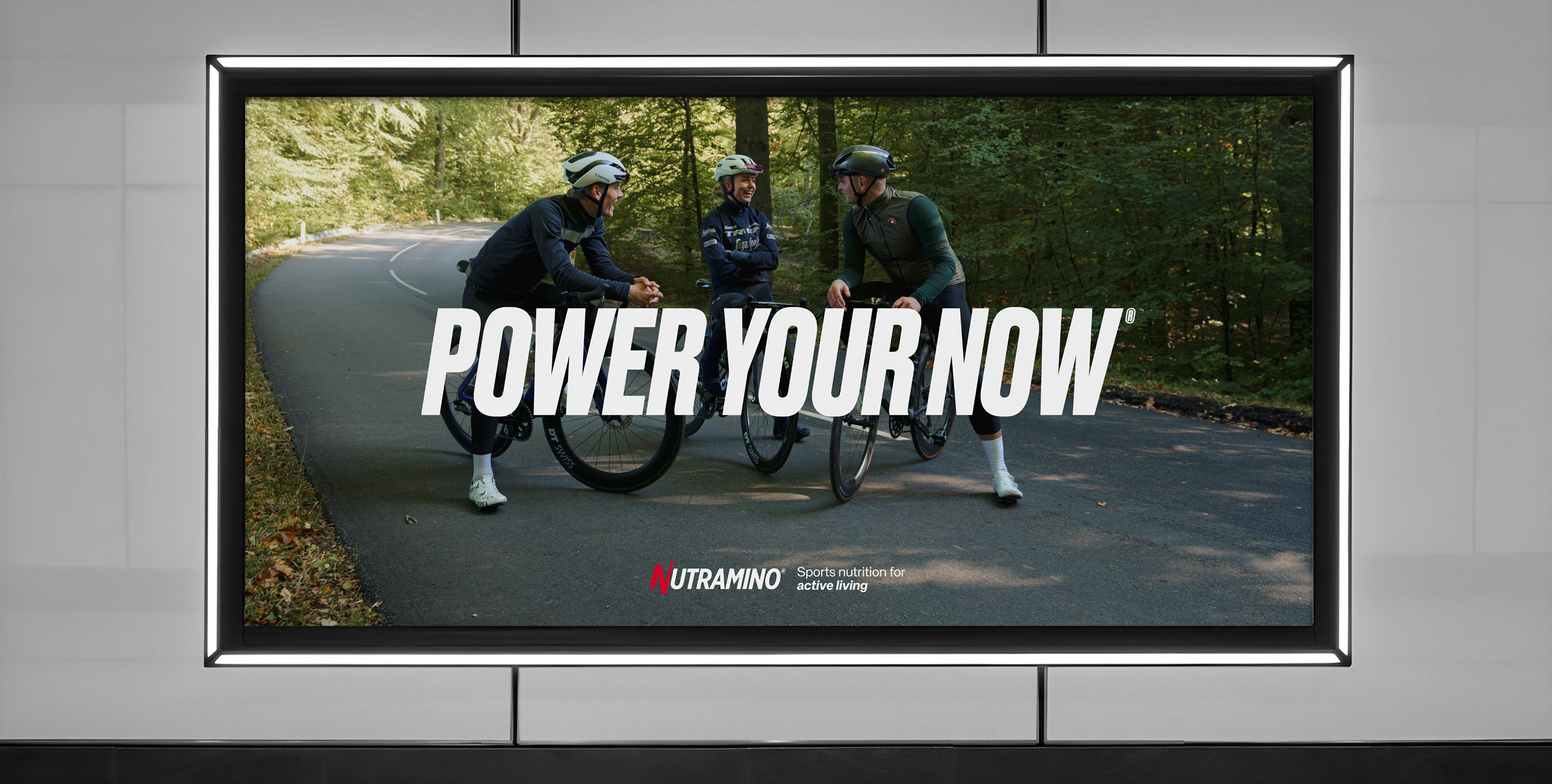
Client: Nutramino
Partnership Lead: Mathilde Ive
Key Focus: Content, brand update, 3D video content