FrançaisContact

Rejsepunkt

Connecting every city across the country
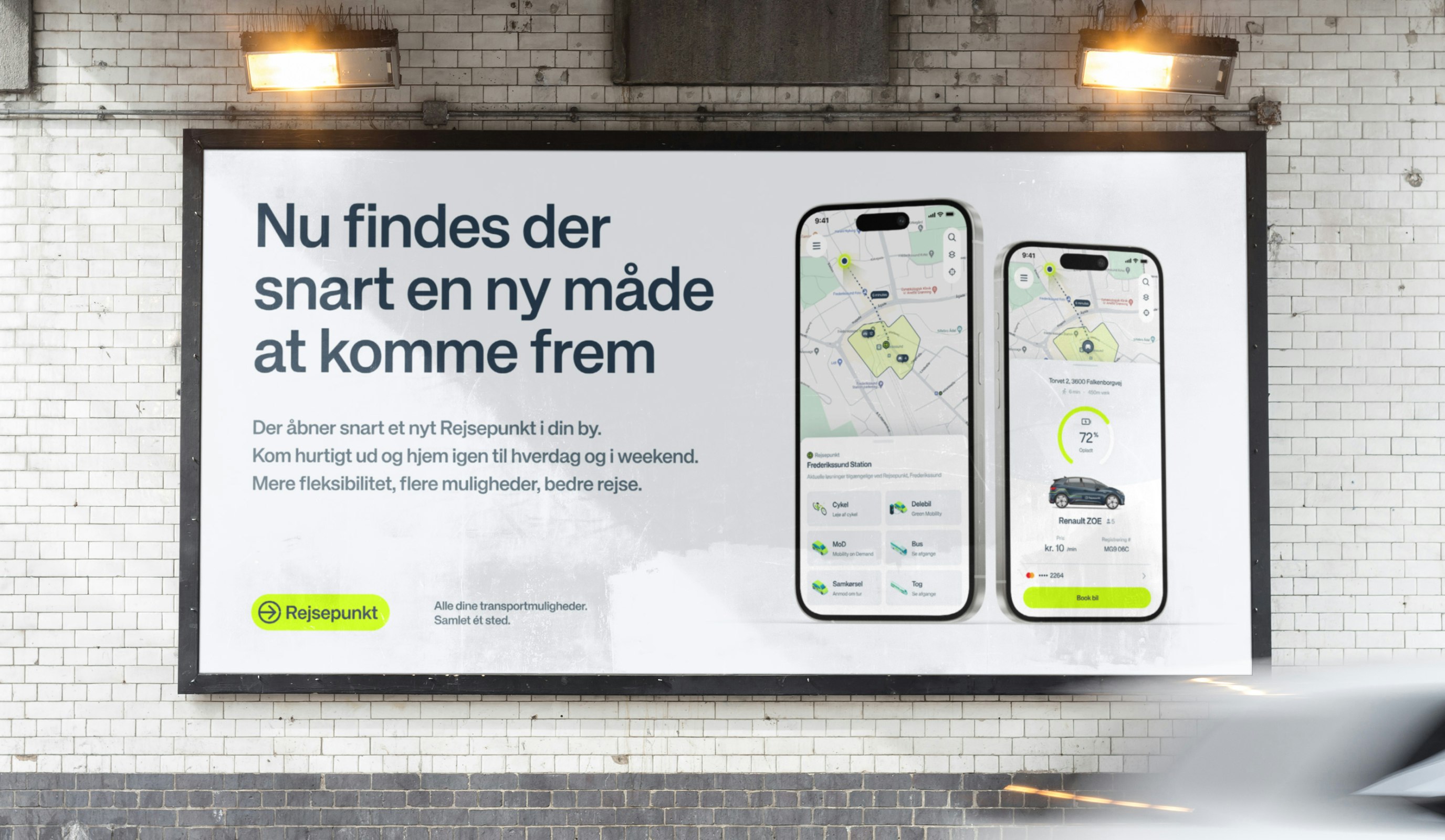
Rejsepunkt case study

Client: Rejsepunkt

Key Focus: Branding, App design, Visual identity
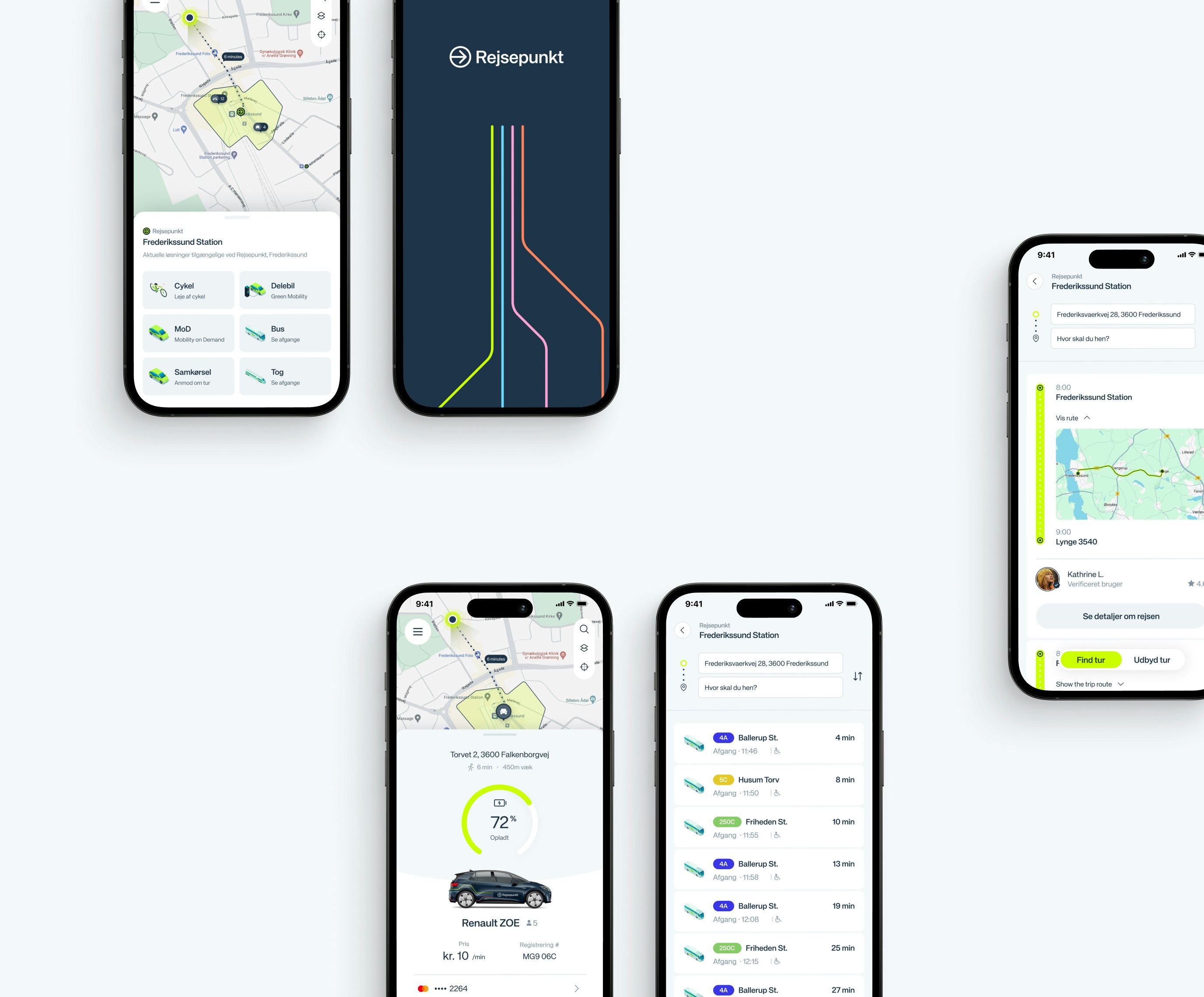
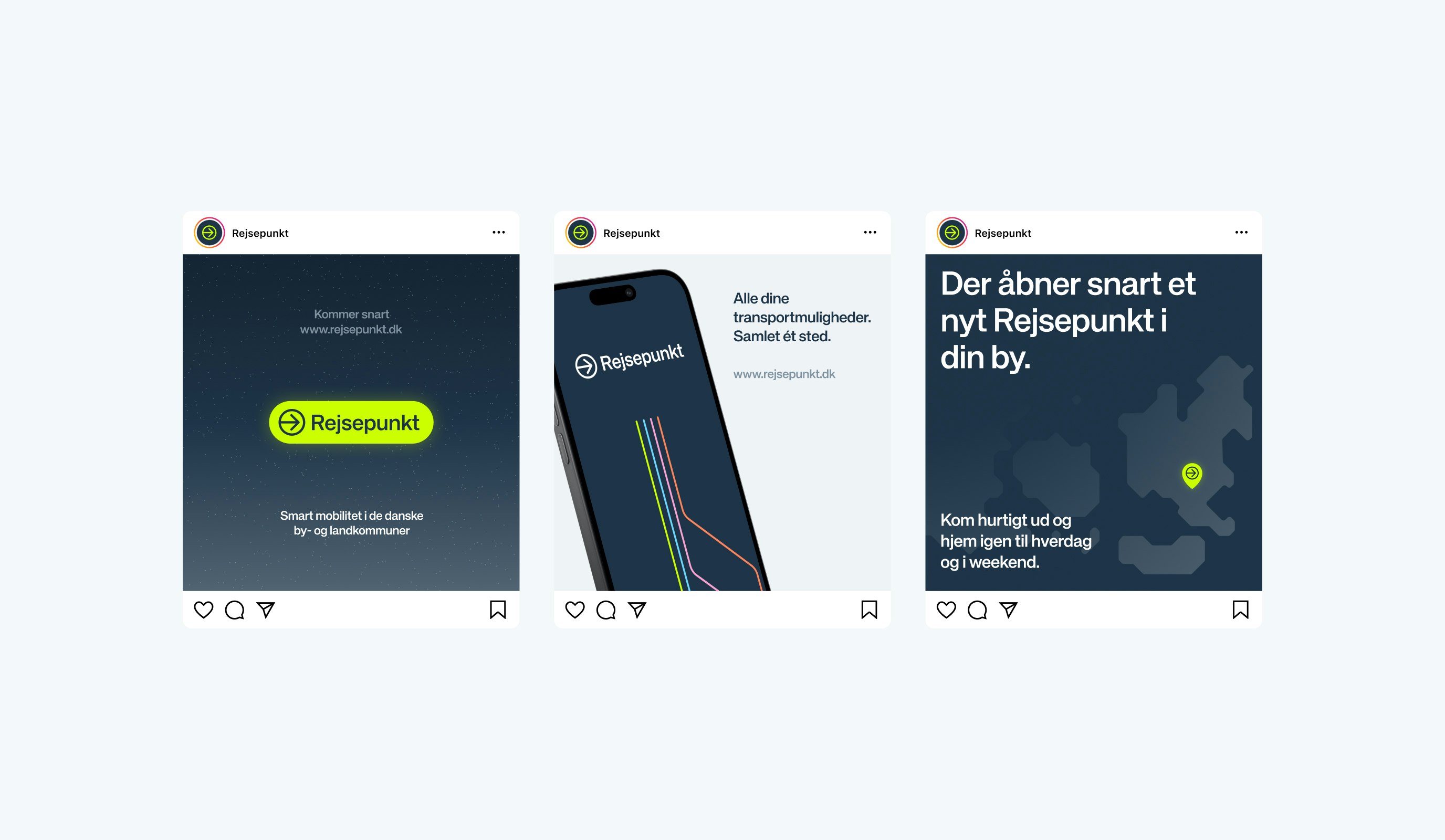
While Denmark's urban areas benefit from well-established transport systems, with strong digital integrations, rural regions continue to face significant mobility challenges. To bridge this gap, Rejsepunkt was created—a unified digital platform with ambitions to facilitate multiple transportation services into one intuitive, easy-to-use platform for those in less connected areas.

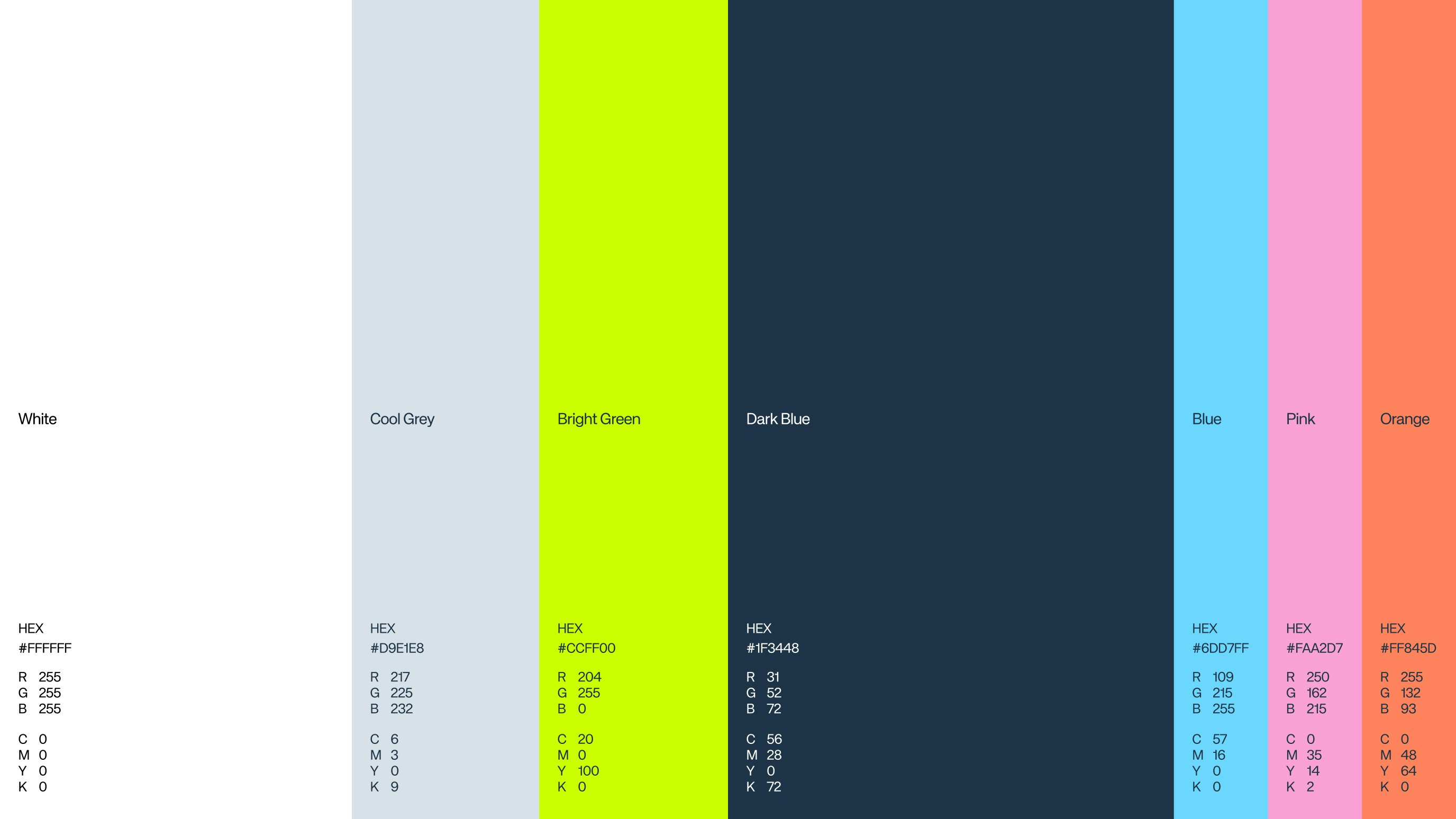
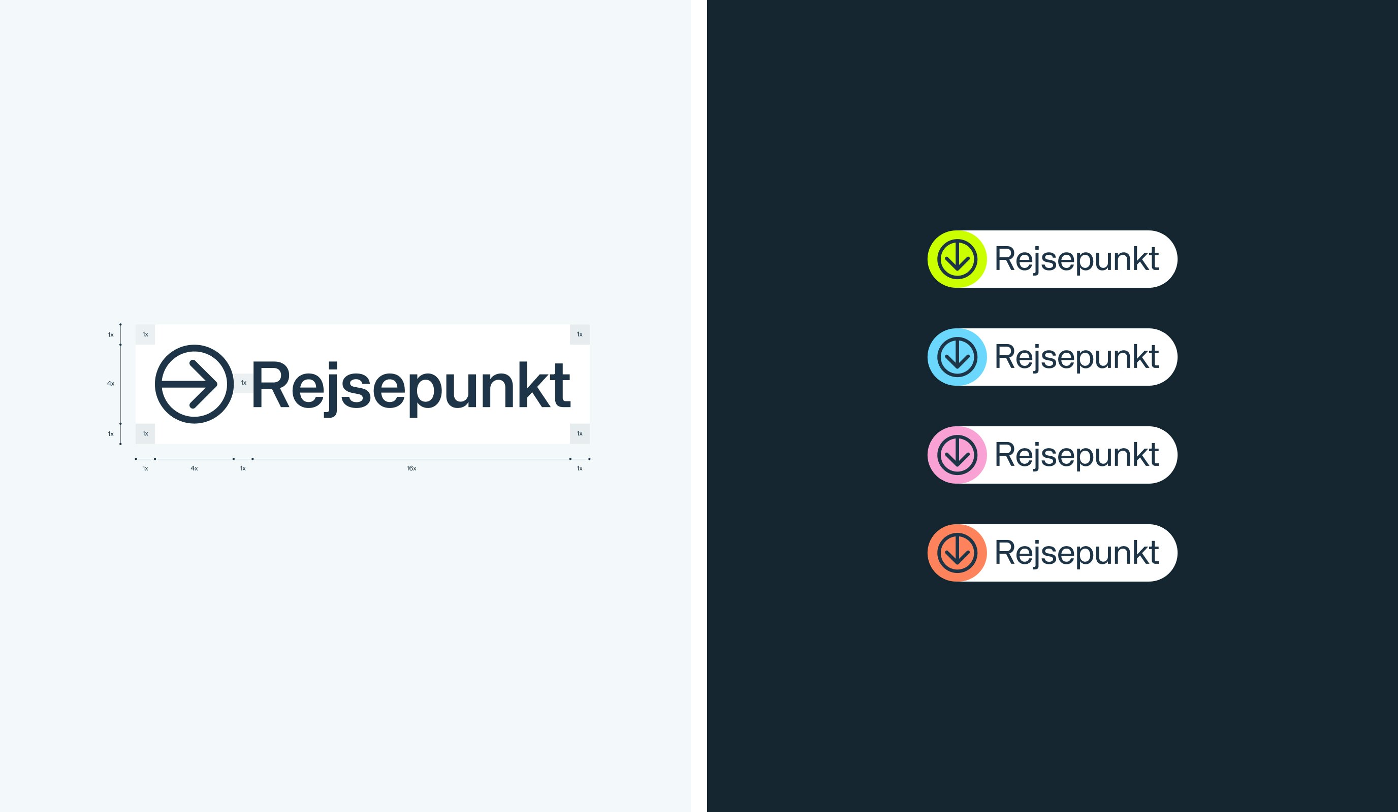
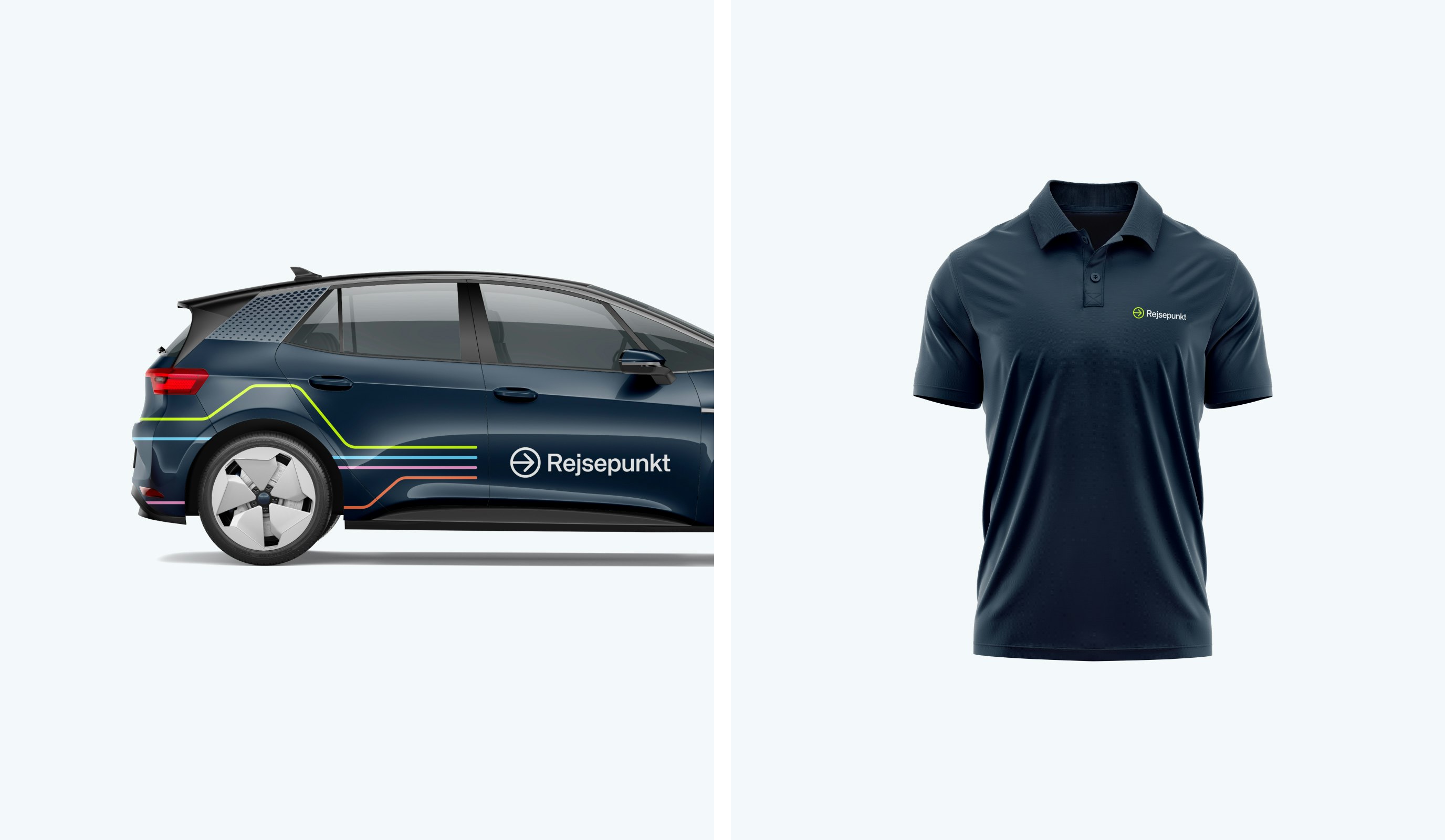
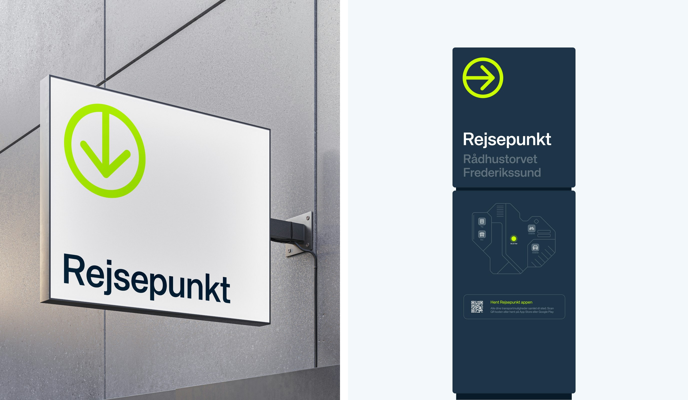
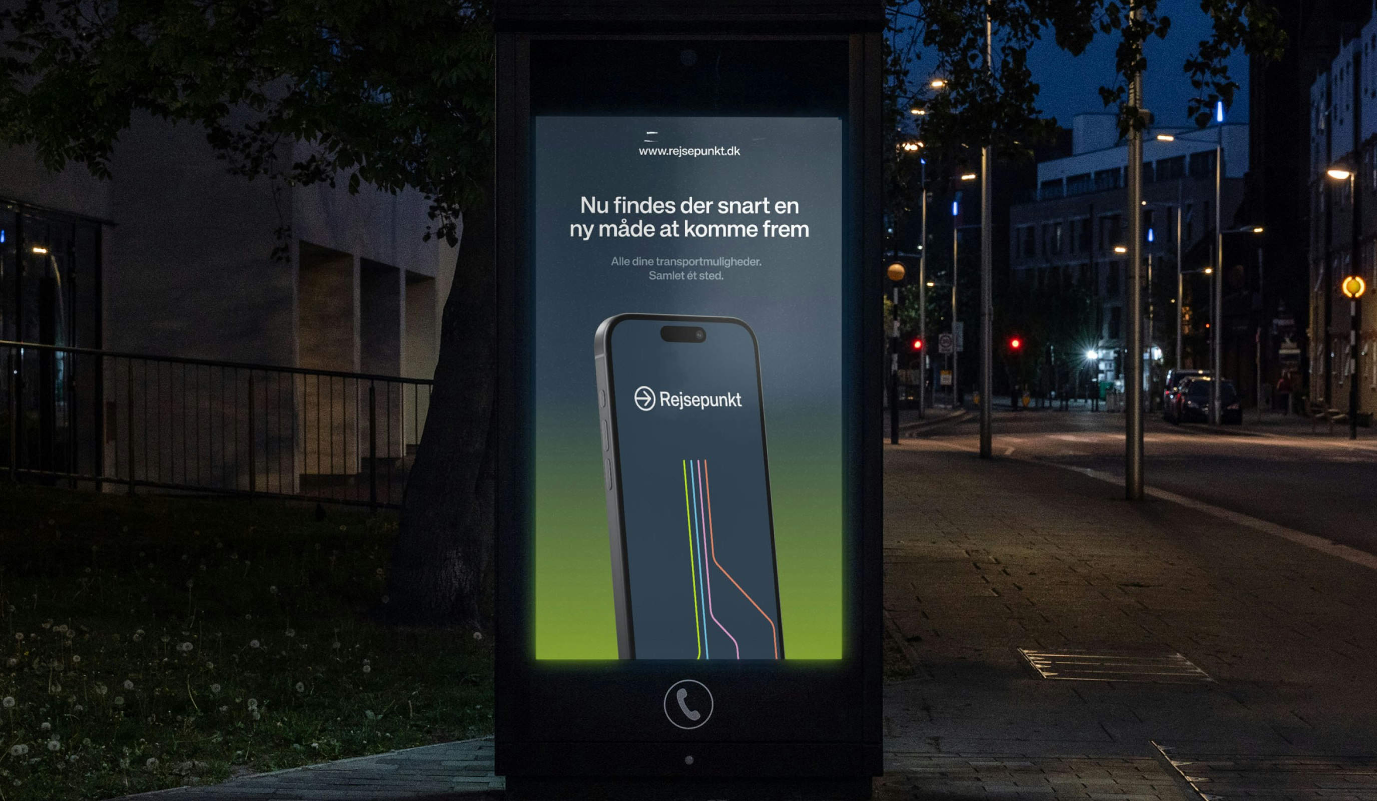
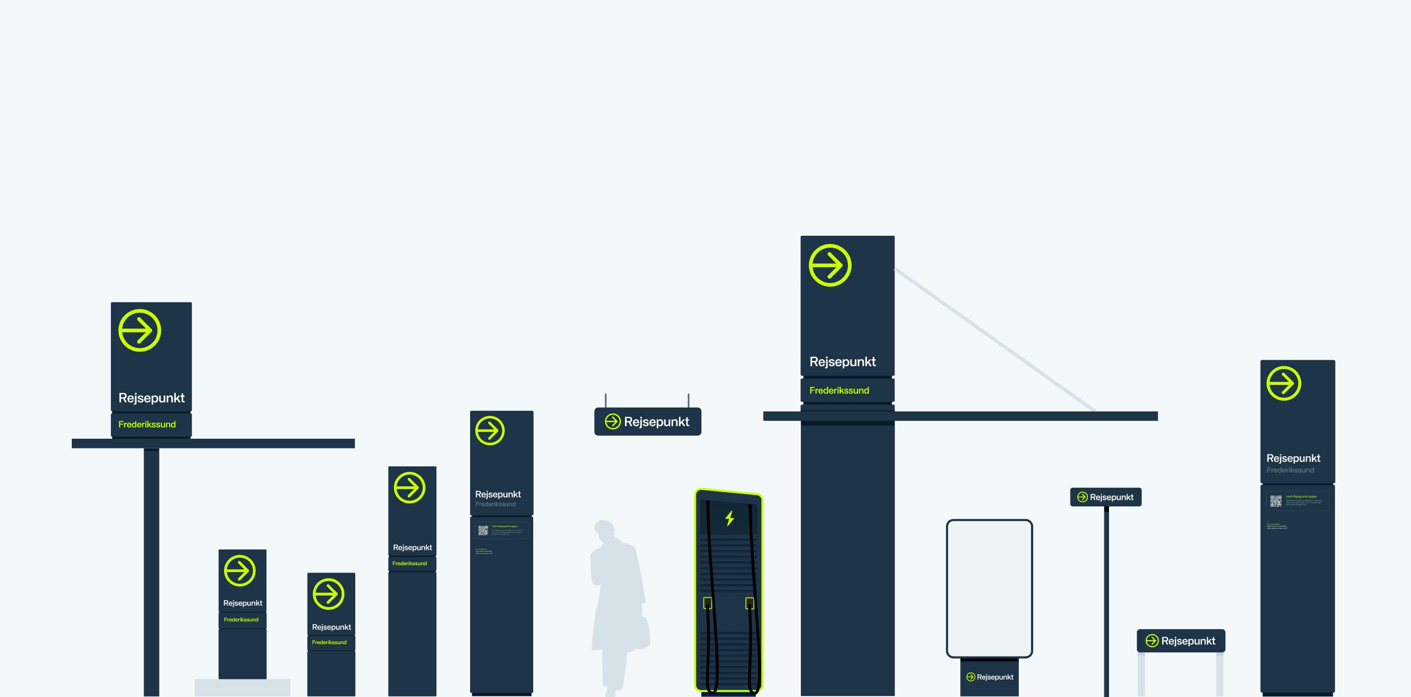
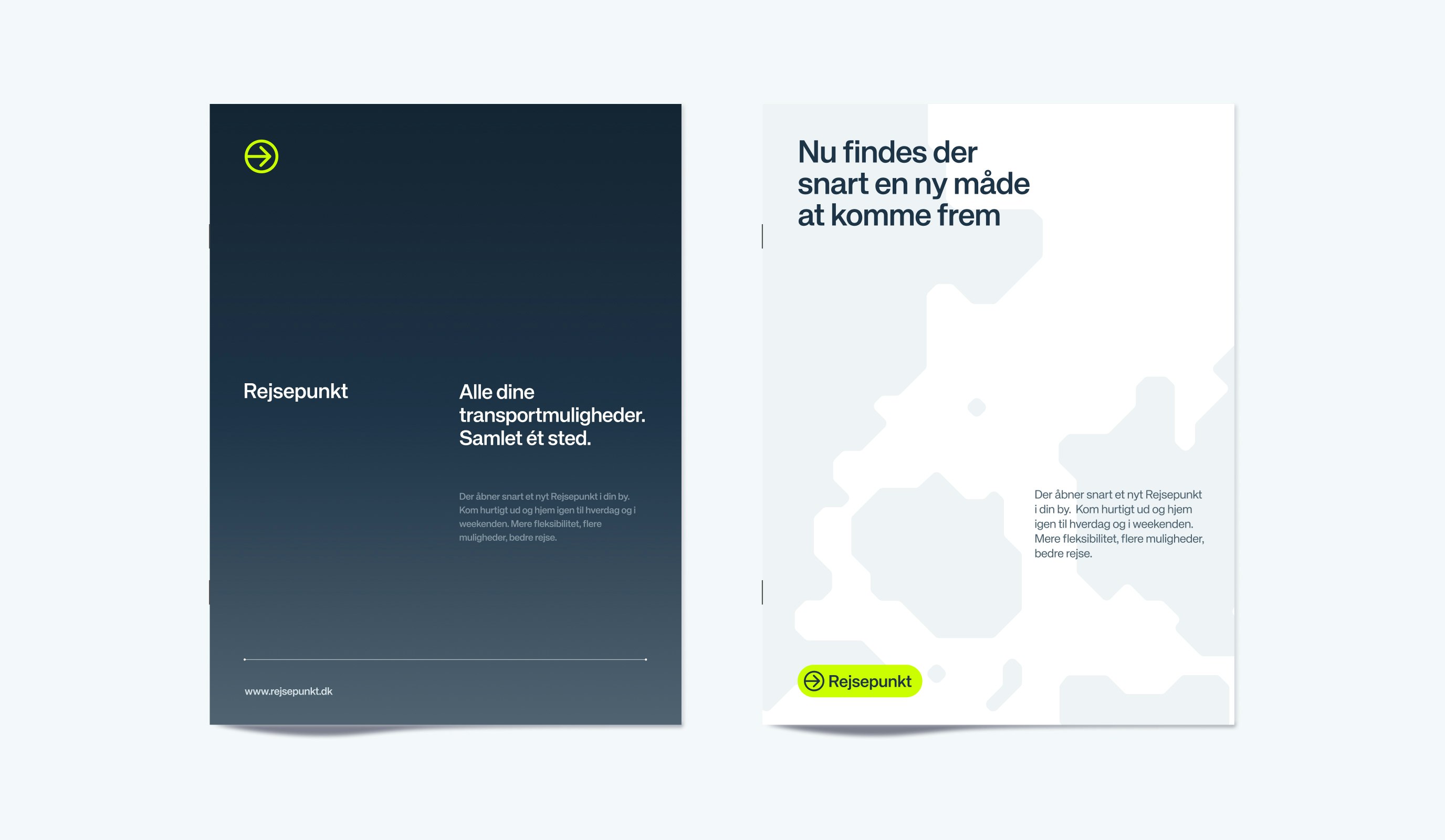
Thename“Rejsepunkt”anditsvisualidentitywerecarefullycraftedtoembodythebrand’scommitmenttosimplicityandaccessibility.Thelogoanddesignaccentswereinspiredbywell-knowntravelsignage,withbrightcolorsthatappearalmost‘litup’.Graphicelements,likeinterconnectedlines,symbolizetravelroutes,whilecolorgradientsdrawinspirationfromcountrysidenightskies—wellknowntoruralcommuters.

Kudos to

Project Manager / Michael Valentin

Project Manager / Mathilde Lundgreen

Strategist and Copywriter / Sofie Henriksen

Visual Identity / Alexander Spliid

Digital Designer / Lukas Jurcik

Design / Christopher Ashton

Design support / Søren Schrøder

Developer / Day Anh Nguyen

Related work

Waitly

Good things come to those who wait
Waitly case study

Client: Waitly

Partnership Lead: Sara Pallesen

Key Focus: Brand, E-commerce

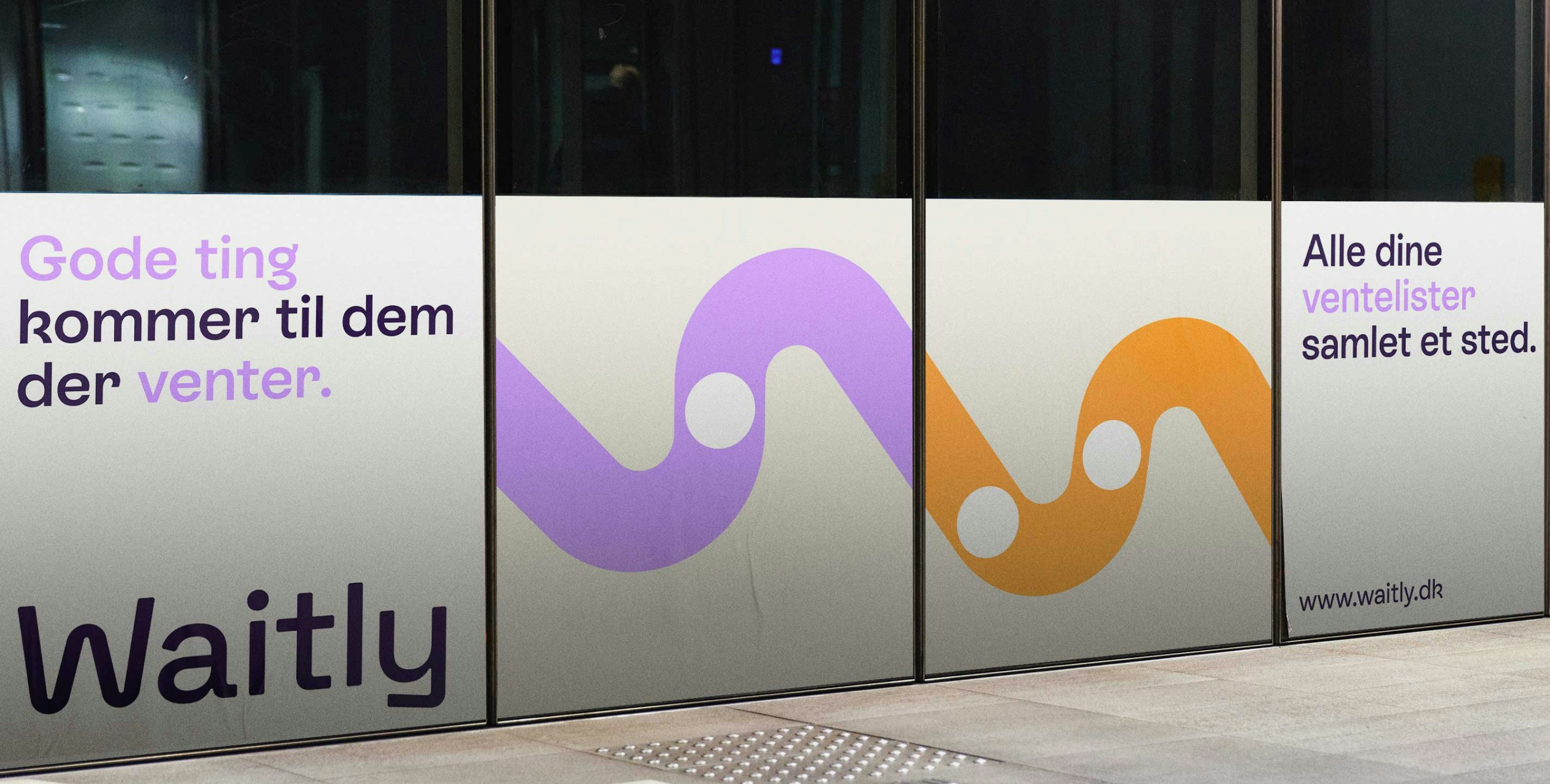
Waitly is a pioneering SaaS company specializing in digital waiting lists, initially focused on the housing sector in Denmark and expanding into Germany. Recognizing the importance of adapting to diverse markets, Waitly began a journey to redefine its brand identity, aiming to appeal to its youthful audience while improving the digital user experience. The outcome is a vibrant and playful brand identity. Waitly’s dedication to transparency lies at the core of its identity, exemplified by its new visual symbol: the “worm.” This straightforward yet meaningful graphic portrays a line of waiting with a dot representing an individual, capturing the essence of the company’s mission.