Eupry
Adapting like a squid

Client: Eupry
Key Focus: Visual Identity
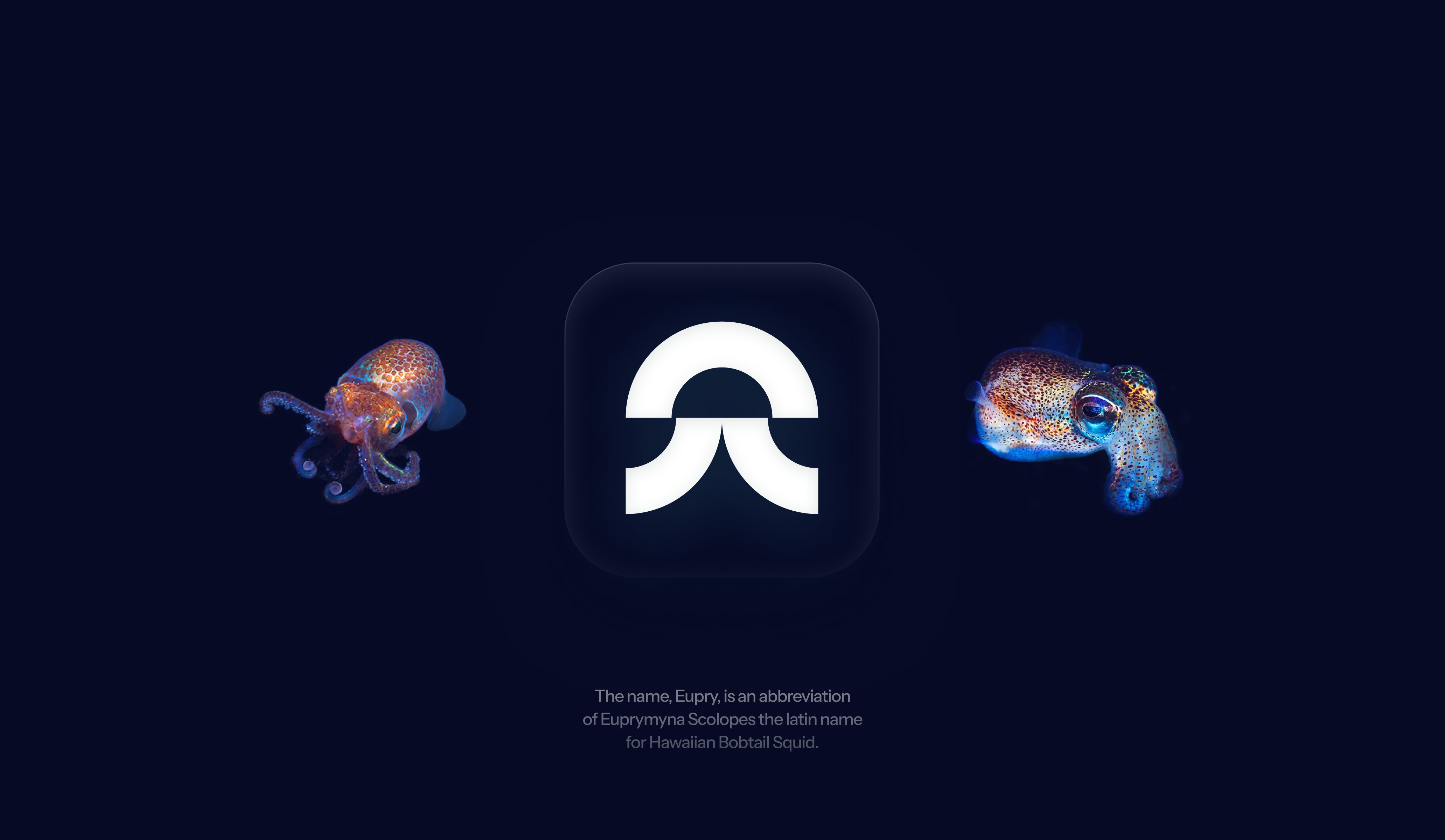
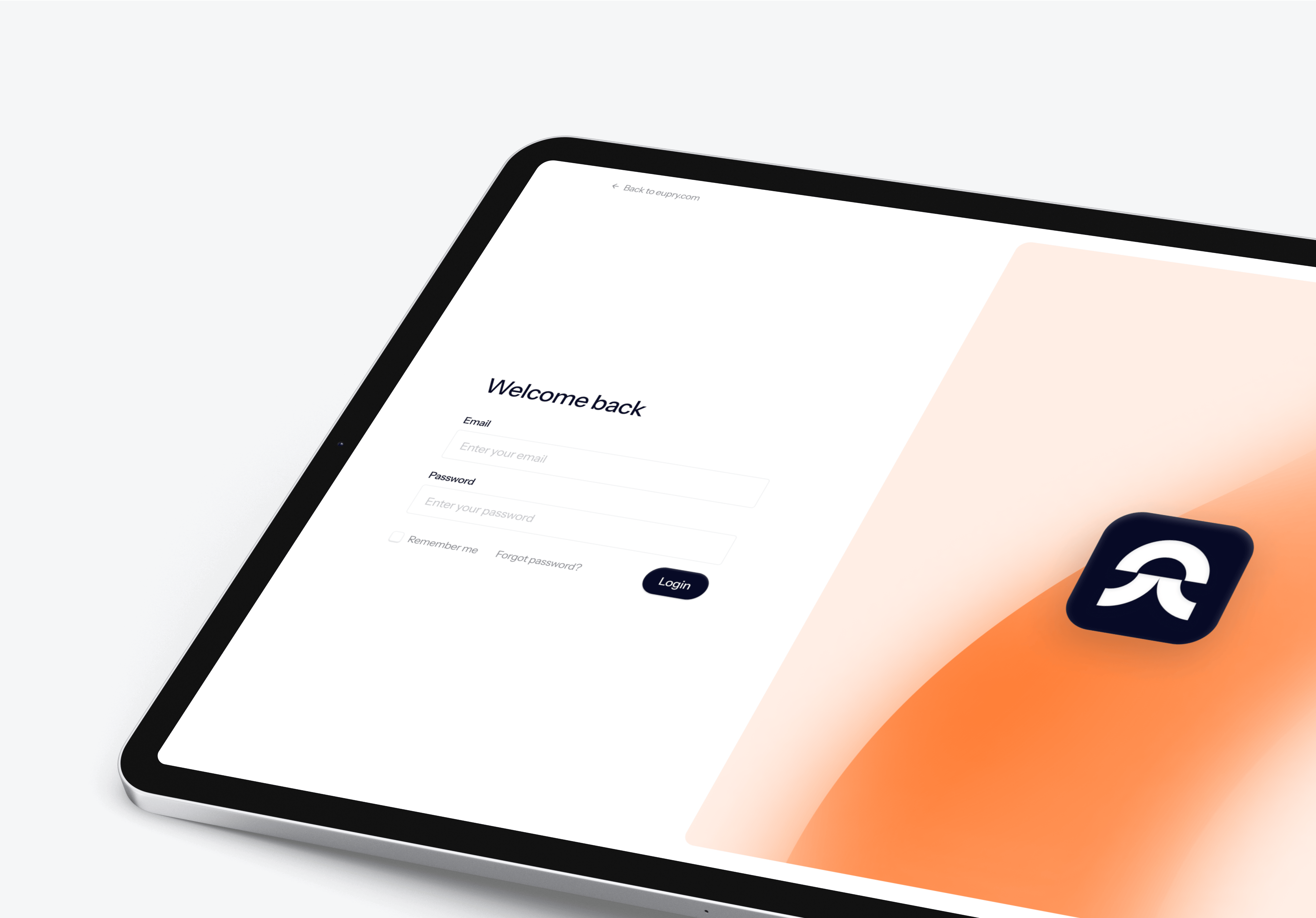
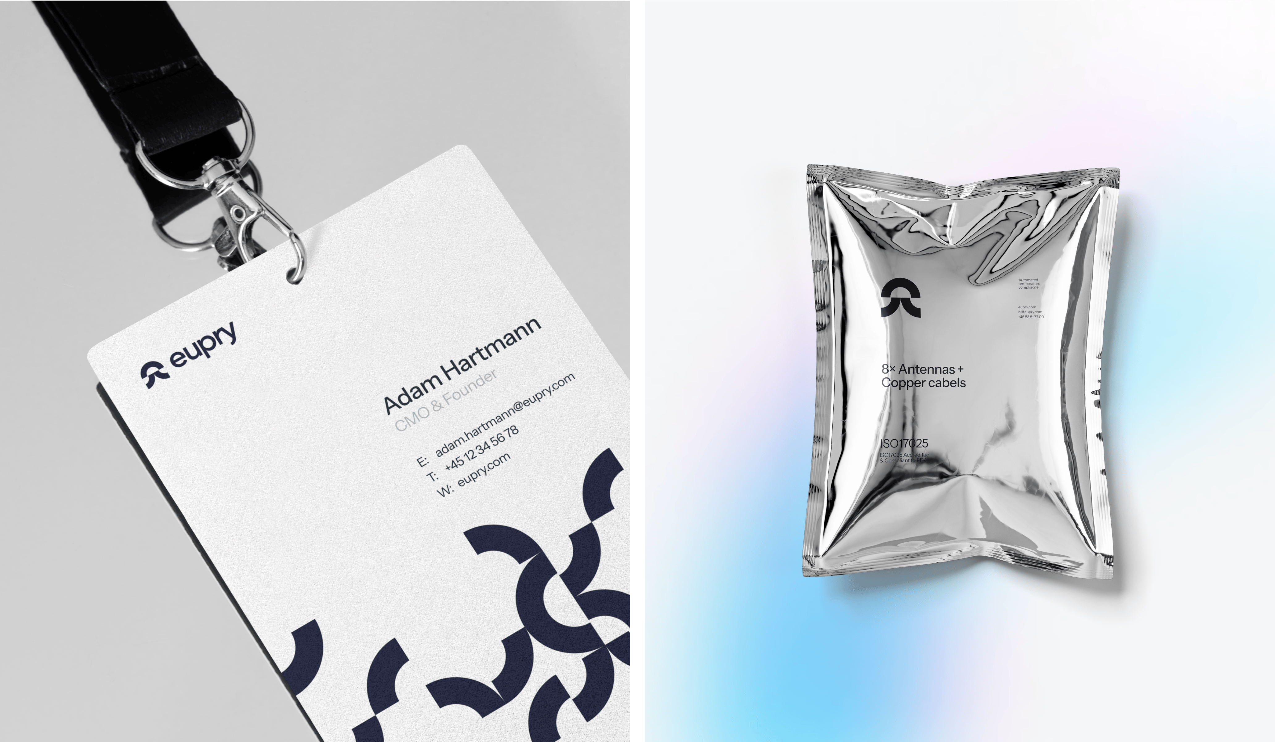
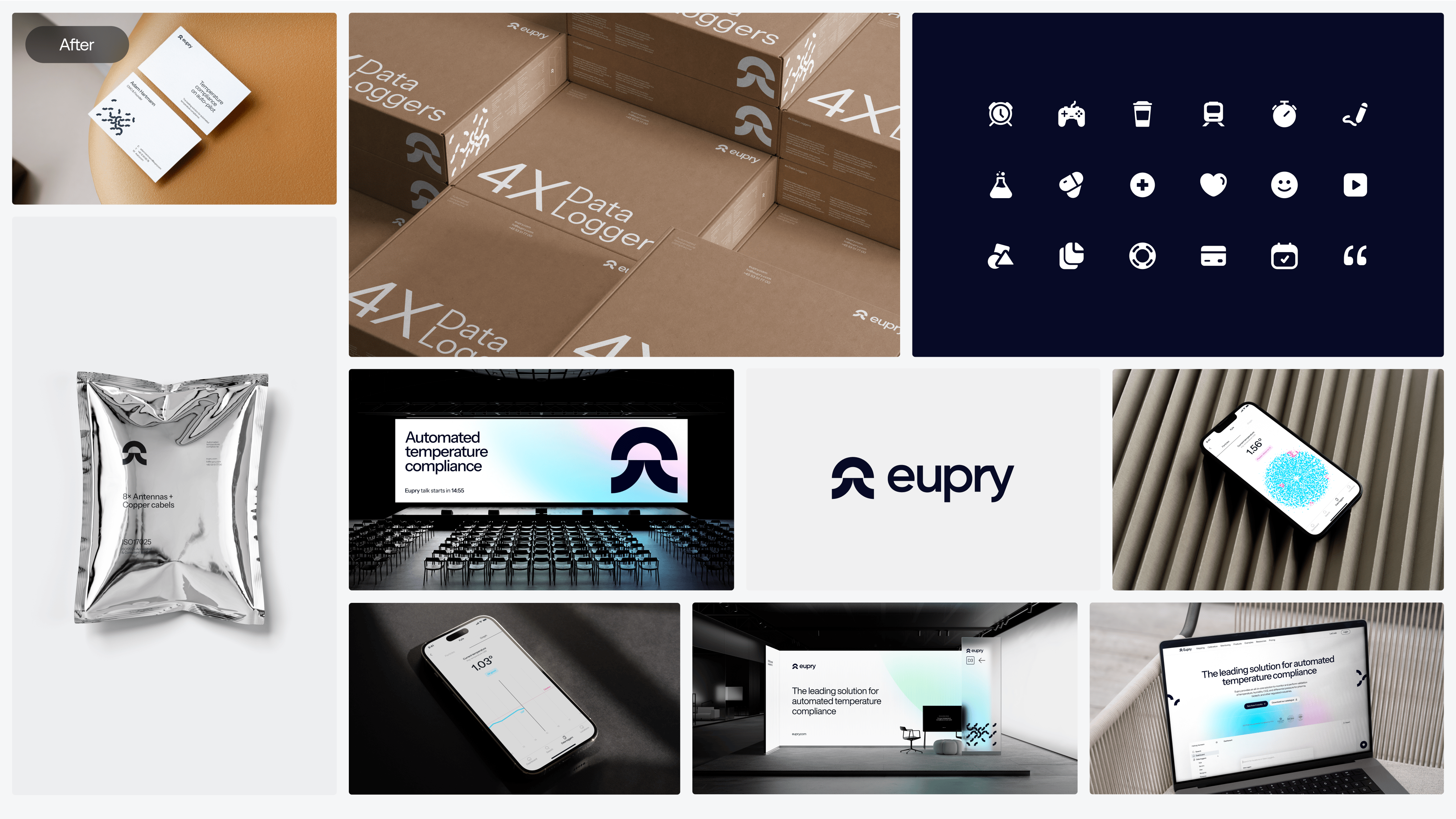
At the heart of this transformation is a dynamic visual identity, inspired by the adaptability and efficiency of its namesake squid—a creature known for managing multiple tasks seamlessly. This influence is captured in a squid logo, which creatively deconstructs the degree° symbol to bring the brand to life.

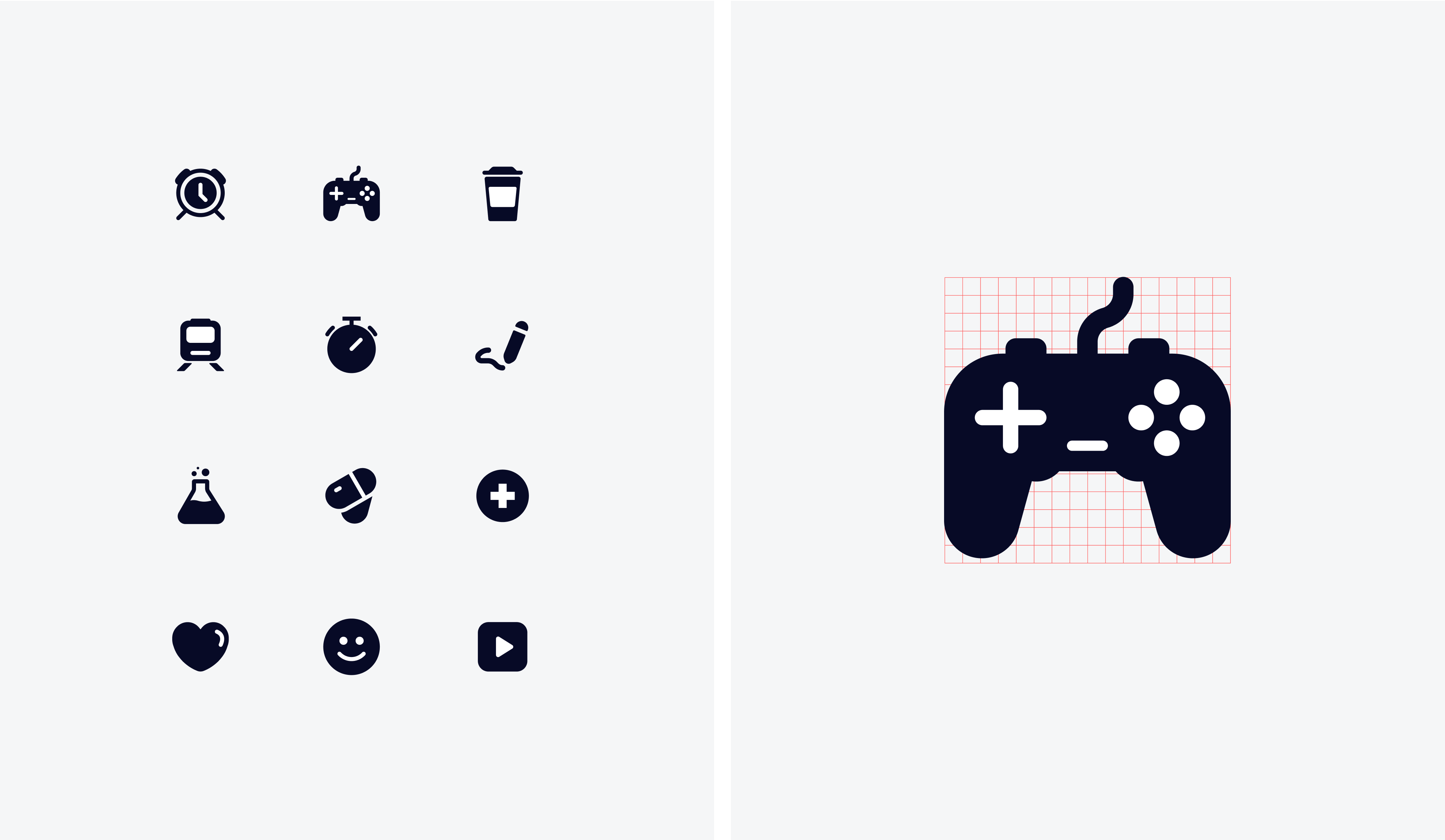
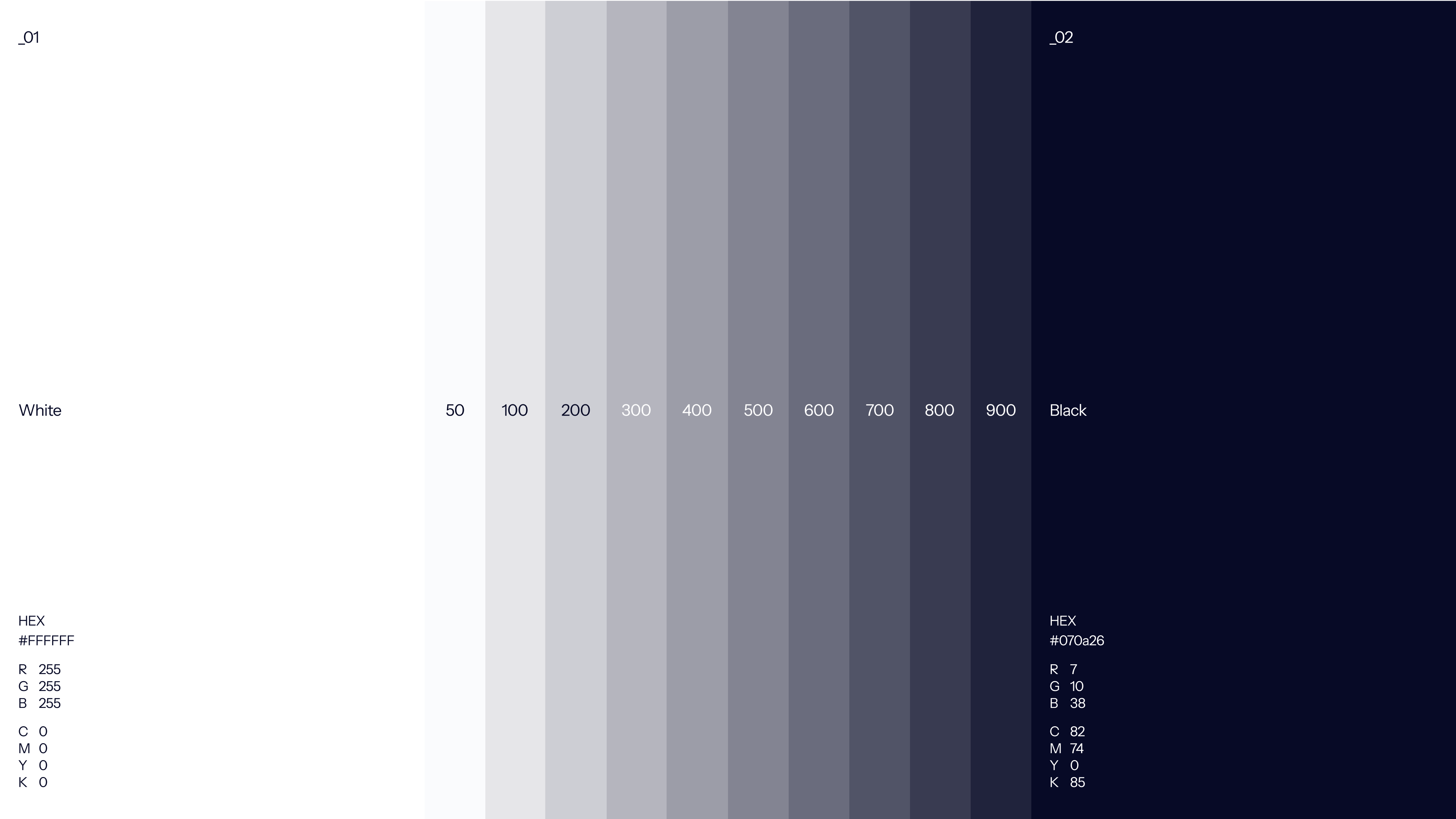
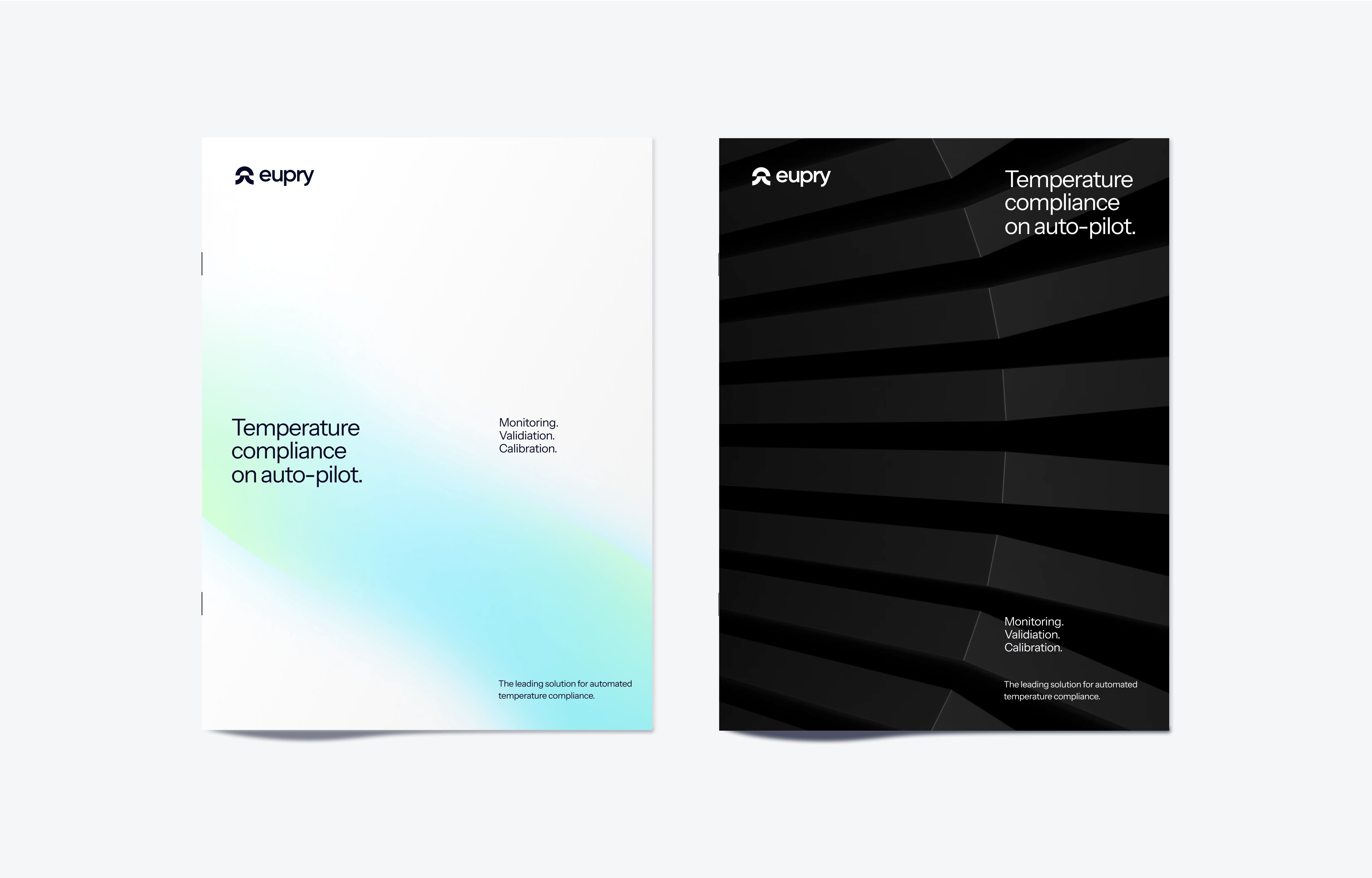
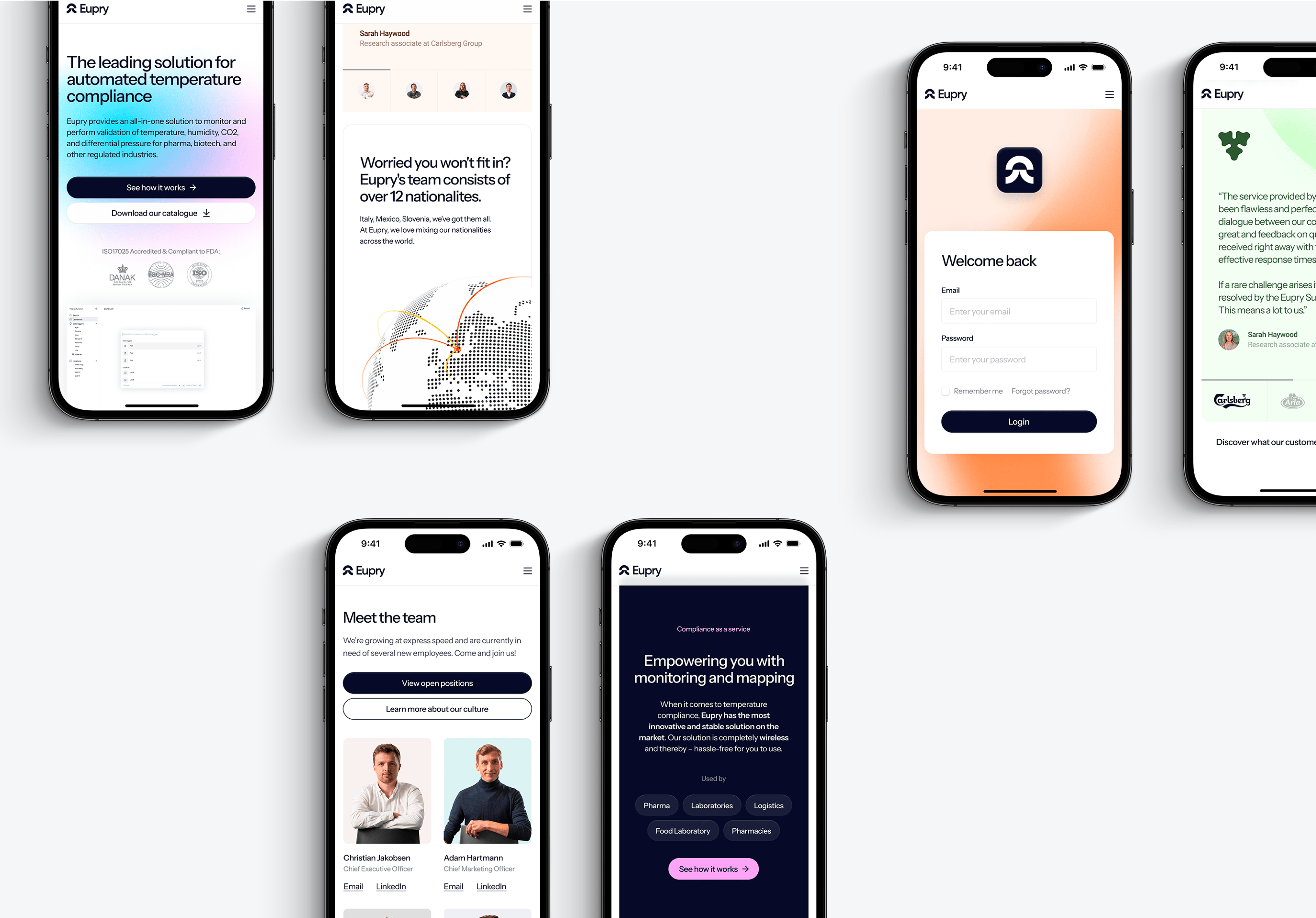
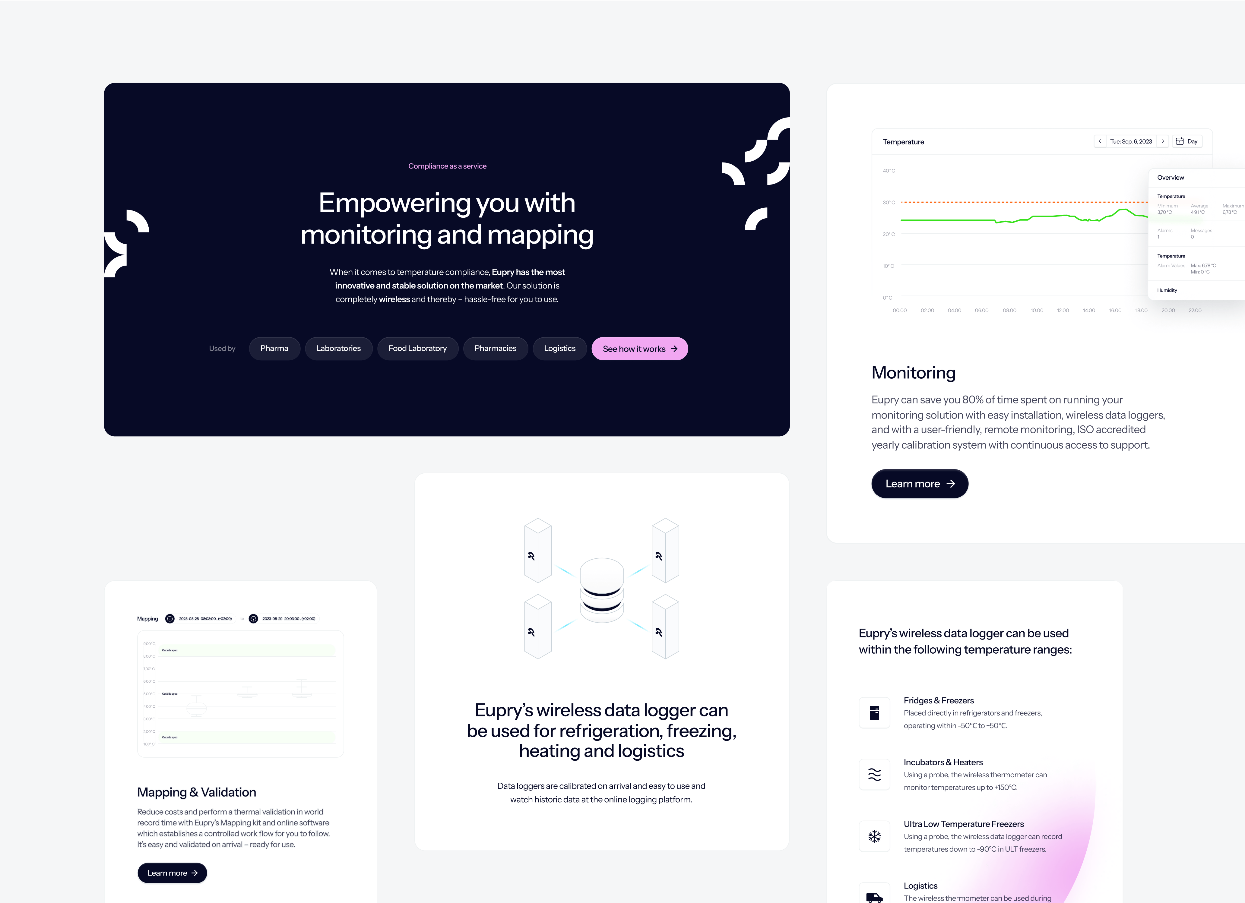
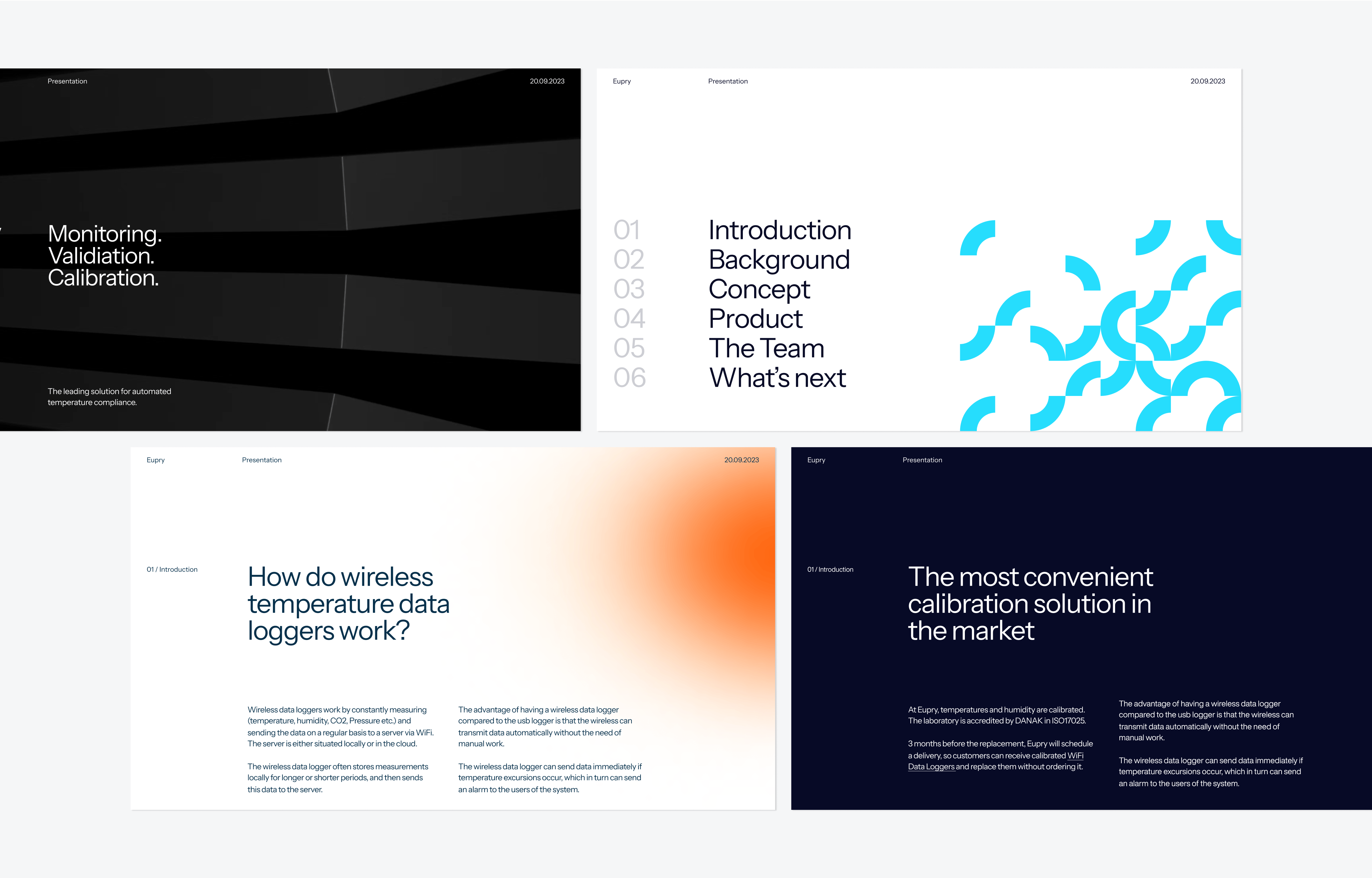
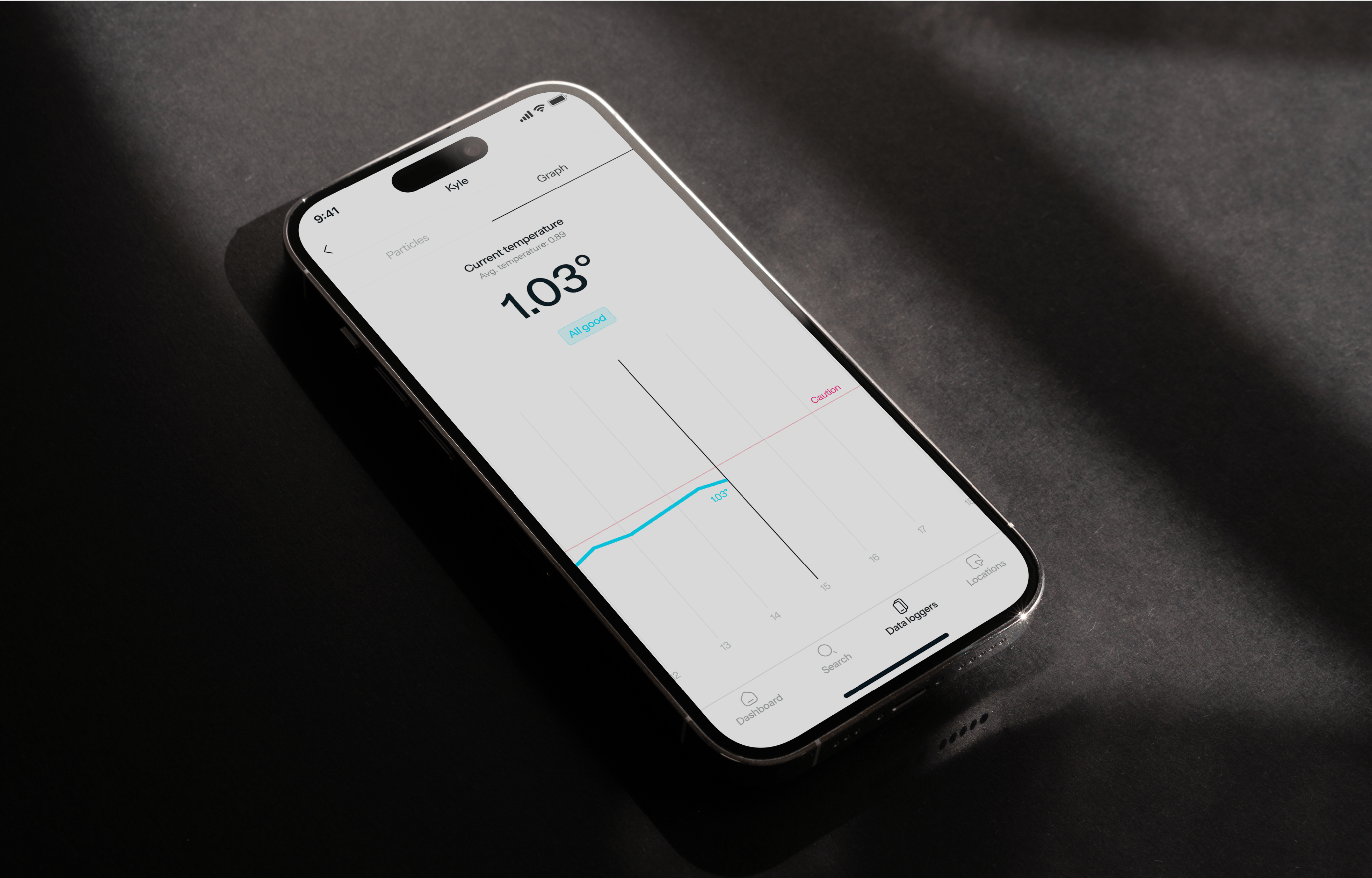
Eupry’s evolved branding breaks away from the overplayed conventions of traditional biotech, embracing a vibrant and playful digital-first aesthetic. The colorful palette represents the extremes of cold and hot in an unexpected way, while the clean design strikes a balance between technical precision and approachable creativity. This fresh approach firmly establishes Eupry as a forward-looking, digitally-driven brand.



Kudos to
Project Manager / Hedvig Aanesen
Lead Designer / Martin Balle
Lead Strategist / Gabby Olivas
Related work
Original Talks
Stand out, speak up
Client: Original Talks and Opus Group ApS
Partnership Lead: Mathilde Ive
Key Focus: Brand, App and e-com