Original Talks
Stand out, speak up
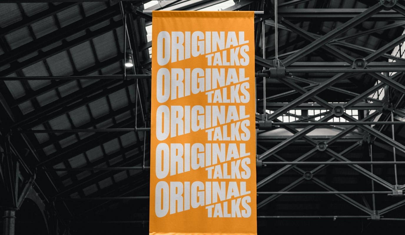
Client: Original Talks and Opus Group ApS
Key Focus: Brand, App and e-com
Feeling bored? Just tap a few times on your phone, and entertainment will come, endless entertainment. But nothing compares to the energy of a live talk, in the flesh.
Still, even the most captivating experiences need to stand out in today’s crowded market. And that’s what Tikko needed help doing. Over the past eight years, the Danish company has grown to host 700+ talks annually, yet its previous name, brand and website didn’t reflect its unique position as a curator of live experiences.
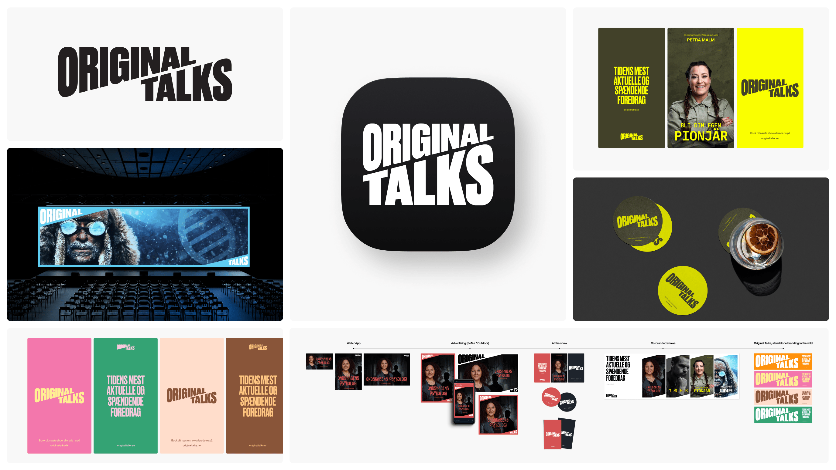
Things kicked off with a renaming process, landing on “Original Talks”—a name that encapsulates its mission to connect audiences with inspiring speakers. From there, a vibrant brand identity and website were developed to elevate the platform and its speakers.
Now, Original Talks is ready to compete with entertainment giants like Netflix and Disney, bringing people together for engaging and enlightening talks. With this rebrand, they’re poised for continued growth across seven new markets.
7 market launches
At the same time
26.000 tickets
Sold in the first month
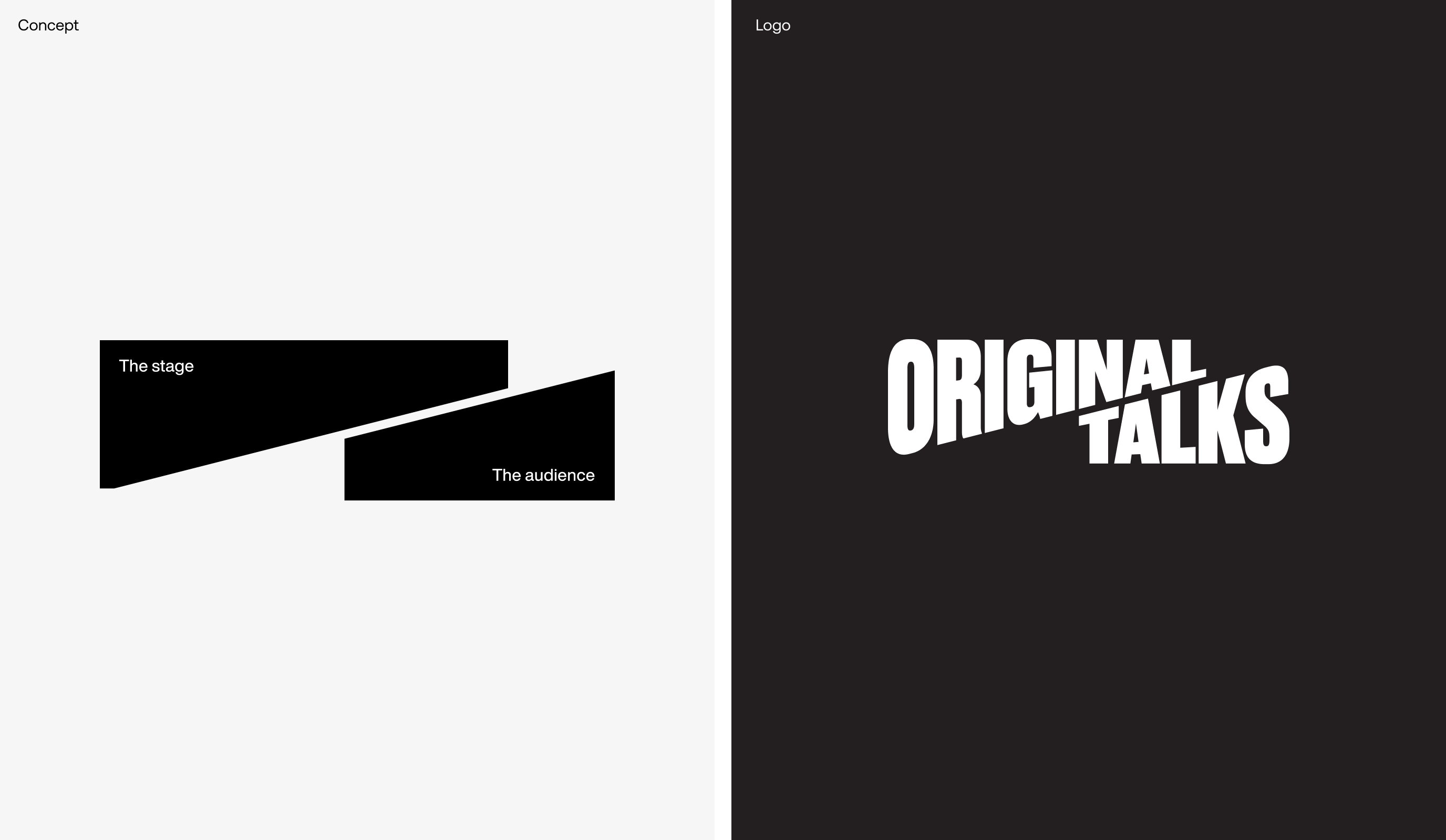
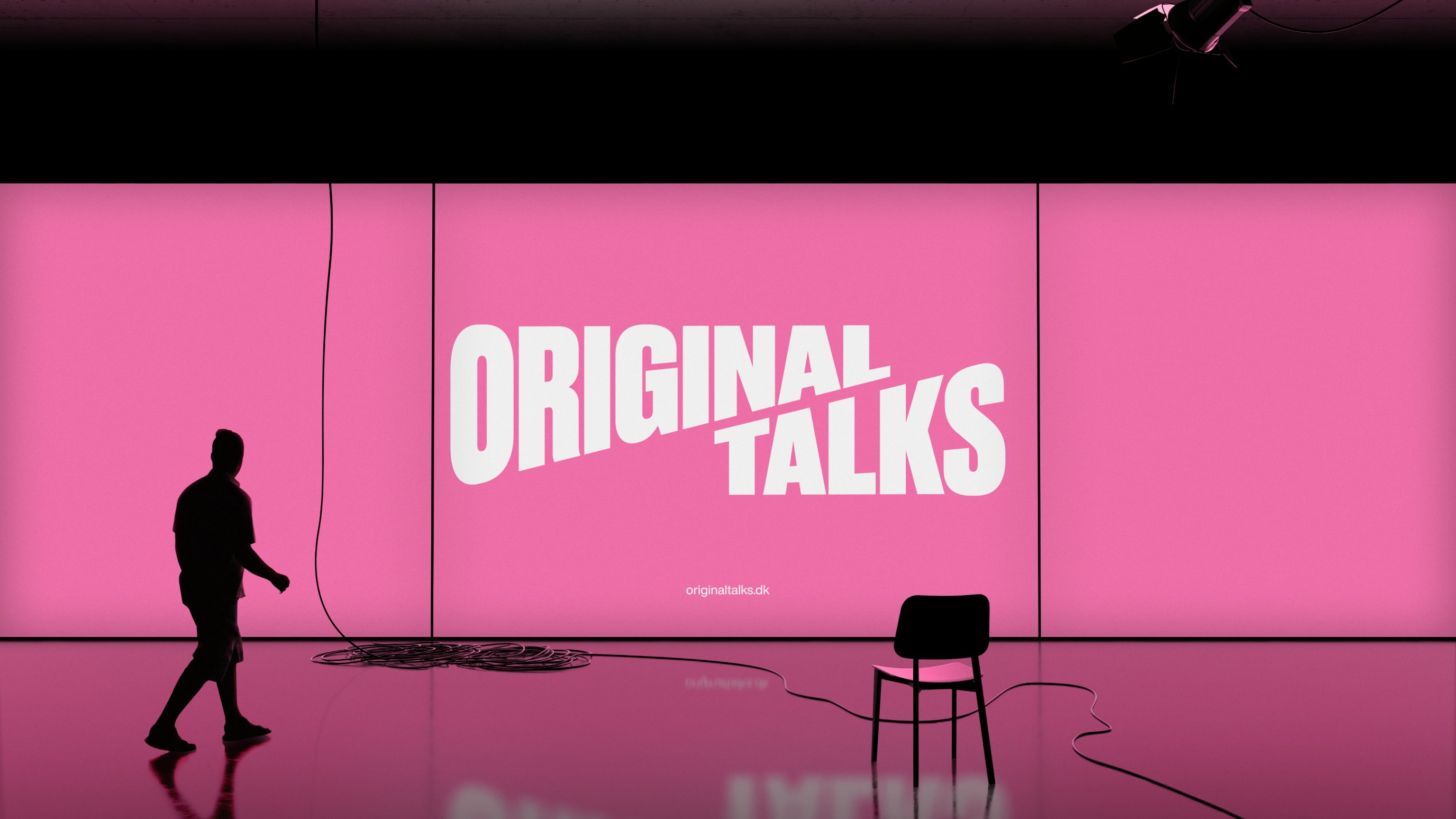
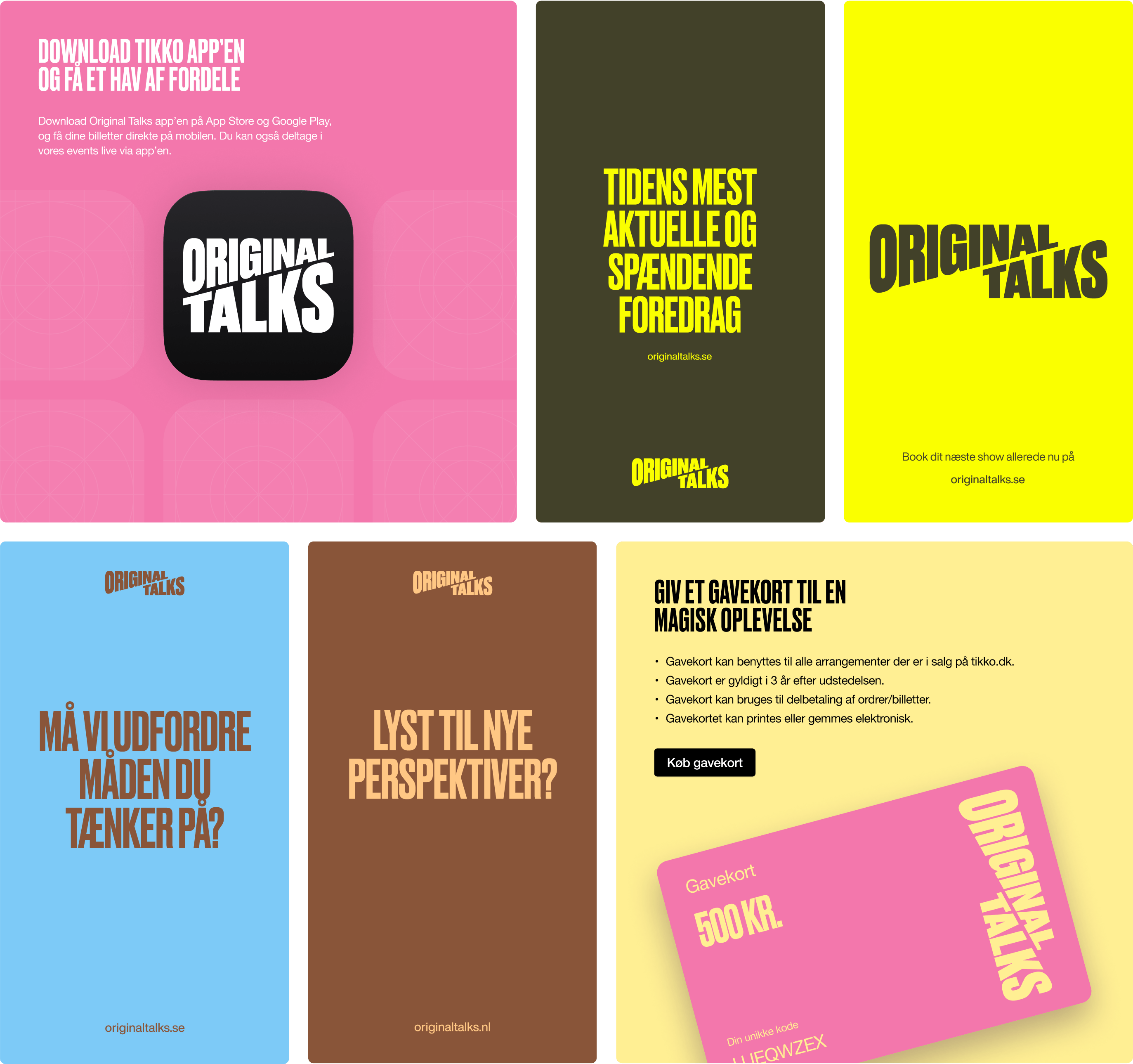
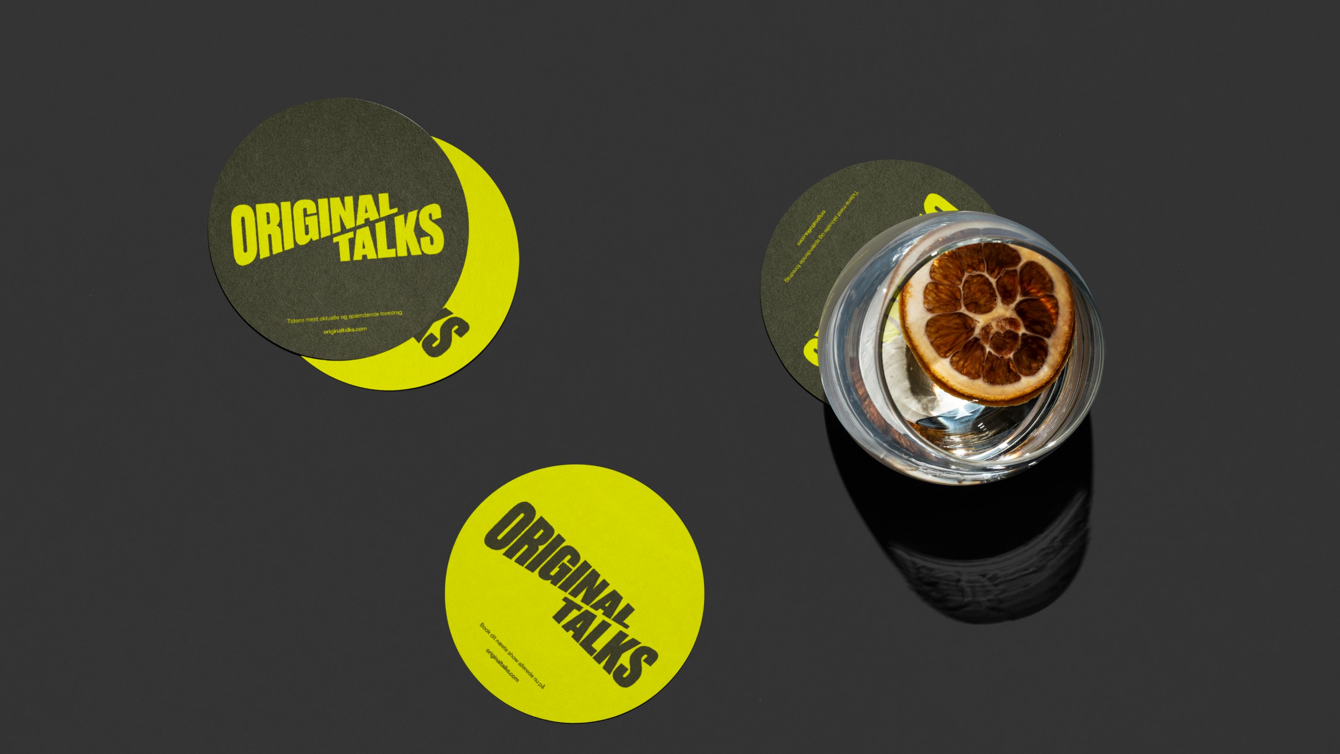
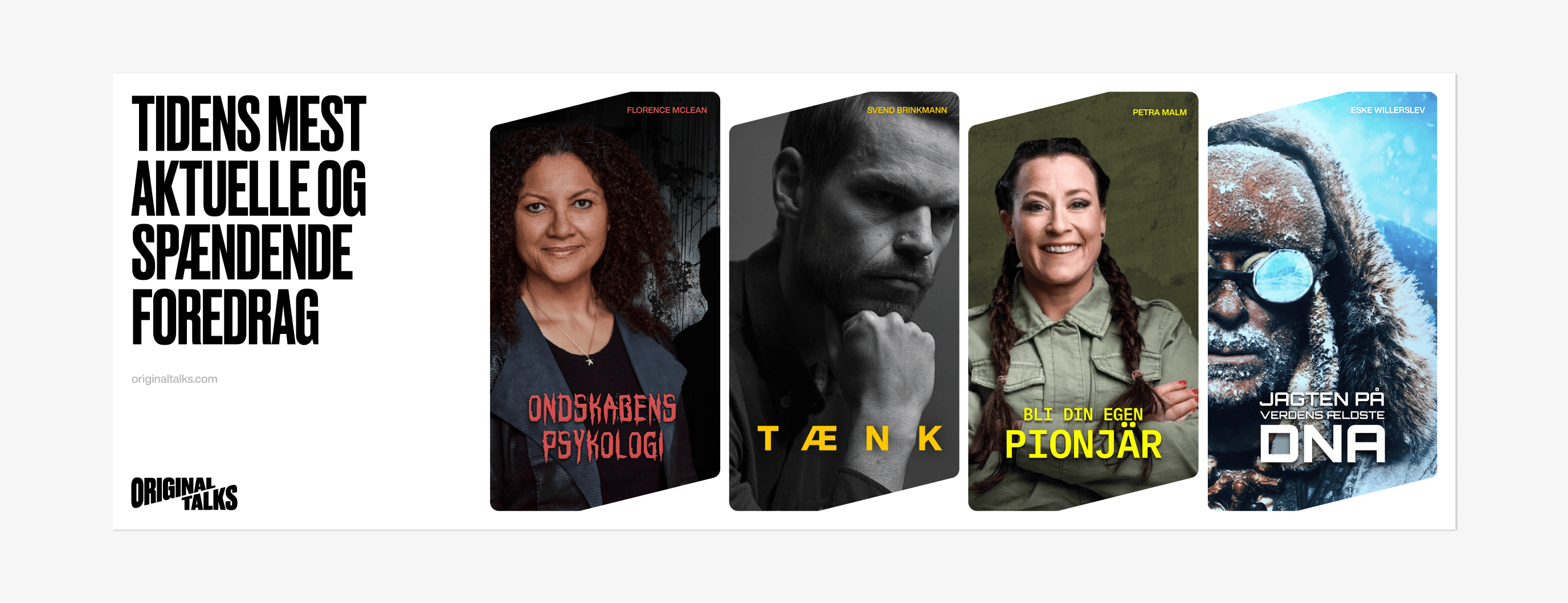
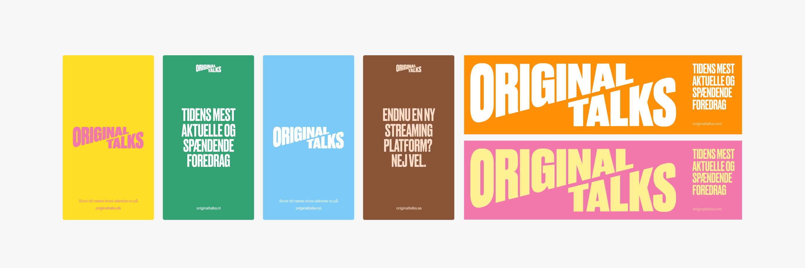
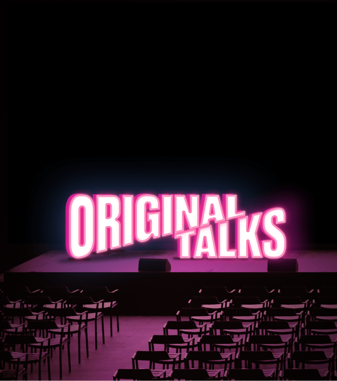
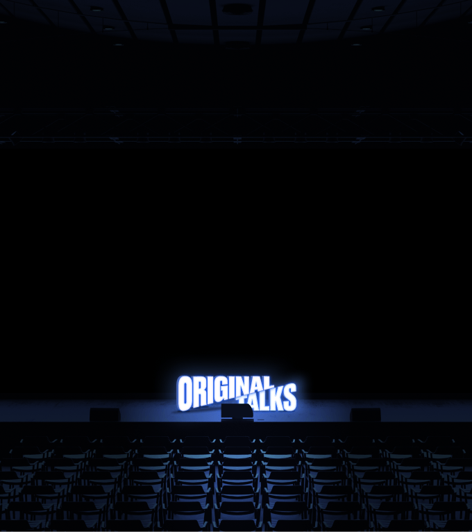
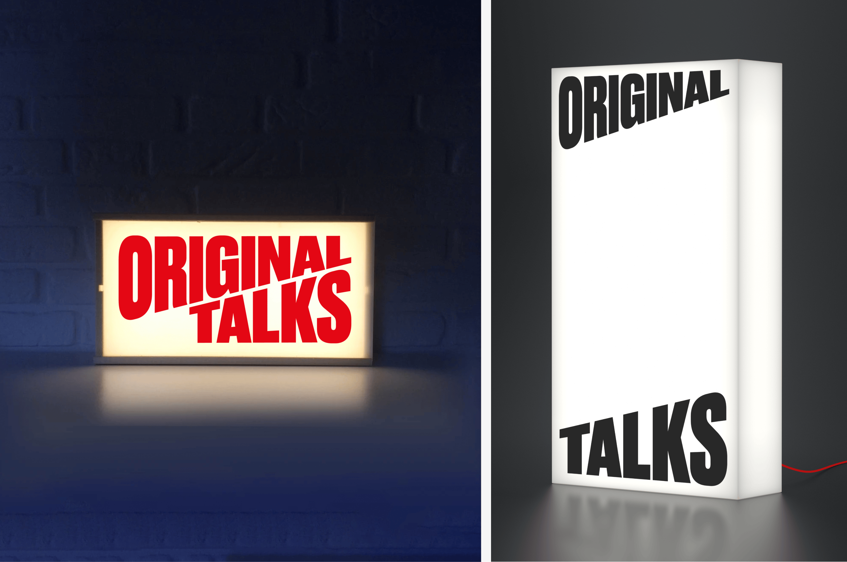
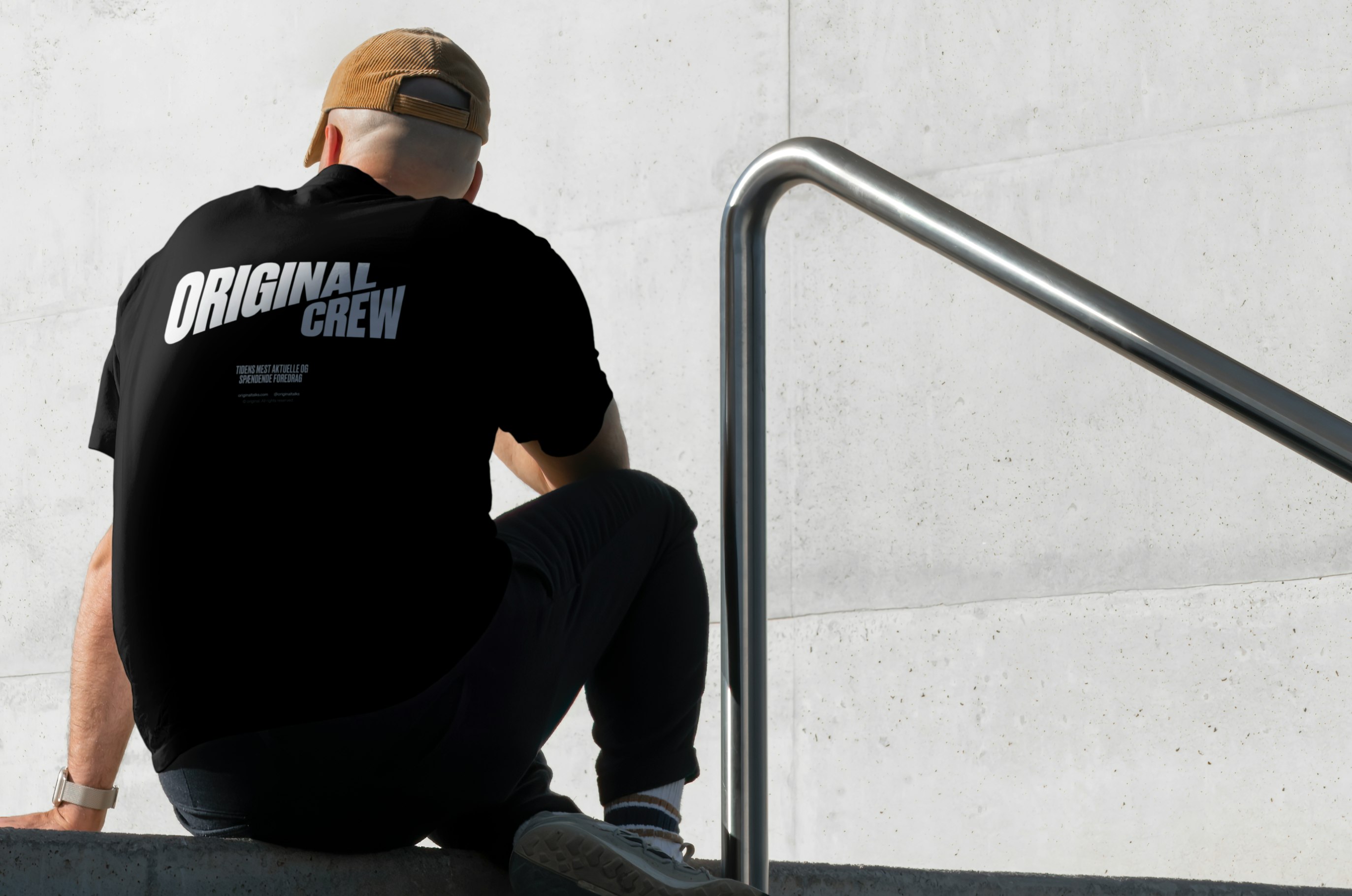
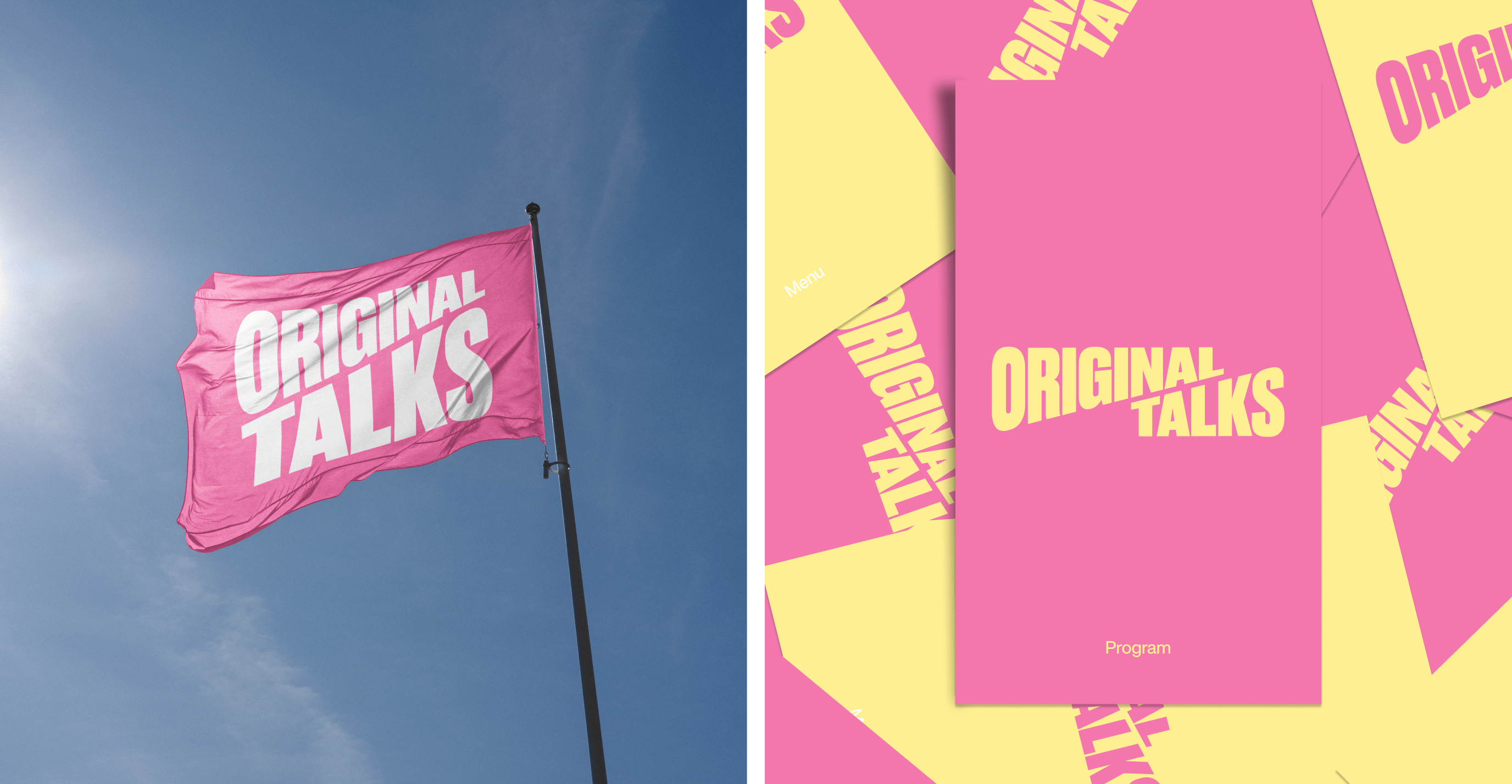
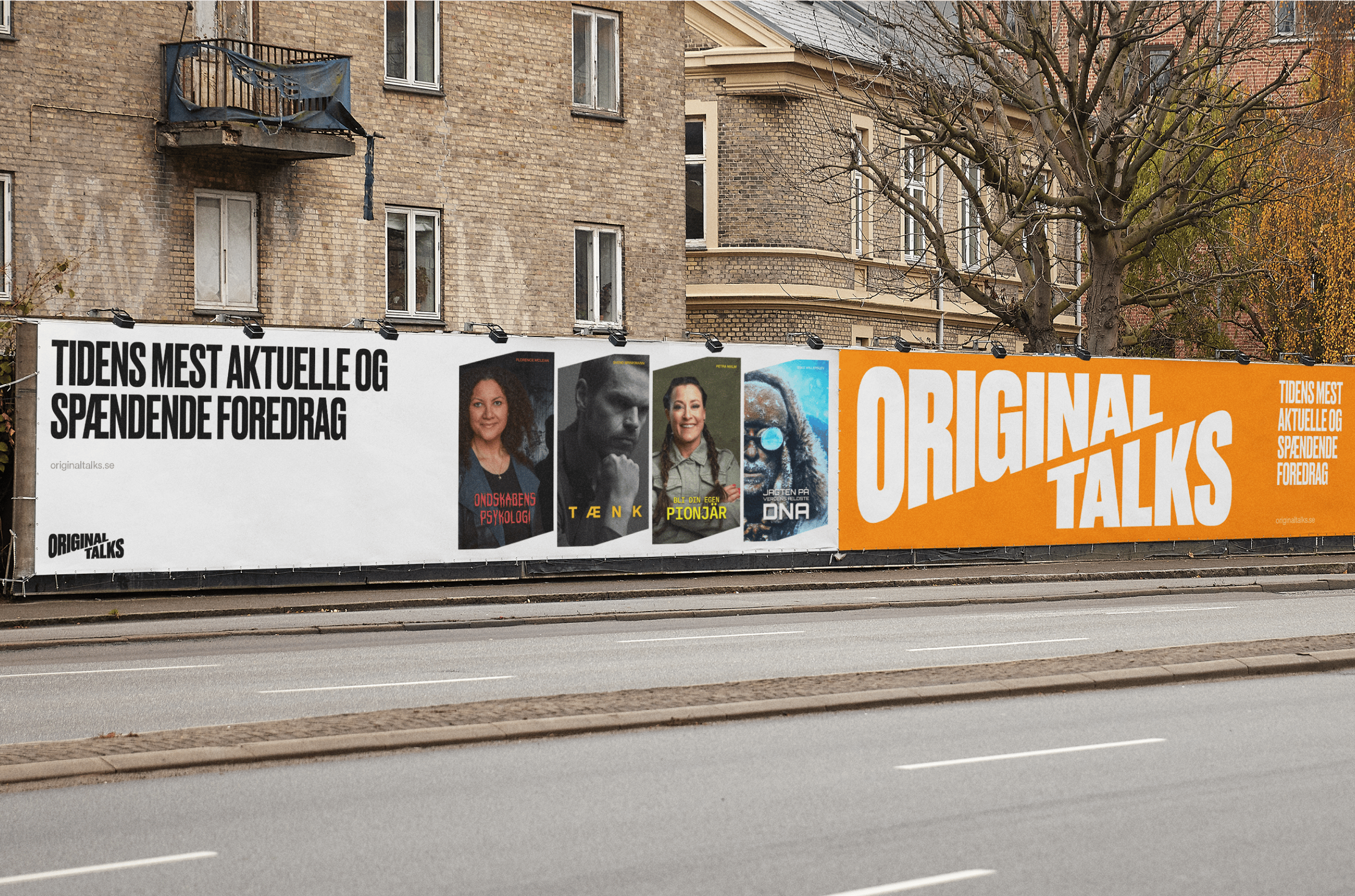
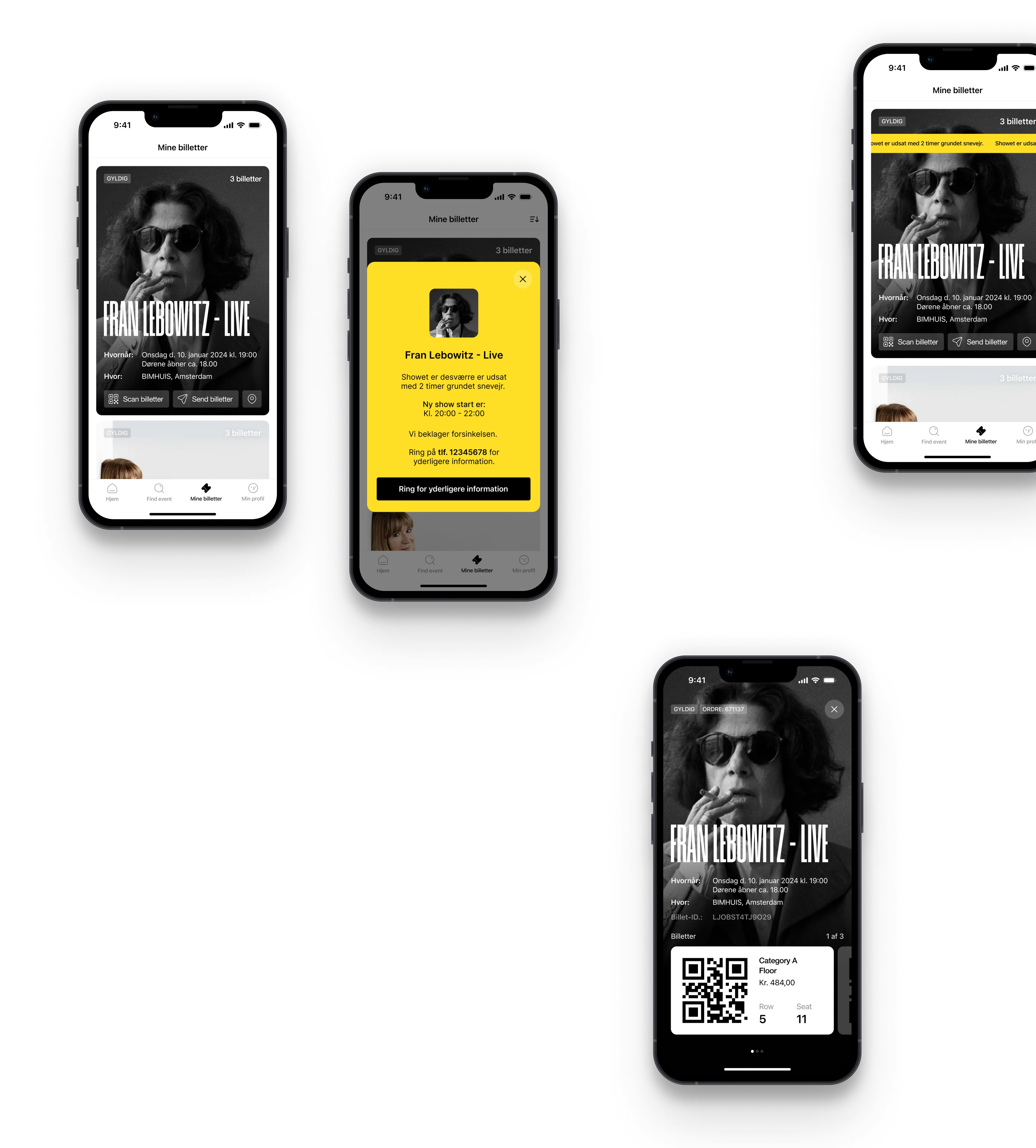
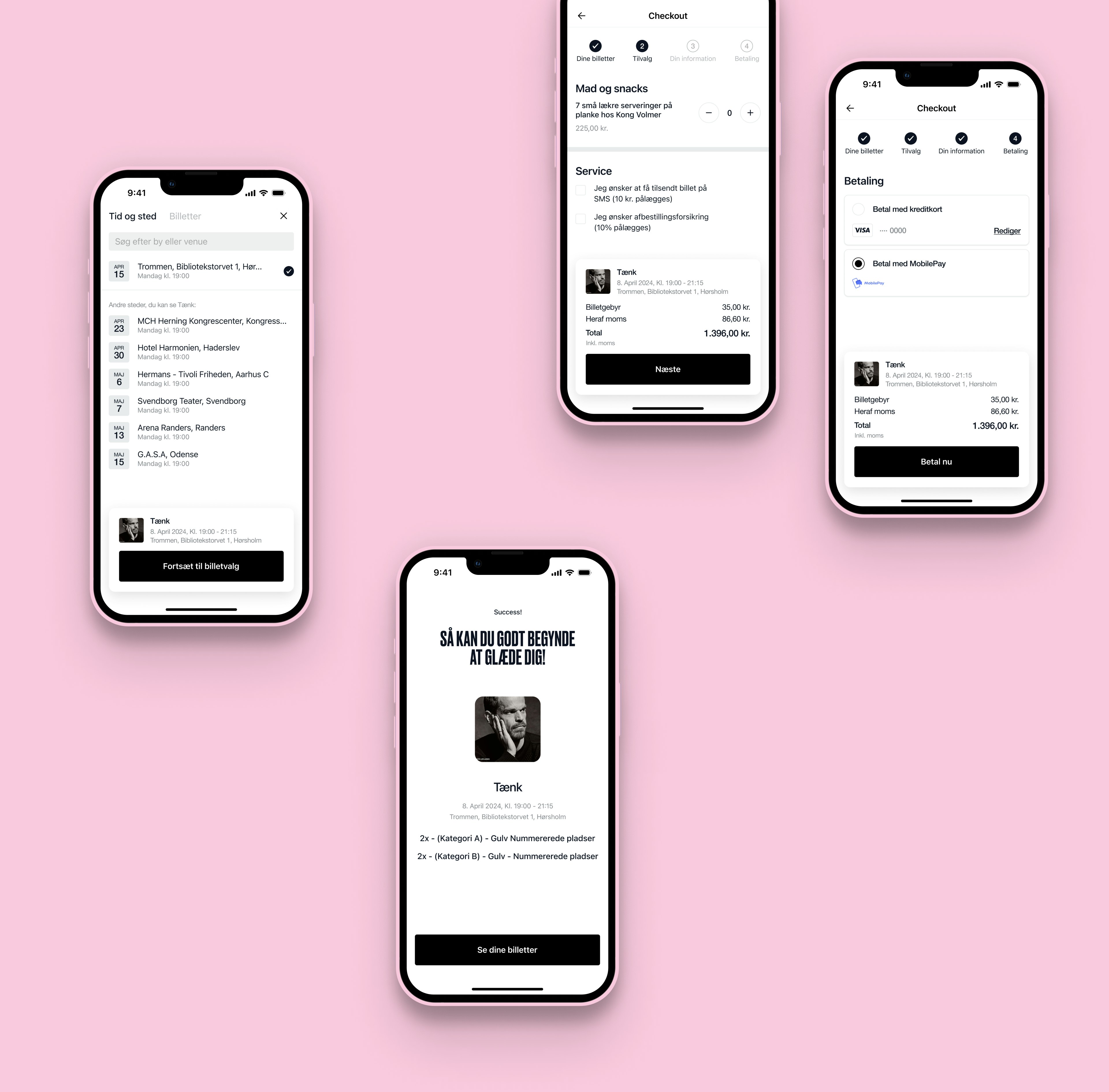
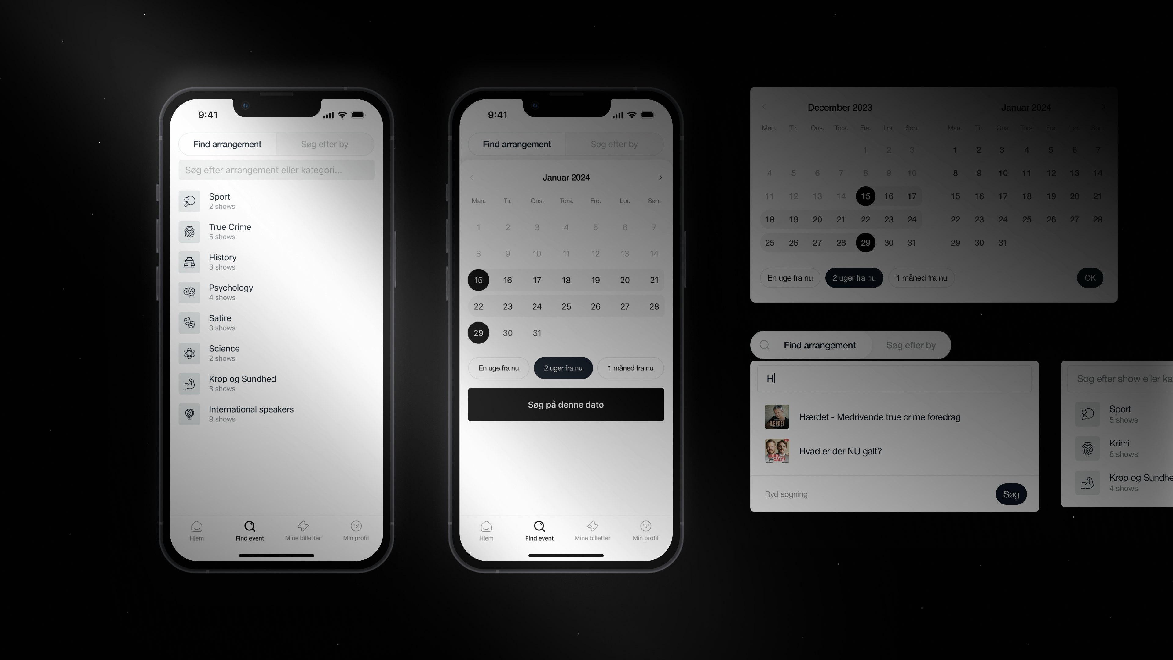
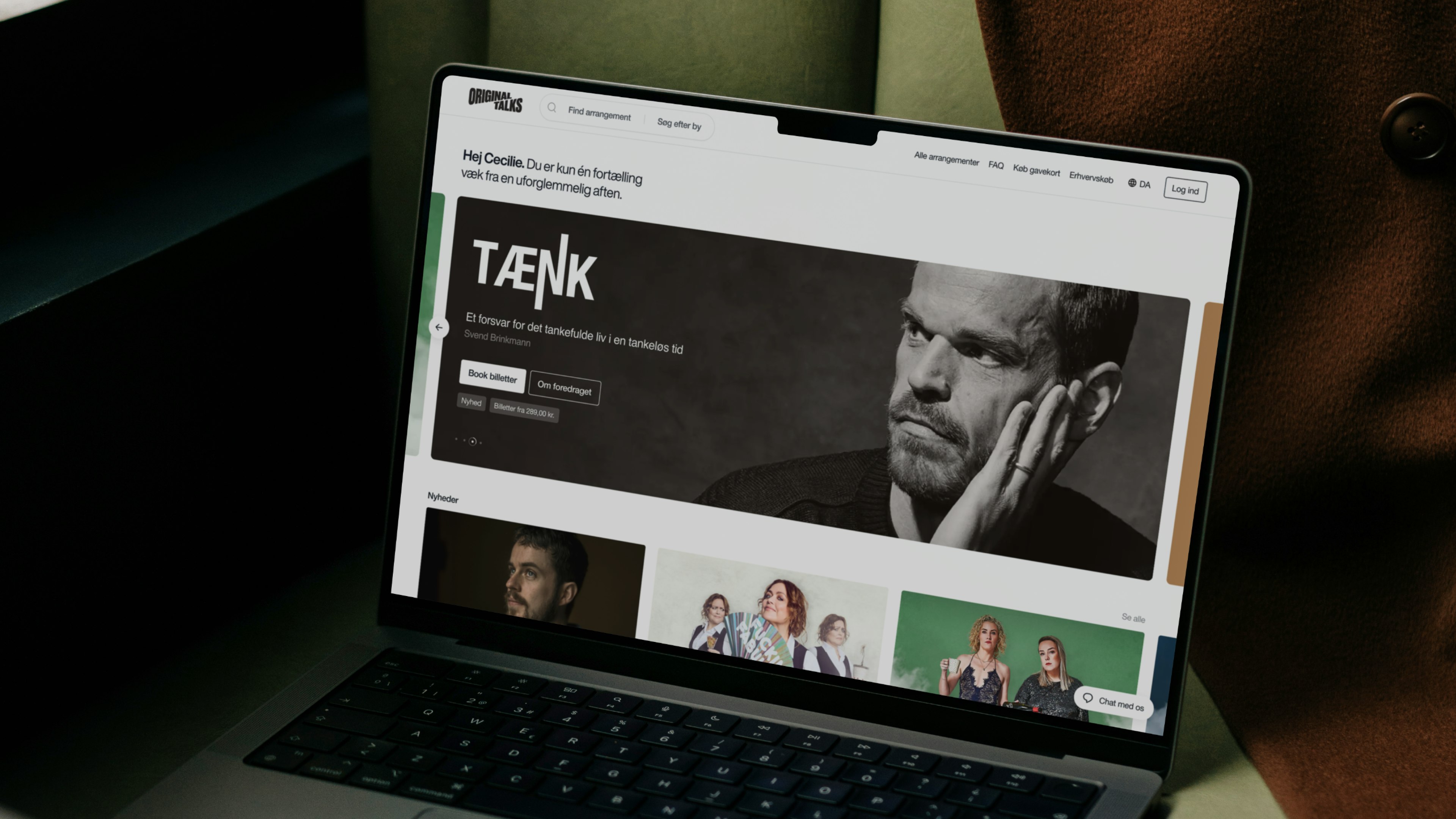
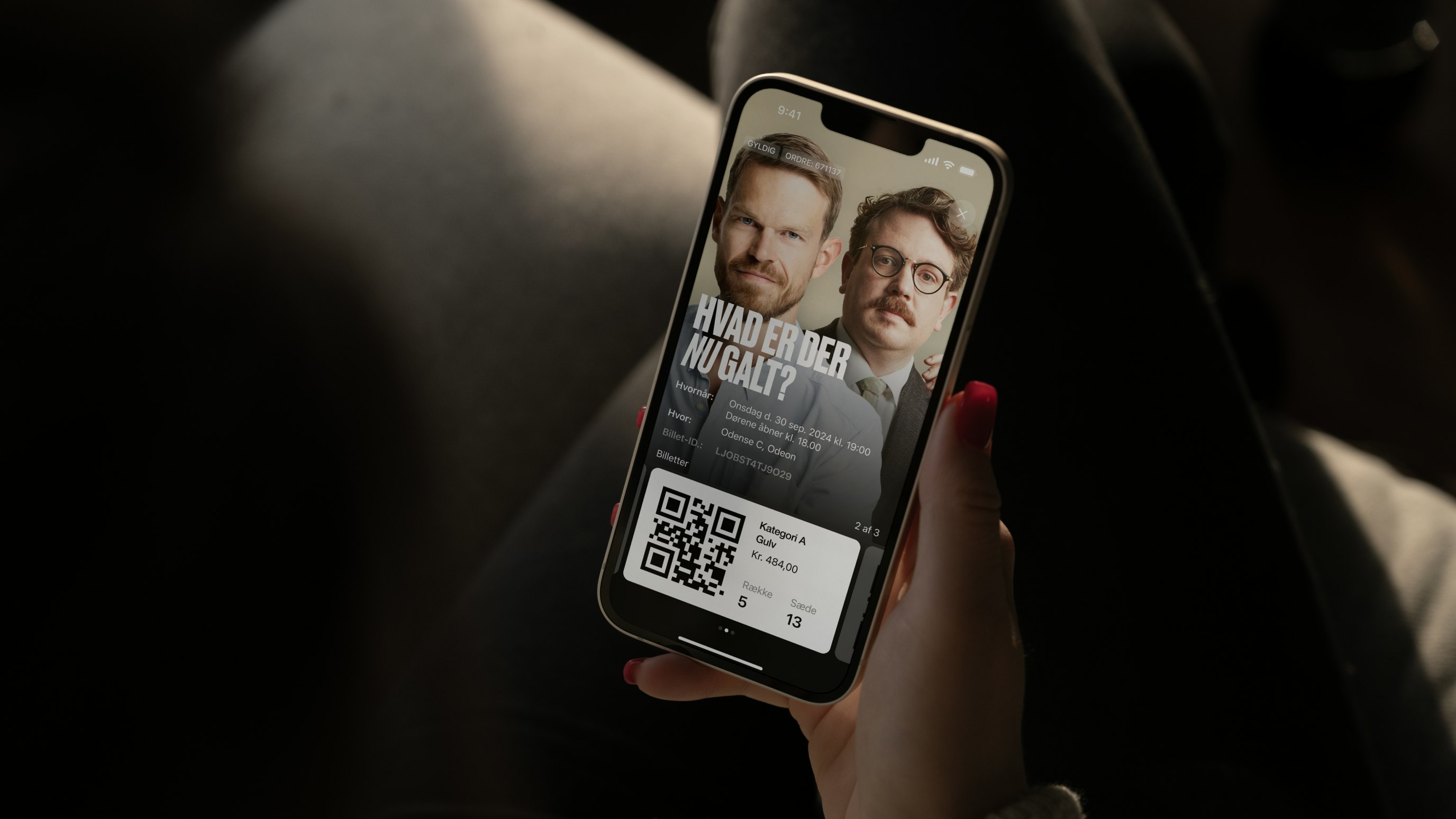
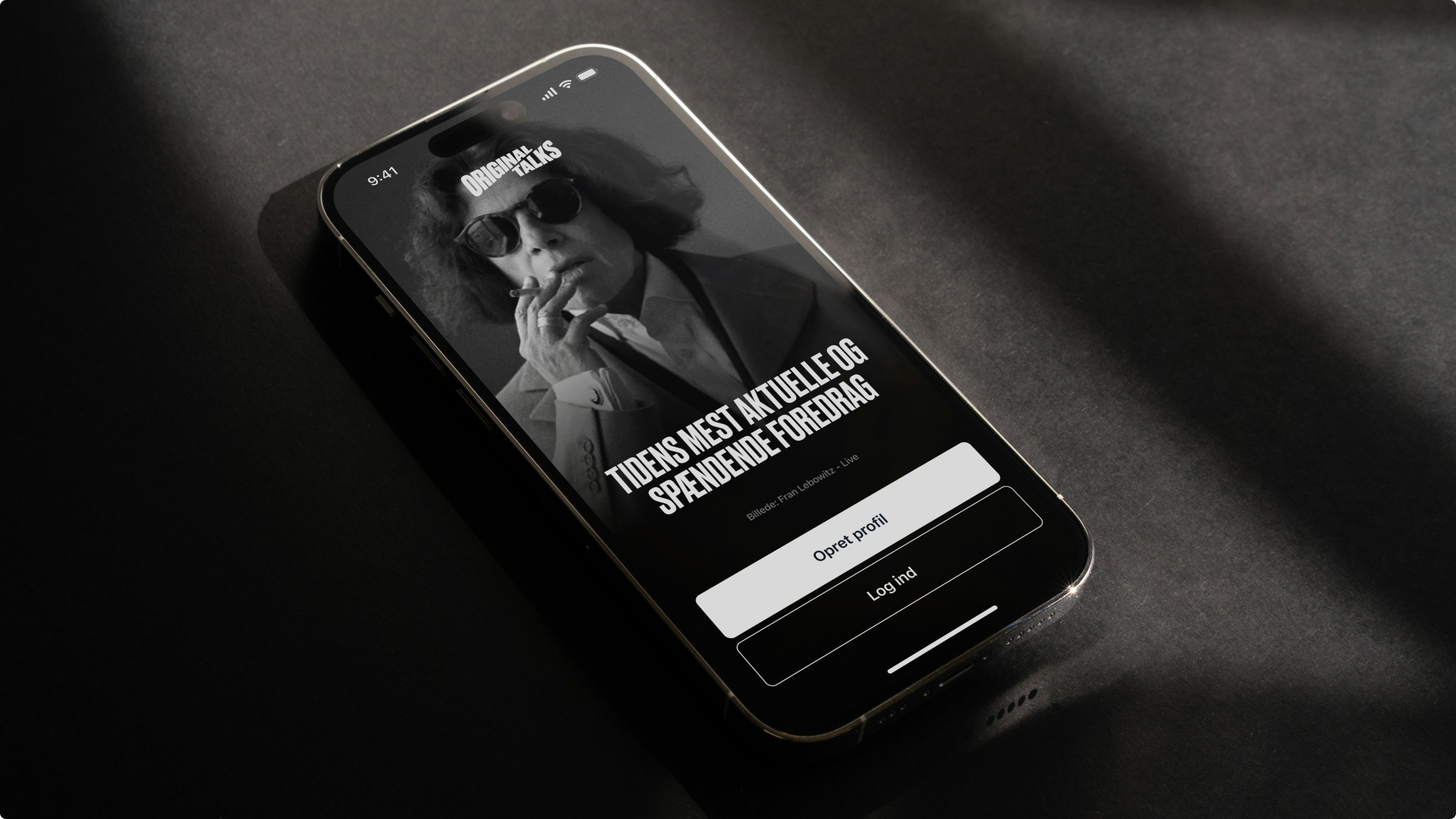
Old identity
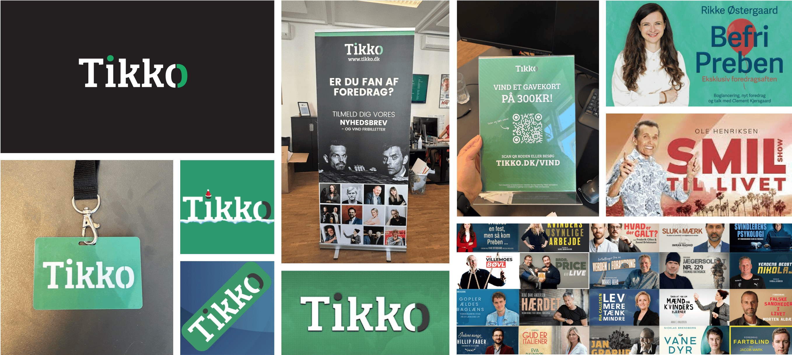
New identity
Kudos to
Client Lead / Mathilde Ive
Project Manager / Oliver Alminde
Designer / Alexander Spliid
Designer / Martin Balle
Front - End developer / Frederik Højriis
Strategist / Gabby Olivas
In close collaboration with the Original Talks Team<3
Related work
RW Blears
With you from formation to exit
Client: RW Blears
Partnership Lead: Matthew Staroste
Key Focus: Brand, Website
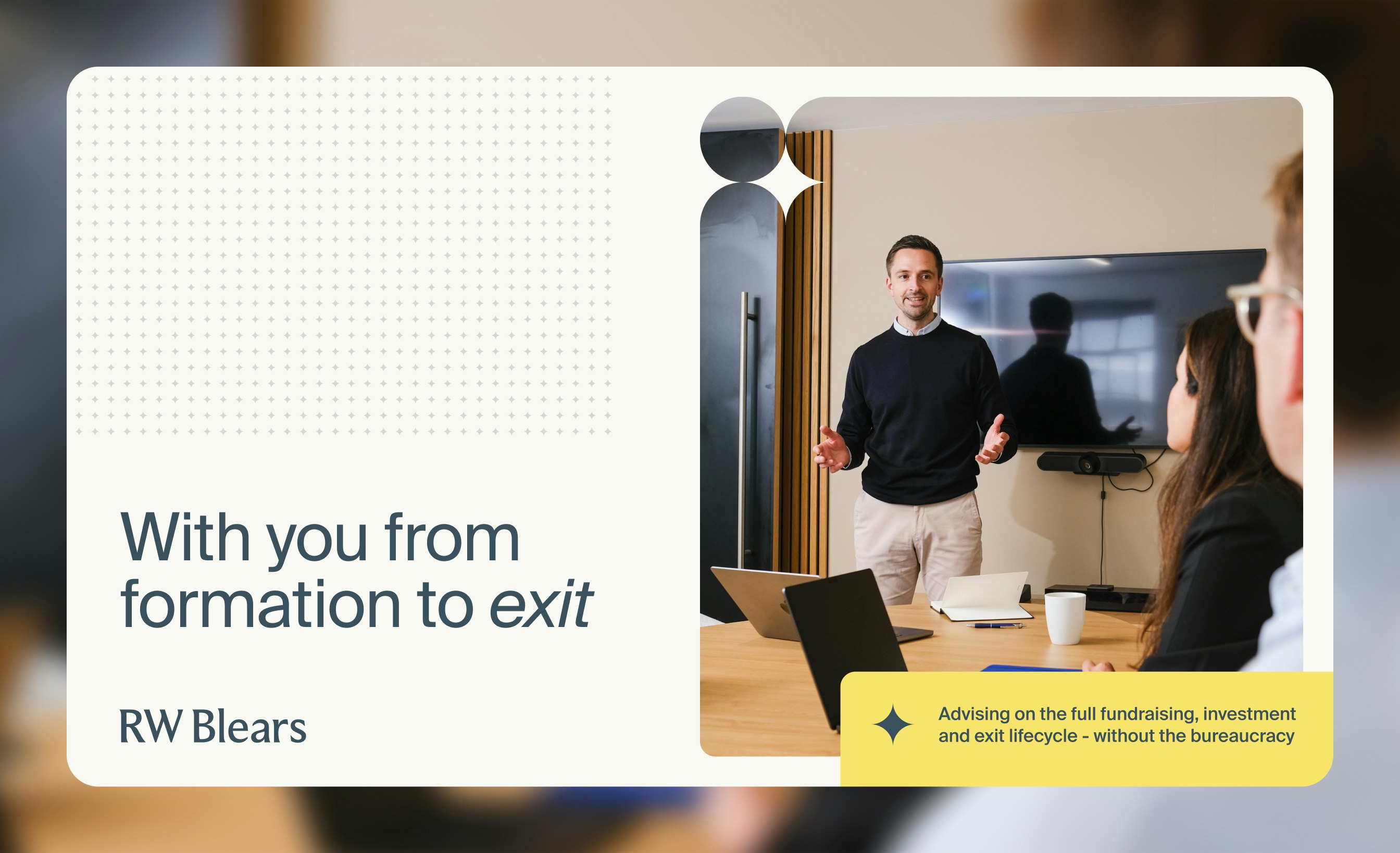
RW Blears has been helping shape the VC space for decades, offering sharp legal expertise in fund establishment, corporate finance, investments, and exits. While their work was agile, their digital identity still reflected a more traditional style rather than focusing on their innovative approach. With a client base of startups, founders, and fund managers, they needed to modernise without losing their well-earned gravitas. Their site wasn’t for lead-gen - it was more like a high-end business card - so it had to be clear, engaging, and unmistakably RW Blears.
We took an evolution, not revolution, approach. The goal: show their adaptability - approachable yet authoritative, traditional yet tech-ready. Instead of listing every possible service, we focused on how they partner closely with clients across the entire fund journey, from capital formation to exit. The brand needed to feel personal, flexible, and tailored - like the legal equivalent of a bespoke suit. The new identity kept their trusted blue but added a burst of vibrant yellow for energy, balanced with light stone and airy blue variations. Navigation was restructured to highlight expertise, and fresh photography captured the team’s personality in action. Subtle animations and a star-motif graphic system added warmth and dynamism, resulting in a brand that feels as nimble and future-ready as the firm itself.