FrançaisContact

Episode one Ventures

Born to found - Raised to fund
Episode one Ventures case study — Episode one

Client: Episode one

Key Focus: Website and Brand
“The UK’s leading seed-stage B2B SaaS VC fund.” With a 73% success rate from seed to Series A, Episode one sought to set itself apart from its competitors in the Venture Capital market. The London VC sector was crowded, competitive and noisy, and they wanted to be different. Previously investing in start-ups such as Zoopla, Attest and Carwow, E1’s reputation was widely recognized, but their website and branding failed to reflect this. They wanted to rebrand and create a website that would help generate interest among the most promising tech start-ups - so the choice to take an investment from E1 was more appealing. Extensive research established two things about the brand. Firstly, E1 is composed of people who have previously been founders and operators themselves. Secondly, these people have decades of knowledge and experience in VC under their belts. These two highlighted aspects of E1’s brand ultimately defined their revamped brand identity.

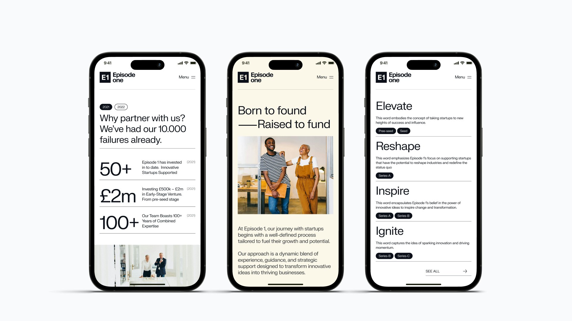
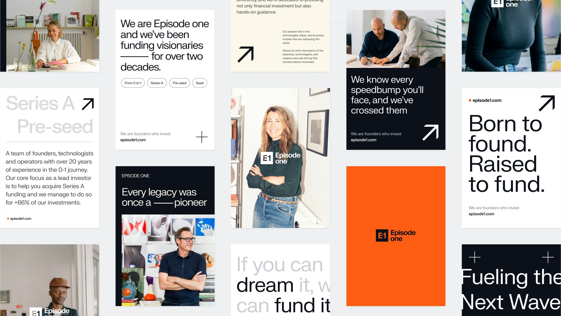
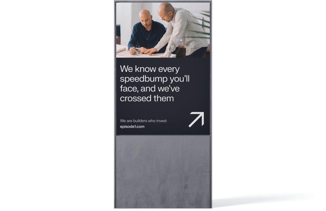
We developed a positioning strategy, new communications, a rebrand and a fresh website to better tell the stories of who they are and their track record.
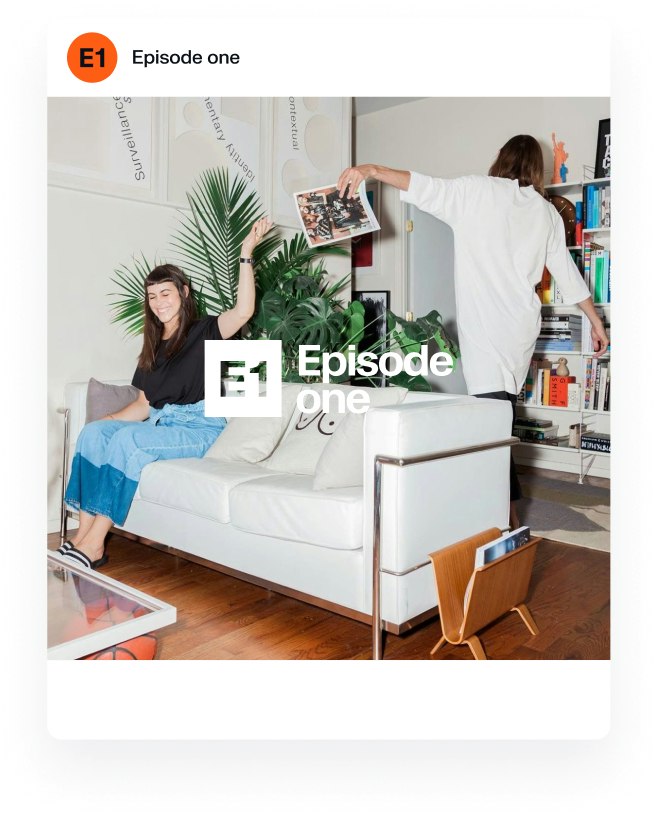
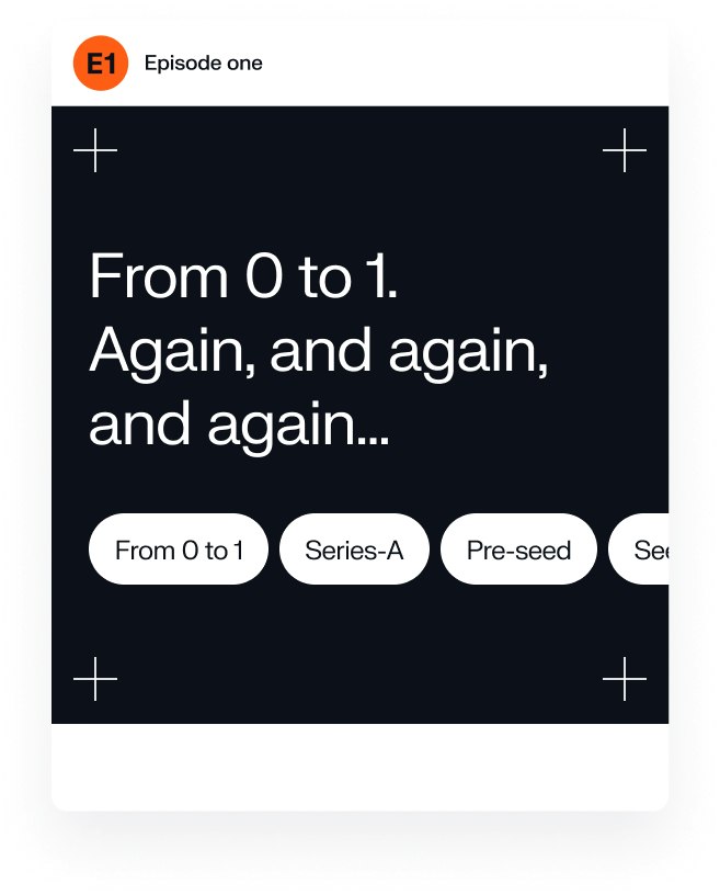
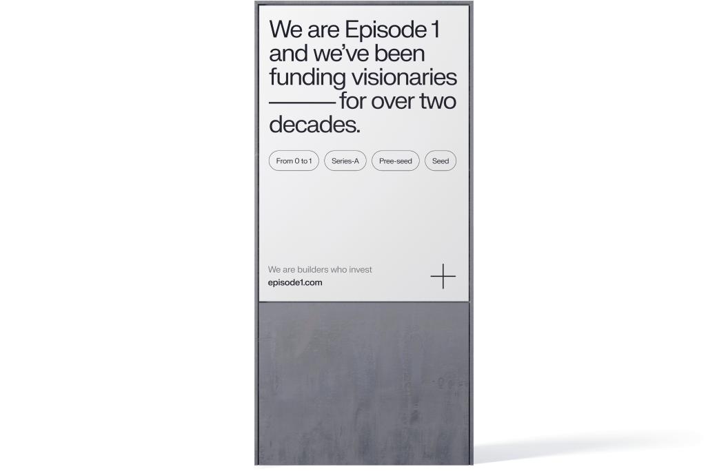
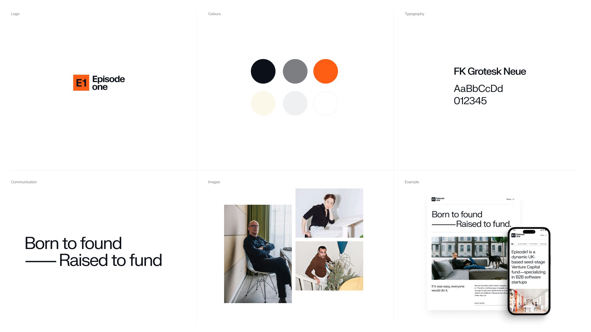
The new website experience reflects the idea - of “born to found - raised to fund”, balancing the fine line between relatability and expertise. E1’s visual identity is crafted with a timeless and professional touch, mirroring the values that define them. With a palette of steadfast hues and clean lines, we evoke a sense of stability, aiming to add trust and welcome founders into a relationship rooted in a shared vision.
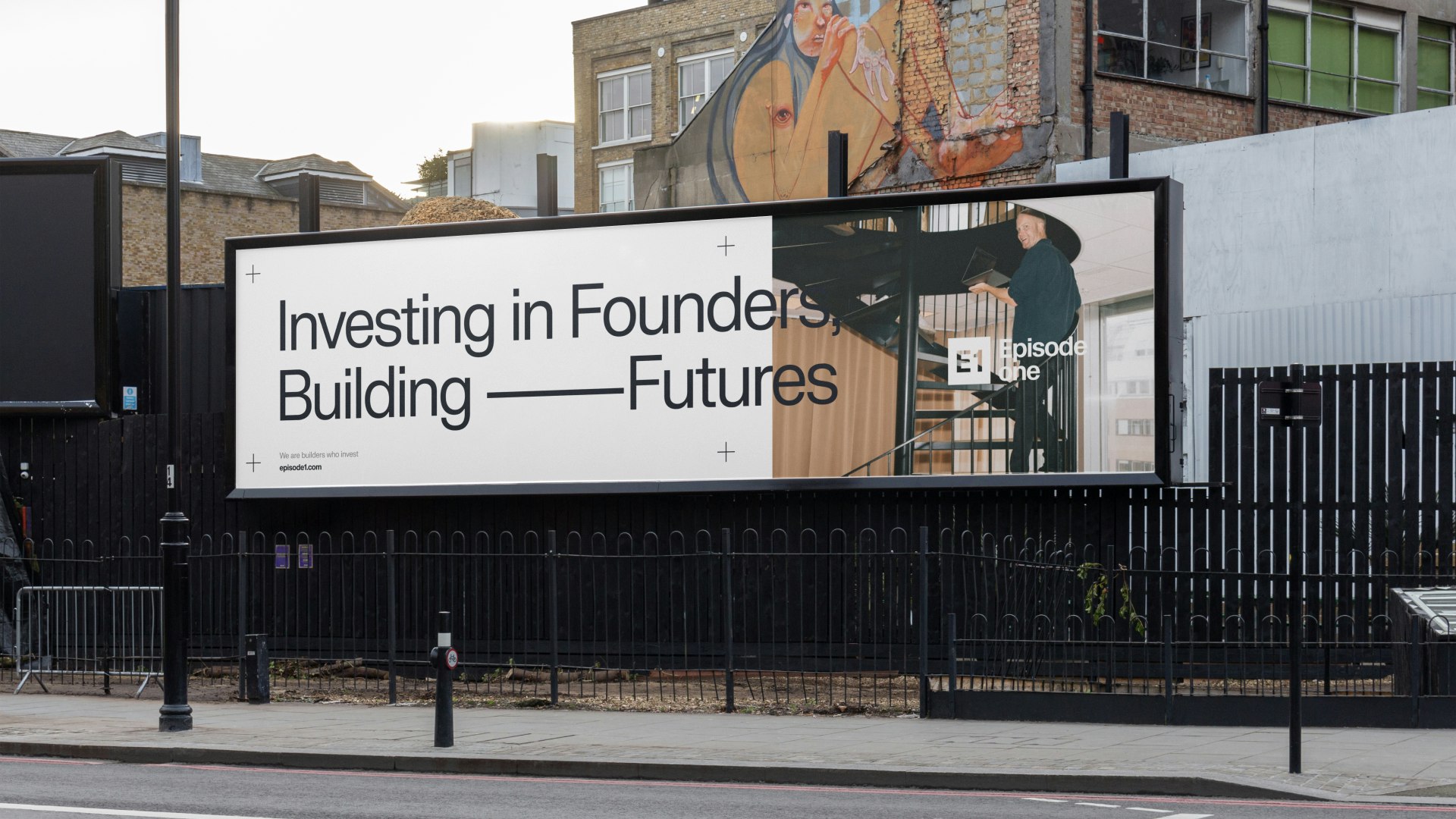
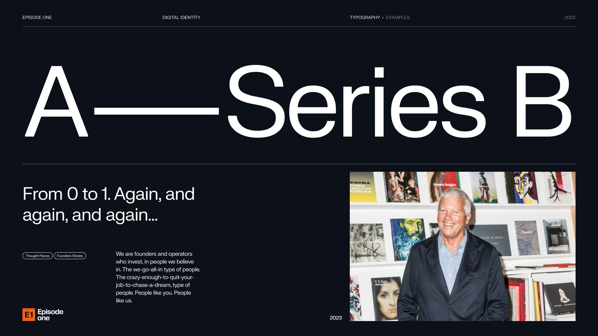
Theconnectionfrom“0to1”istheevolutionfromseedtoSeriesA,andbeyond.Weusedthatasavisualguidelineofgrowthandputitatthecentreofourbrandactivationstrategy.

Ourcolourpaletteisatestamenttosimplicityandmodernity.However,whenit’stimetocallattentiontokeyelements,wedeployadistinctandvibrantorange.

Kudos to

Client Lead / Jamie Vaughan

Client Lead / Dženita Džindo

Strategist / Sofie Henriksen

Designer / Kristoffer Balzer Nielsen

Designer / Julie Elgaard

Related work

Rejsepunkt

Connecting every city across the country
Rejsepunkt case study

Client: Rejsepunkt

Partnership Lead: Sofie Henriksen

Key Focus: Branding, App design, Visual identity

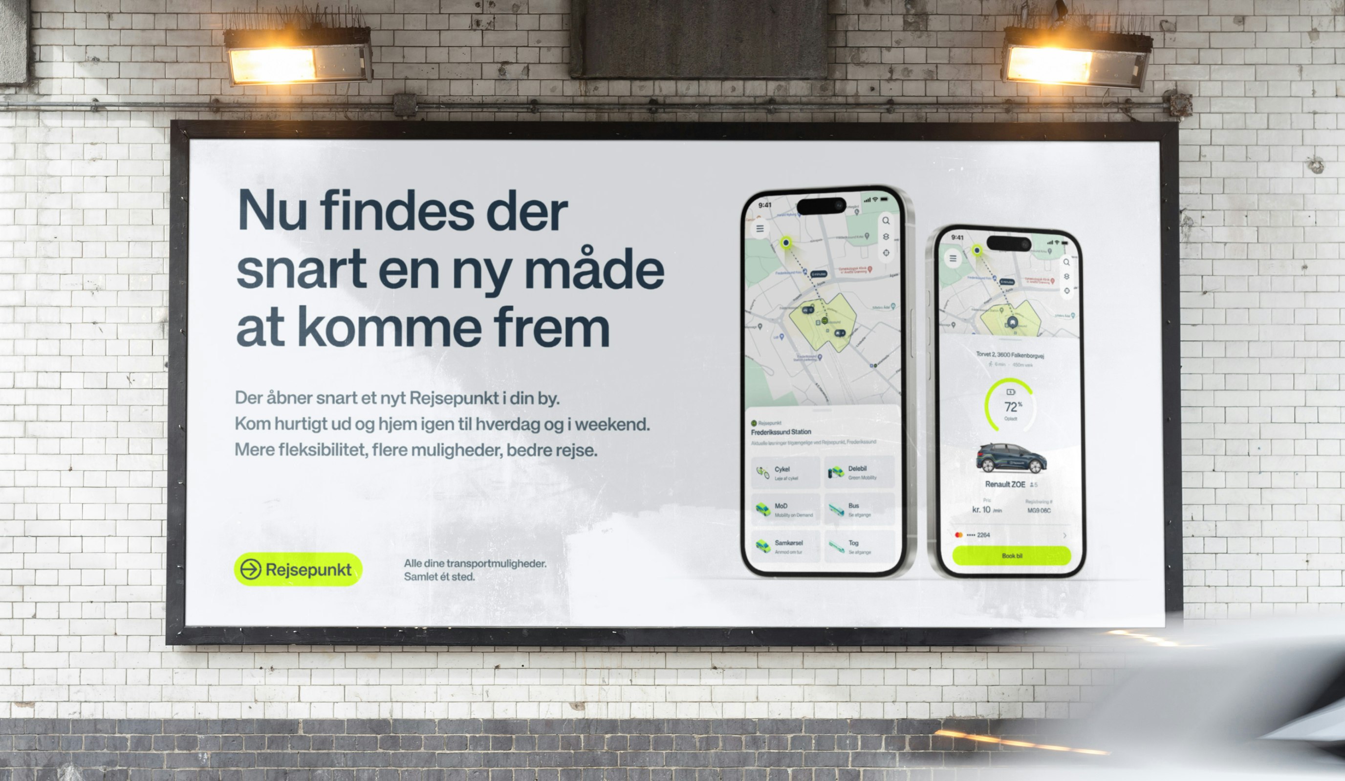
While Denmark's urban areas benefit from well-established transport systems, with strong digital integrations, rural regions continue to face significant mobility challenges. To bridge this gap, Rejsepunkt was created—a unified digital platform with ambitions to facilitate multiple transportation services into one intuitive, easy-to-use platform for those in less connected areas.