Revaly
Because performance doesn’t stop at purchase
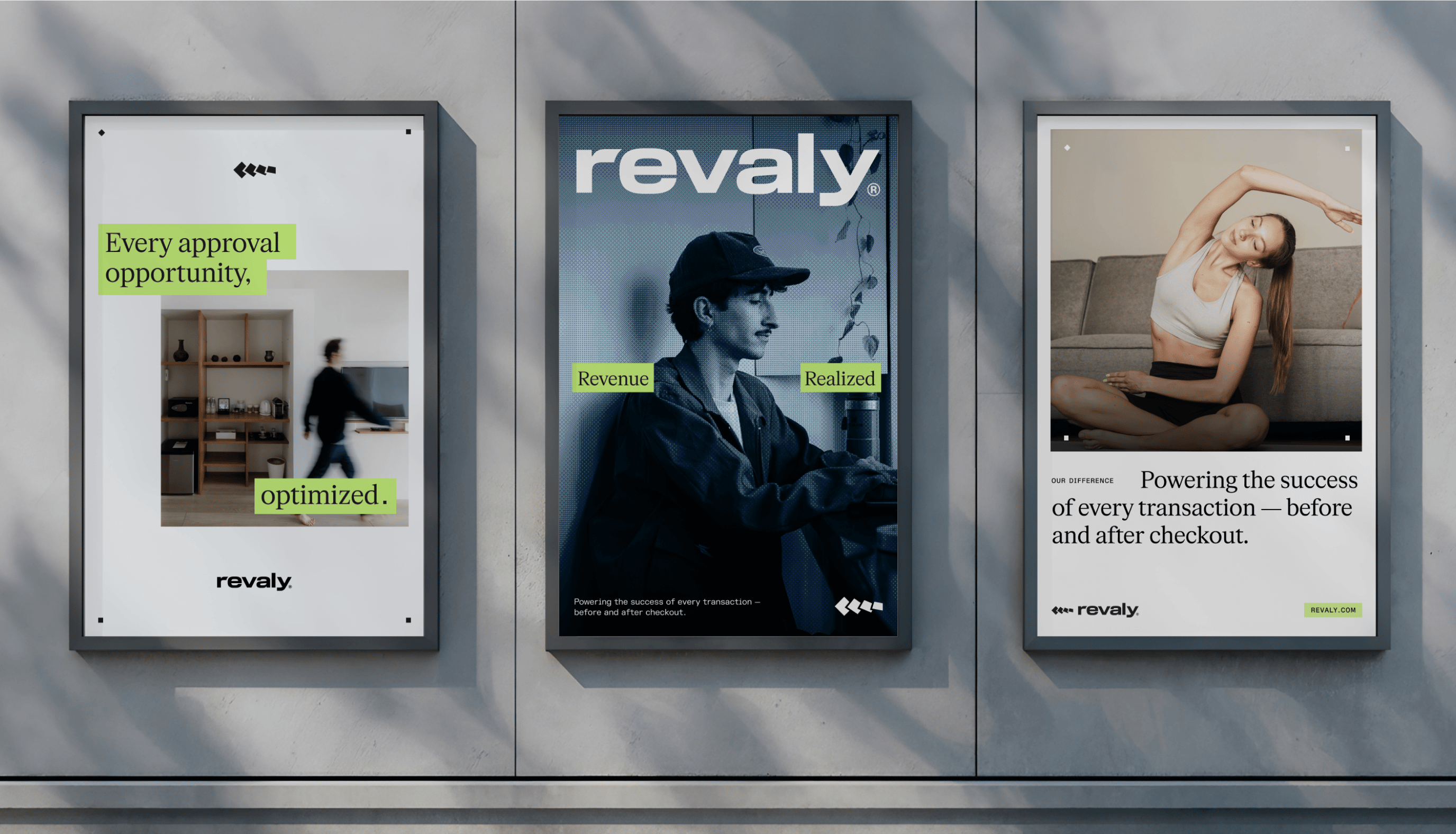
Client: Revaly
Key Focus: Strategic Positioning, Brand Identity, Web Design
Payment performance is a growth lever hiding in plain sight. Too many transactions fail due to minor errors that compound into a critical amount of missed revenue. Revaly has built the solution, now it needed to position itself as the go-to performance partner for revenue owners.
Fundamentals aren’t always exciting when they should be. With its new brand, Revaly now stands as clear and powerful as the product behind it - built for revenue leaders ready to optimise, recover, and grow.
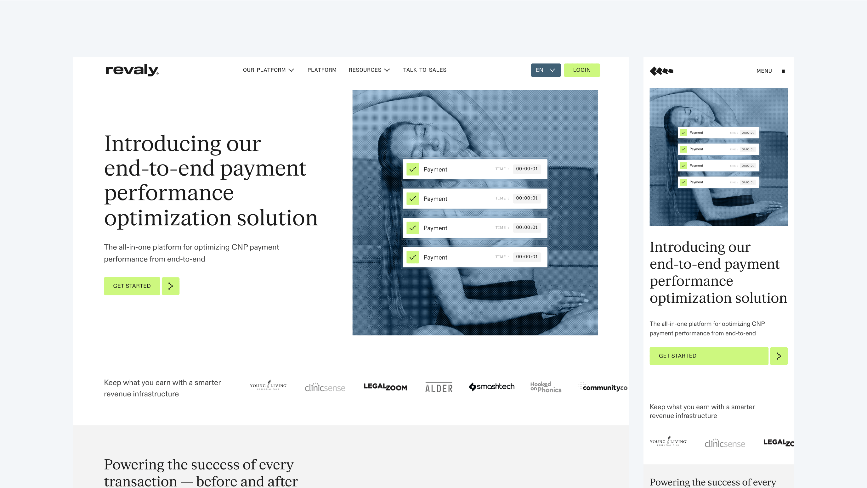
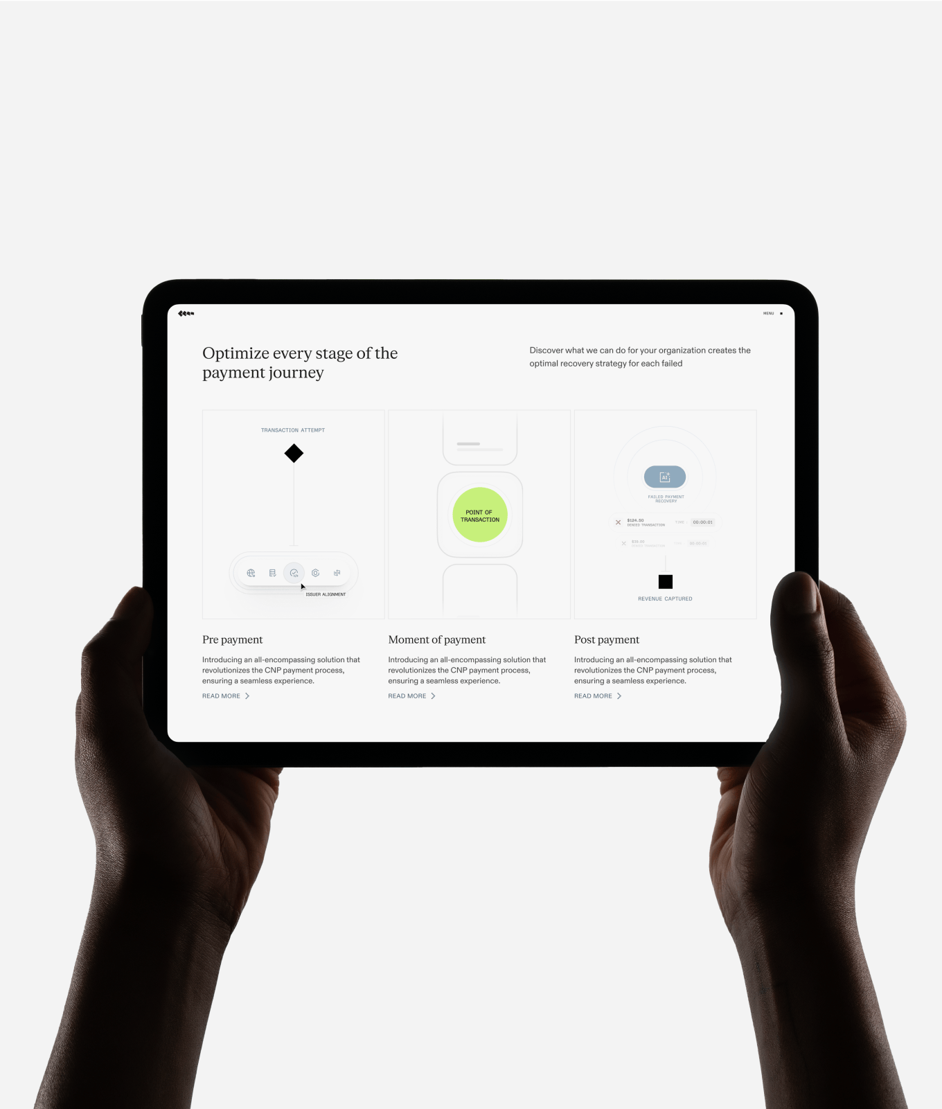
Strategy and design move as one: revealing the unseen, organising the complex, and making every approval count. The strategic platform speaks directly to those accountable for top-line growth, while the visual identity brings this clarity to life.
Revaly now has a brand as sharp as its product — ready to help modern businesses keep payments flowing, customers engaged, and revenue growing.
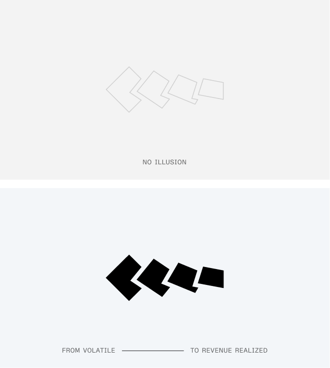
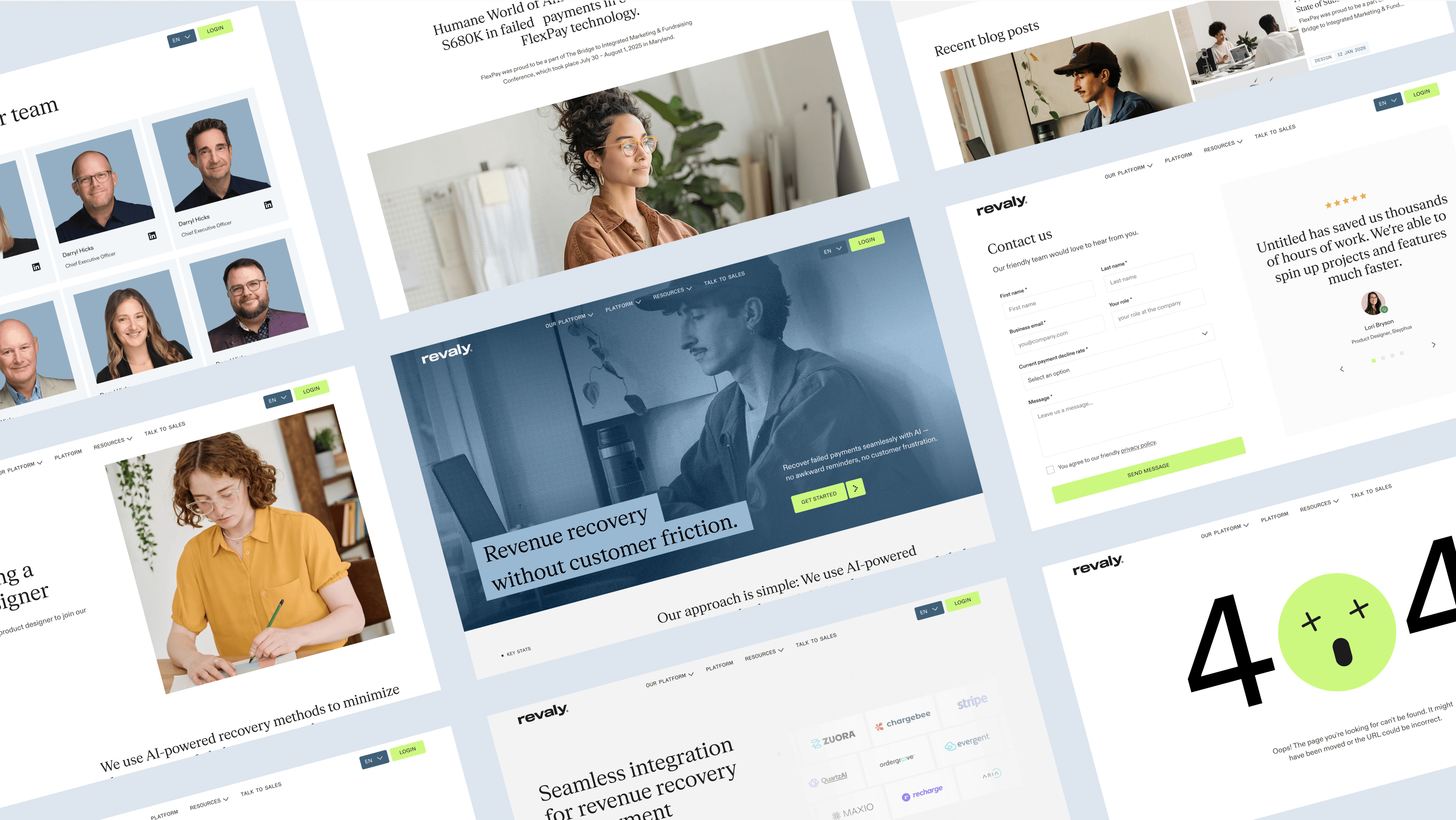
Revaly’s logo pairs a clean, confident wordmark with a distinctive lowercase “r” that signals approachability and precision. The accompanying free-flowing symbol captures the brand’s core promise: seamless momentum from purchase to approval.

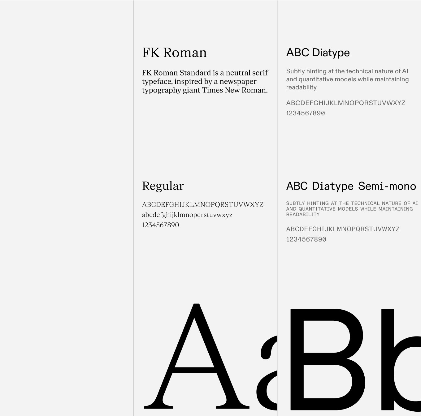

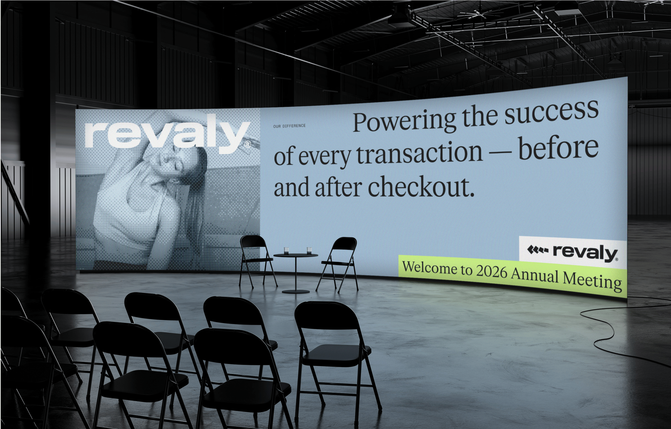



The dither effect was introduced as a subtle yet distinctive visual signature — a digital texture that adds depth and motion without overwhelming the design.

Related work
Telgea
Global mobile plans, made easy
Client: Telgea
Partnership Lead: Michael Valentin
Key Focus: Brand identity, Product Design
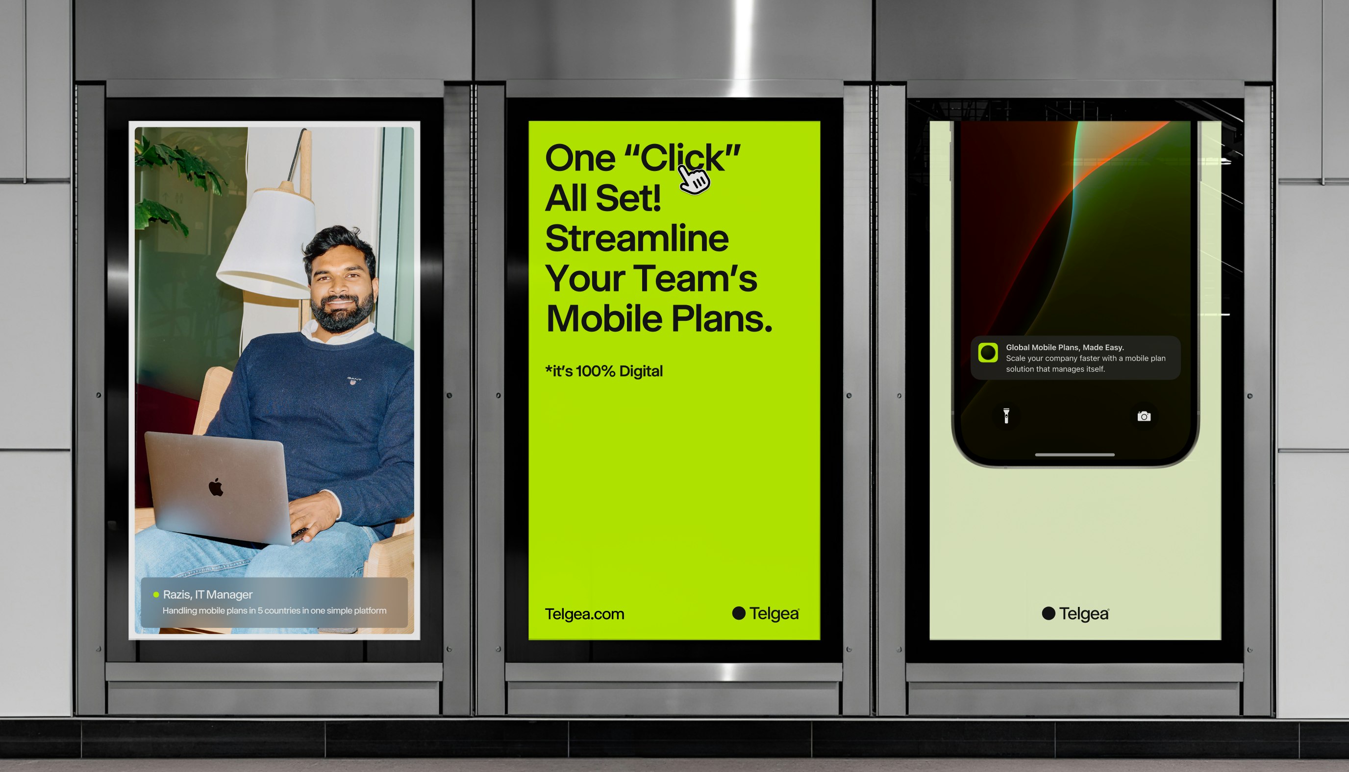
Telgea is a forward-thinking startup with a bold mission: to simplify and streamline telecommunications for businesses. They understand the complexities companies face when juggling multiple carriers, diverse plans across different countries, and managing telecom services for hundreds or thousands of employees. Telgea eliminates this chaos by offering an all-in-one solution. With their platform, businesses can easily acquire local numbers and enjoy a unified plan that meets all their needs.
When developing the Telgea brand, the goal was to craft something that embodies digital innovation and simplicity. The name “Telgea” merges the concepts of “Pangea” and “Telco,” symbolizing a unified telecommunications experience across the globe. This vision inspired a minimalist logo mark, representing the coming together of all continents into a single, connected sphere.