FrançaisContact

Nasstar

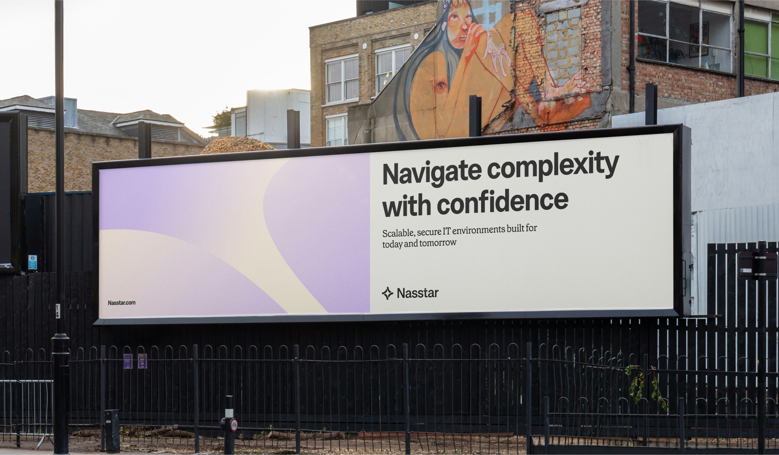
Navigate complexity with confidence
Nasstar case study

Client: Nasstar

Key Focus: Brand, Product
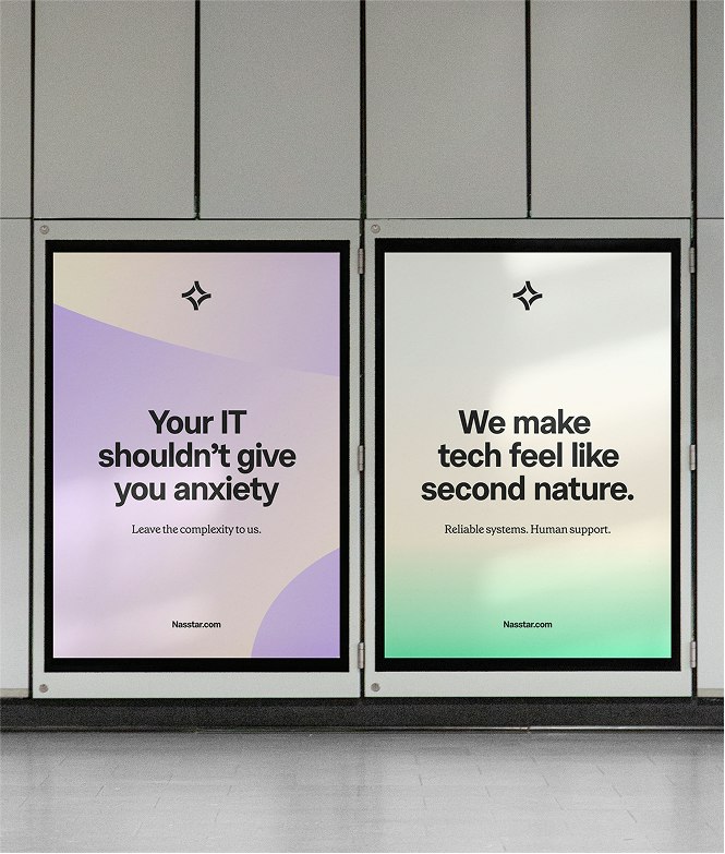
When Nasstar came to us, they’d been at the cutting edge of technology for 25 years, growing steadily through acquisitions. The outcome was an enterprise tech provider with unmatched expertise… and a fragmented brand identity. In a world where technology moves faster than ever, they spoke technical talk to a technical audience. But that audience was shifting, and they needed plain, human language. Their challenge wasn’t just to look modern – it was to sound approachable, cut through complexity, and prove that in a sea of similar services, their real difference was people and approach. We began with strategy and an insights sprint, interviewing stakeholders across the business to uncover who Nasstar really was beneath the jargon. The findings were clear: every competitor sells the same Microsoft, cloud, and networking solutions, but Nasstar’s real value lies in how they deliver them – curious, collaborative, ambitious, authentic, and above all, easy to understand. We built a positioning that celebrated people as much as technology, shifted their tone of voice from technical to plain-speaking, and set the stage for a brand that made enterprise technology not just clear, but enjoyable.

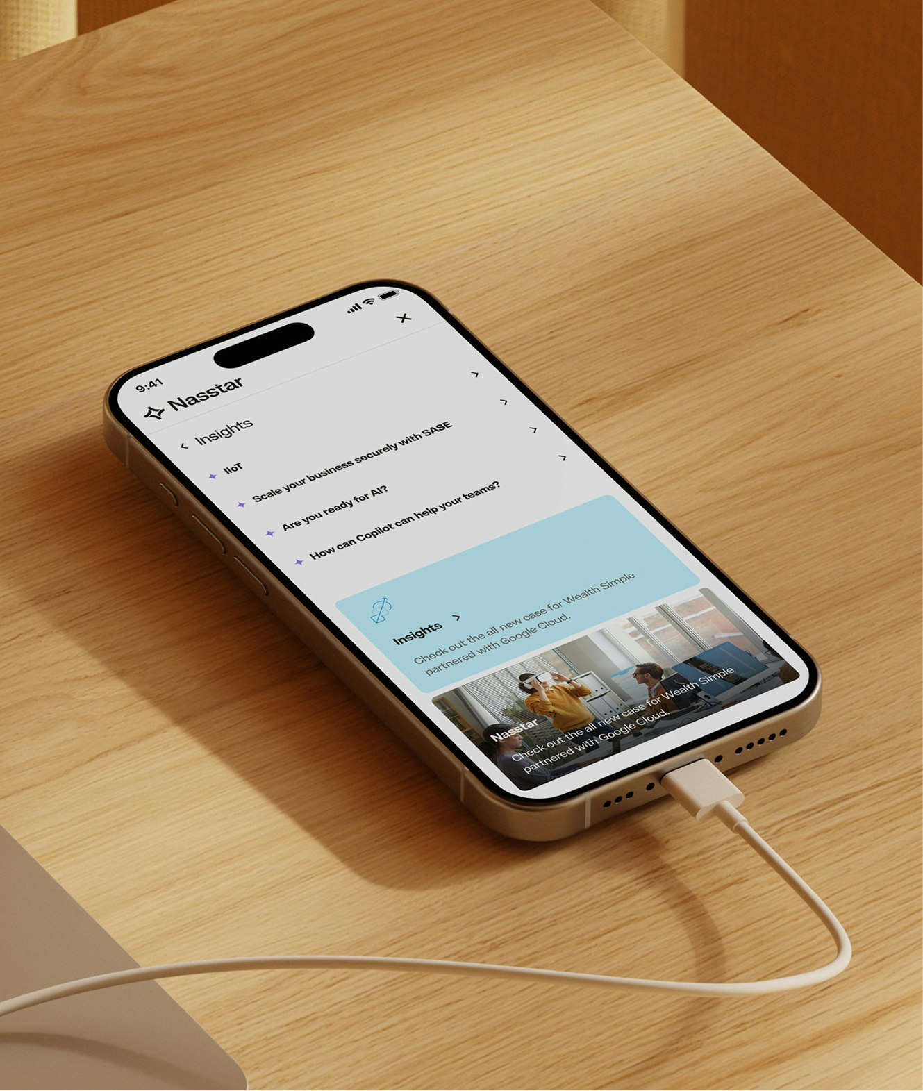
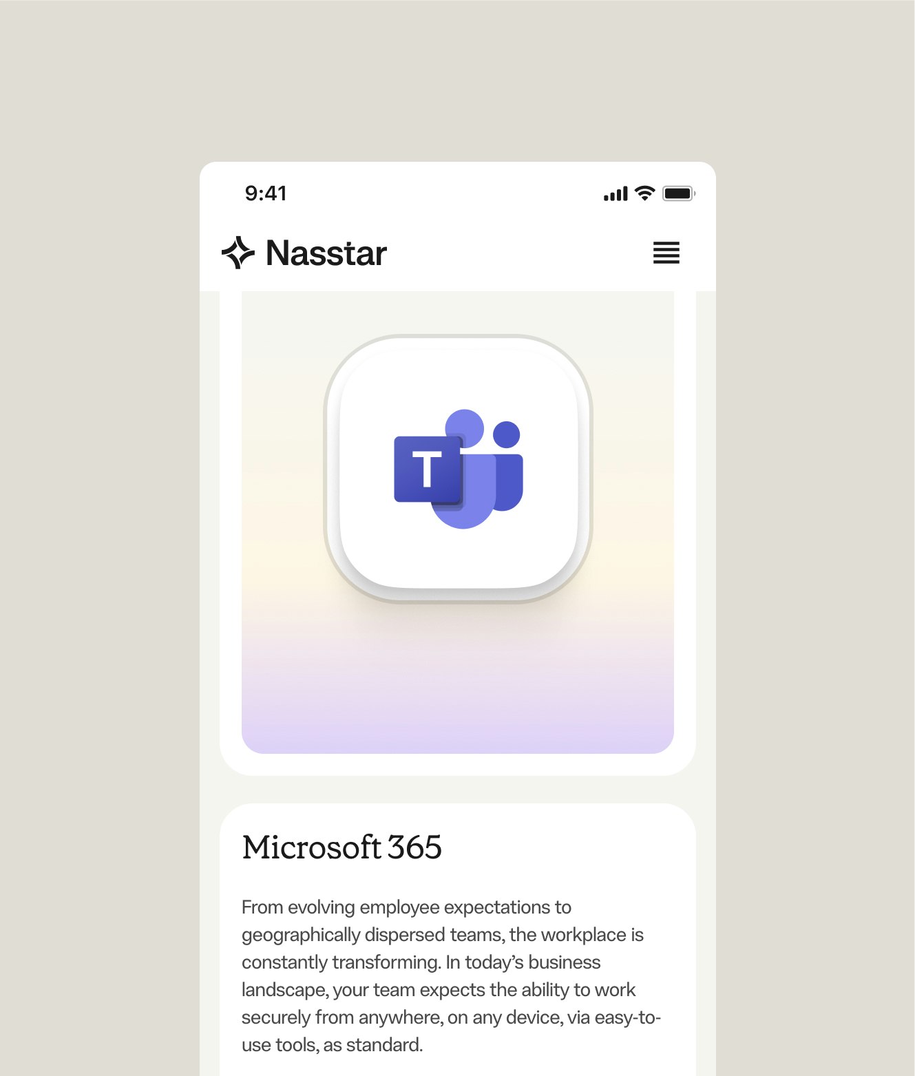
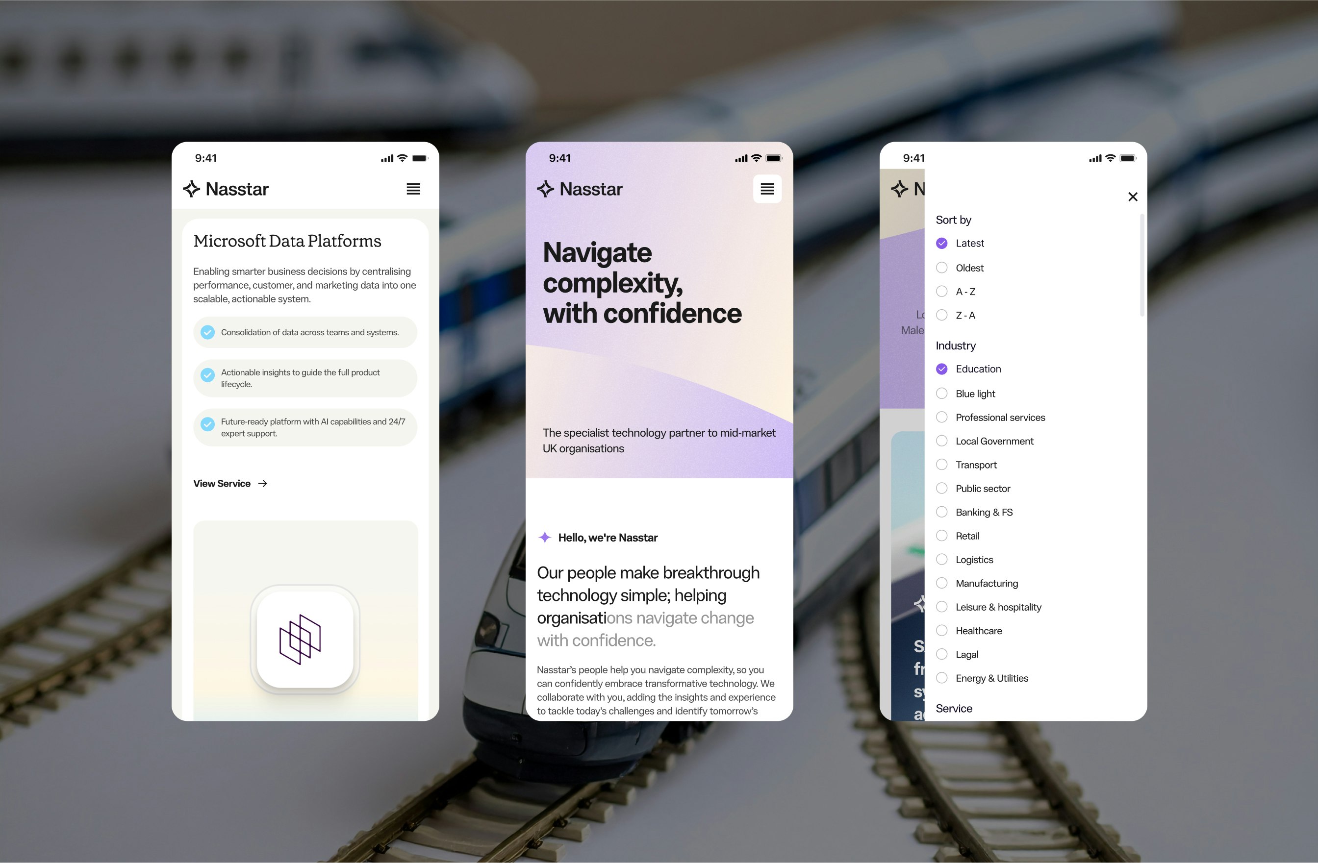
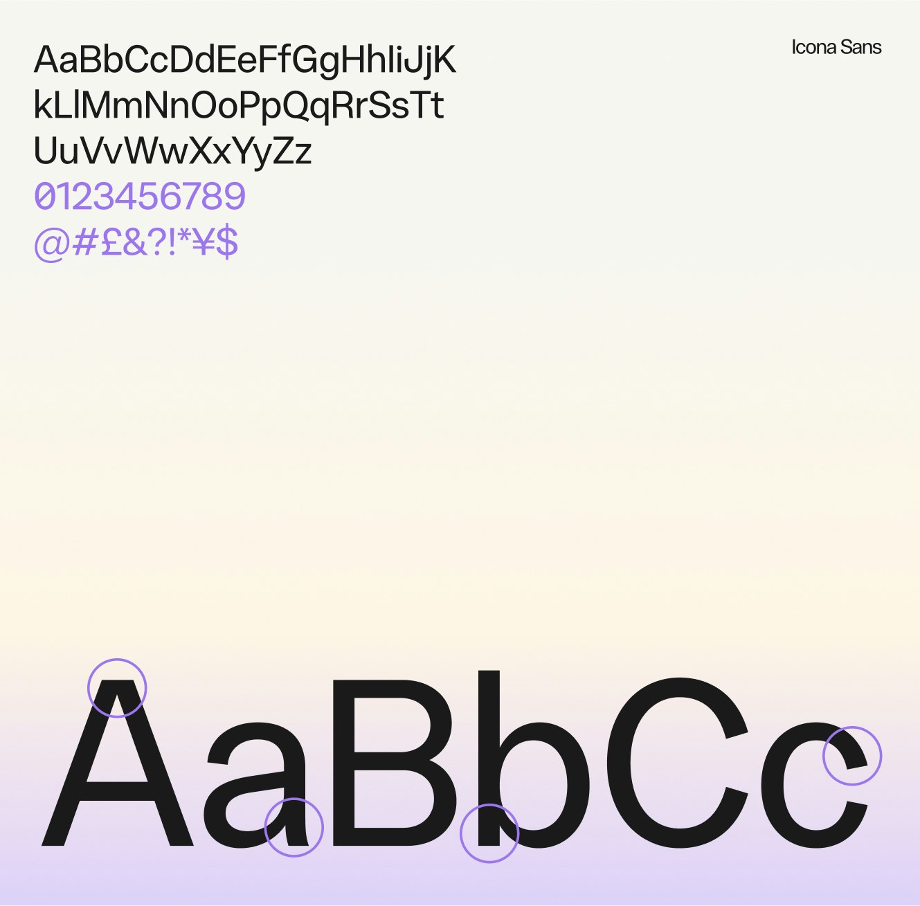
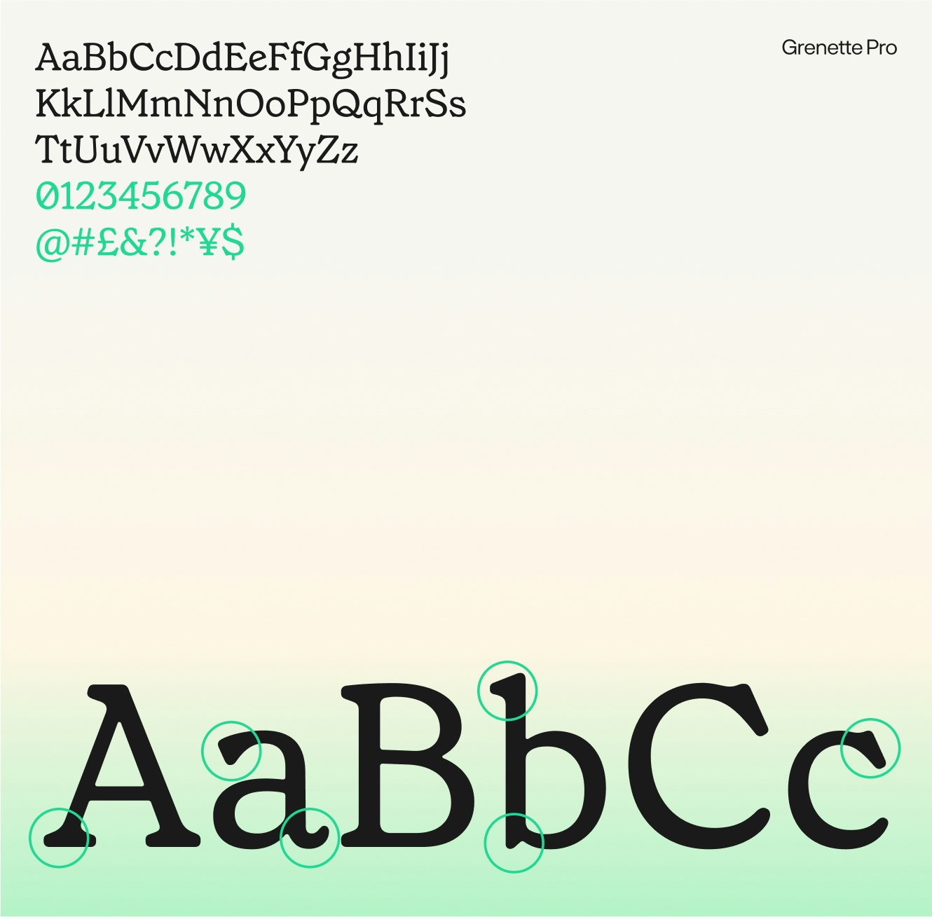
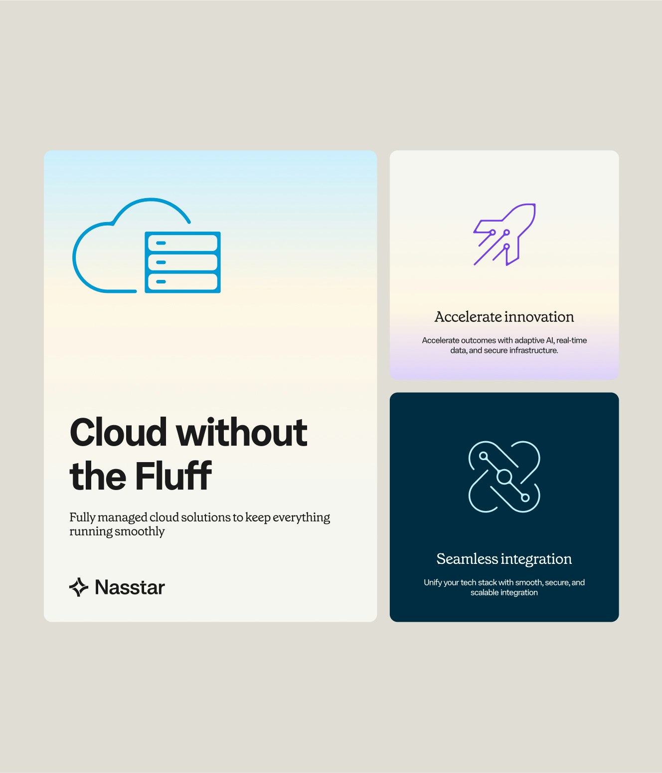
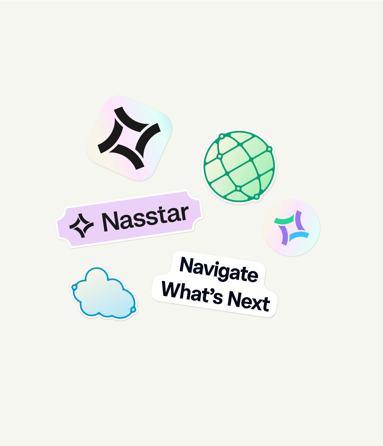
Visually,welightenedthepalette,introducedservice-specificcolours,andcraftedplayfulpictogramswithrounded,approachableforms.ThelogowasrefinedtonodtoNasstar’sservicelineswhilefeelingmodernanddistinctive.

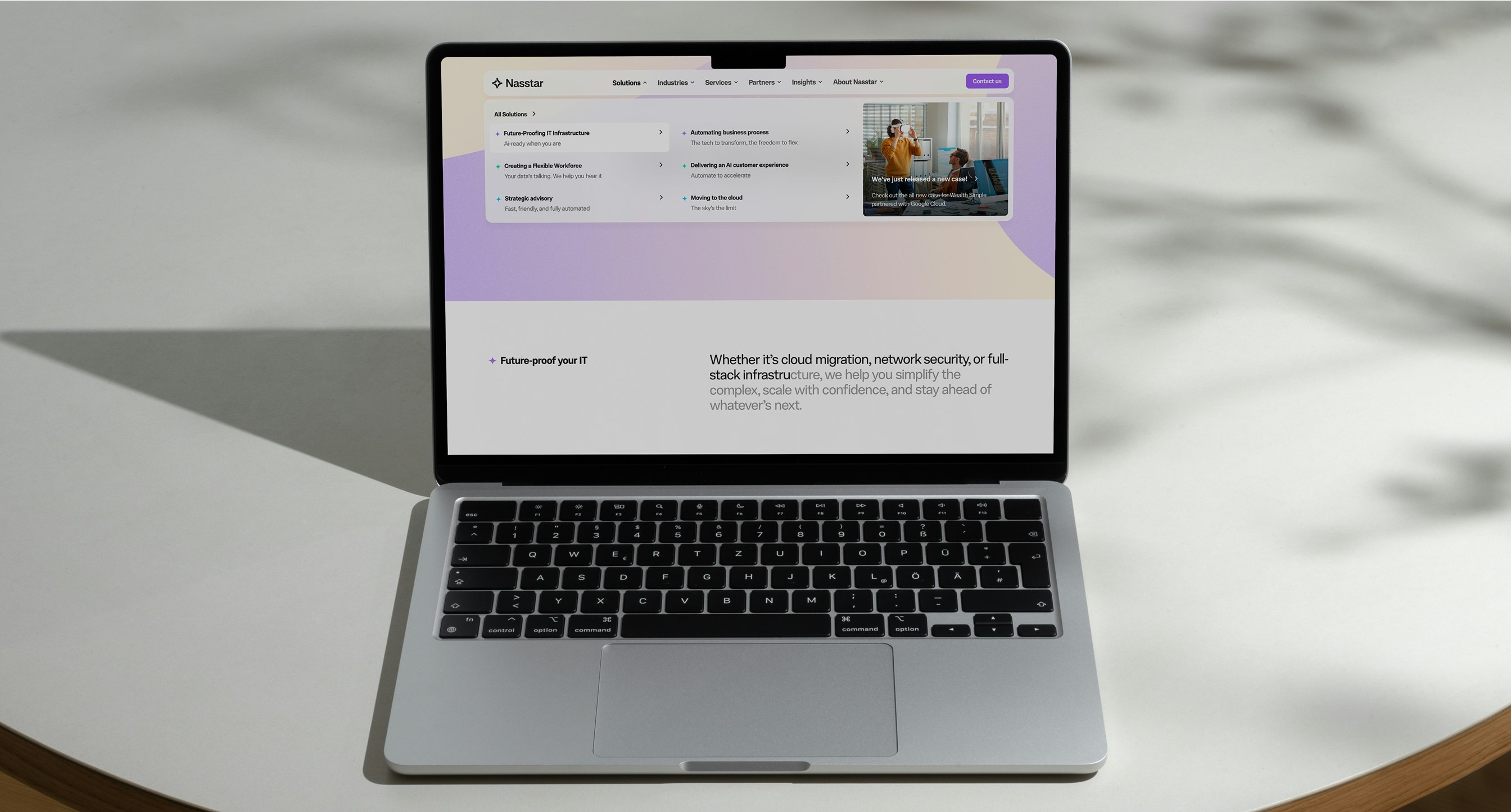
Onthewebsite,simplifiednavigationandawarmer,moreconversationaltonemadedecision-makingfasterandeasier.Inshort:wekeptthebrainsofaserioustechbrand,andturnedupthepersonality.

Byshiftingfromcomplexitytoclarity,Nasstarimprovednotonlycustomerengagementbutalsointernalculture,withemployeesrallyingbehindabrandtheycouldeasilyarticulate.

Kudos to

Strategist / Joe Portman

Designer / Lukas Jurcik

Designer / Christopher Ashton

Strategist / Gul Cheema

Client Lead / Dženita Džindo

Designer / Hakim Hasni

Designer / Sarah Delfos

Developer / Dudley Denman-Rees

Developer / Junhwan Im

Developer / Frederik Højriis

Related work

Telgea

Global mobile plans, made easy
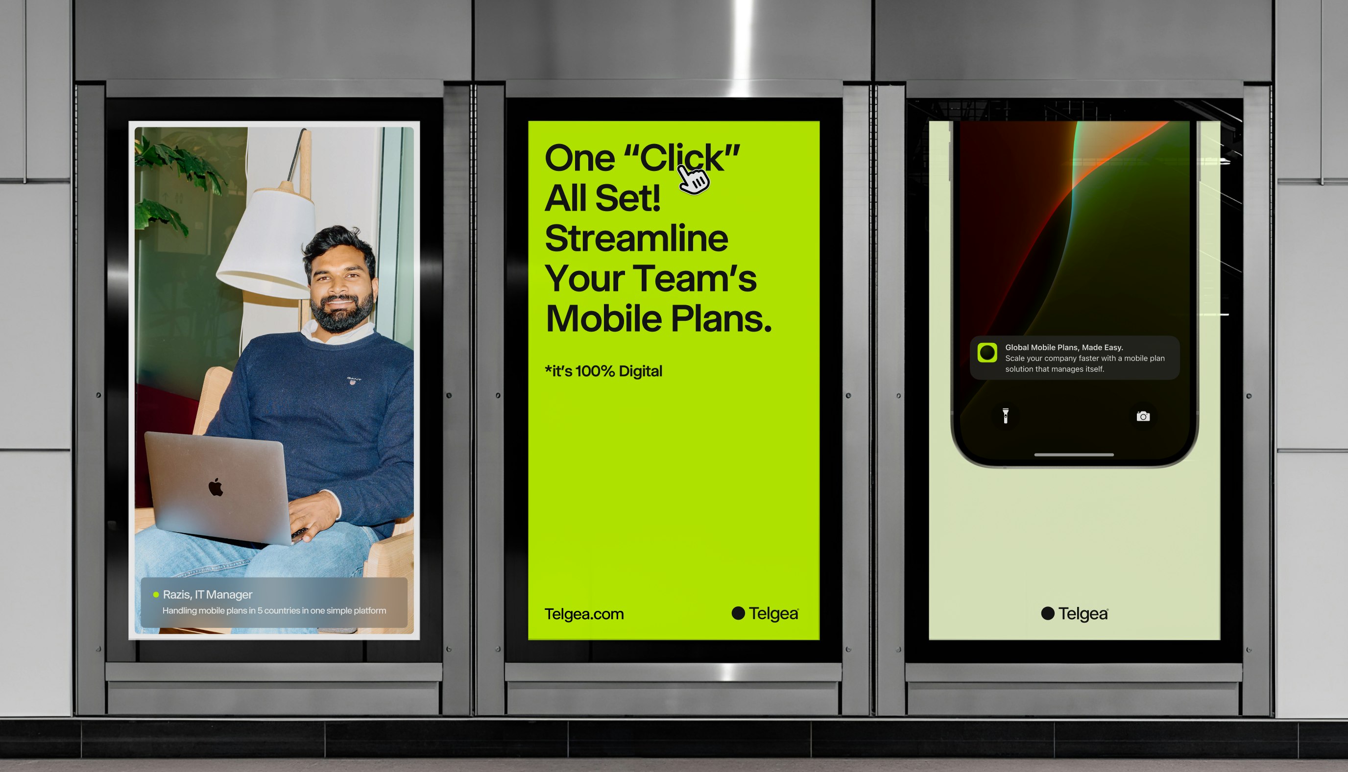
Telgea case study

Client: Telgea

Partnership Lead: Michael Valentin

Key Focus: Brand identity, Product Design

Telgea is a forward-thinking startup with a bold mission: to simplify and streamline telecommunications for businesses. They understand the complexities companies face when juggling multiple carriers, diverse plans across different countries, and managing telecom services for hundreds or thousands of employees. Telgea eliminates this chaos by offering an all-in-one solution. With their platform, businesses can easily acquire local numbers and enjoy a unified plan that meets all their needs.

 When developing the Telgea brand, the goal was to craft something that embodies digital innovation and simplicity. The name “Telgea” merges the concepts of “Pangea” and “Telco,” symbolizing a unified telecommunications experience across the globe. This vision inspired a minimalist logo mark, representing the coming together of all continents into a single, connected sphere.