Moebe
Choose less, expect more.
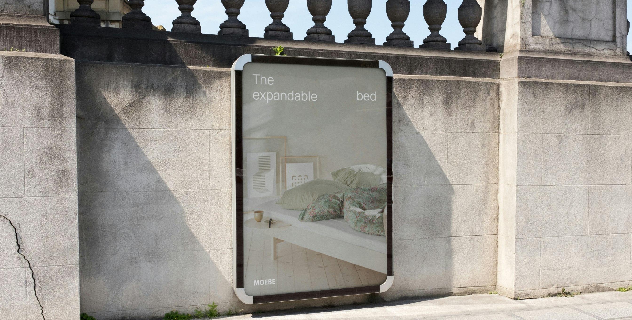
Client: Moebe
Key Focus: Branding
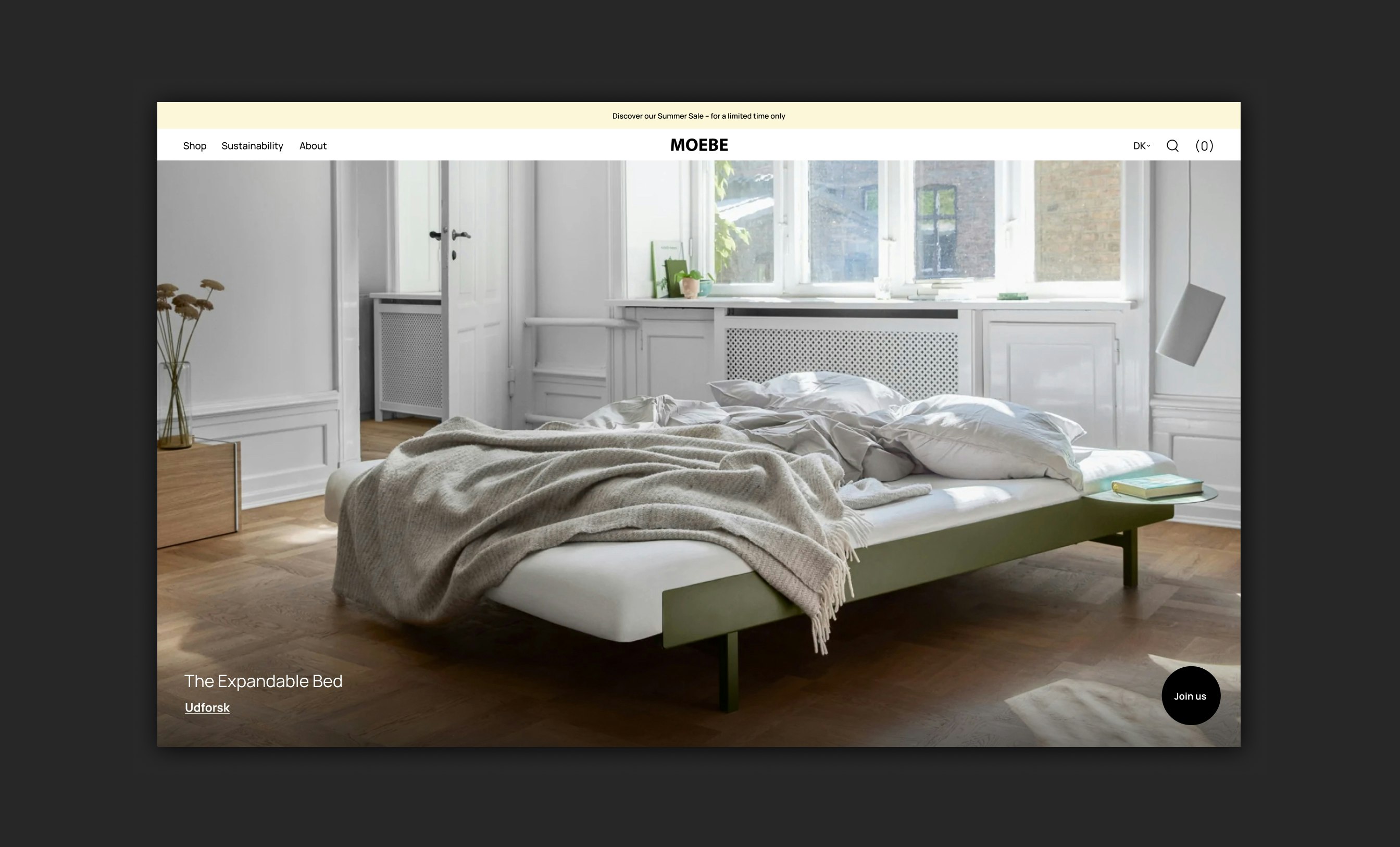
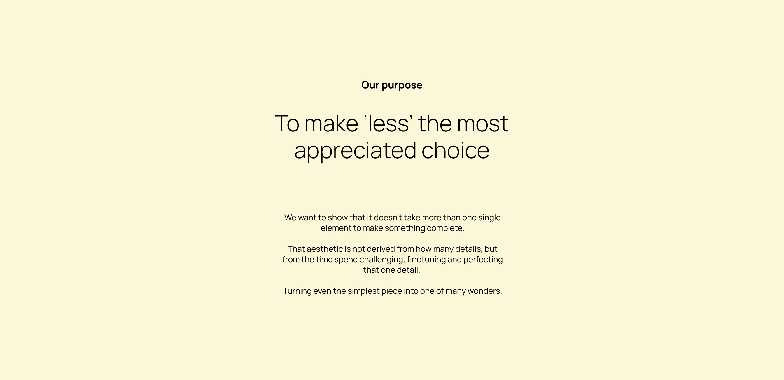
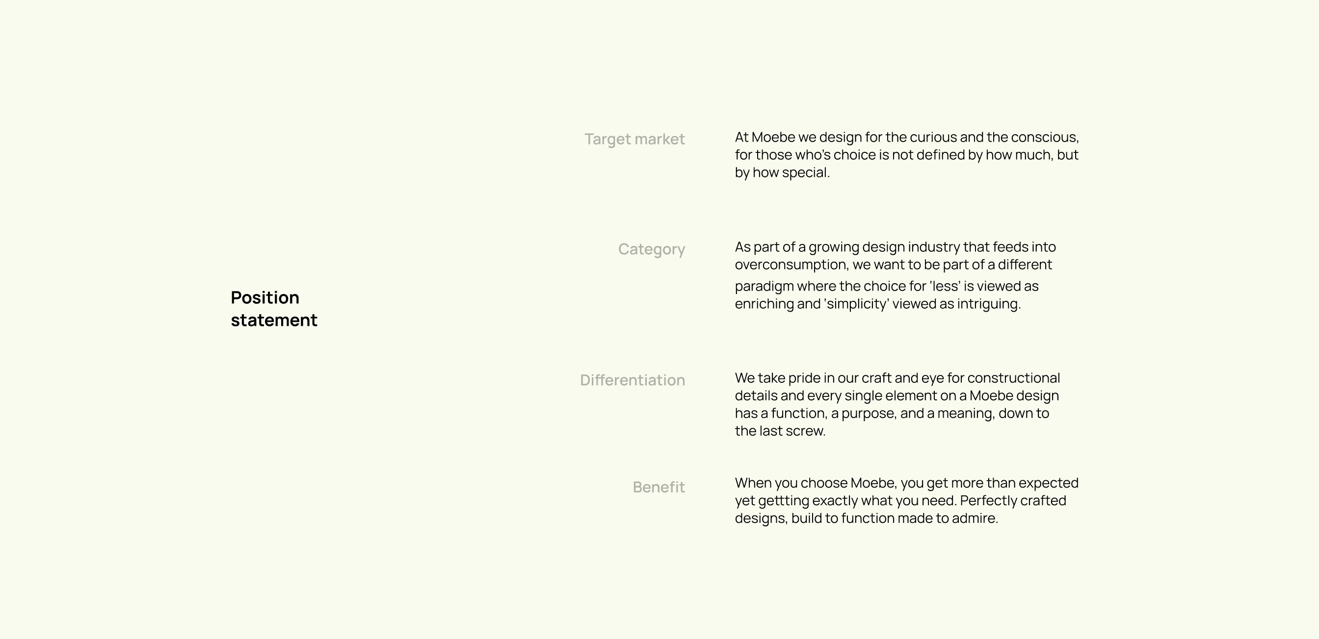
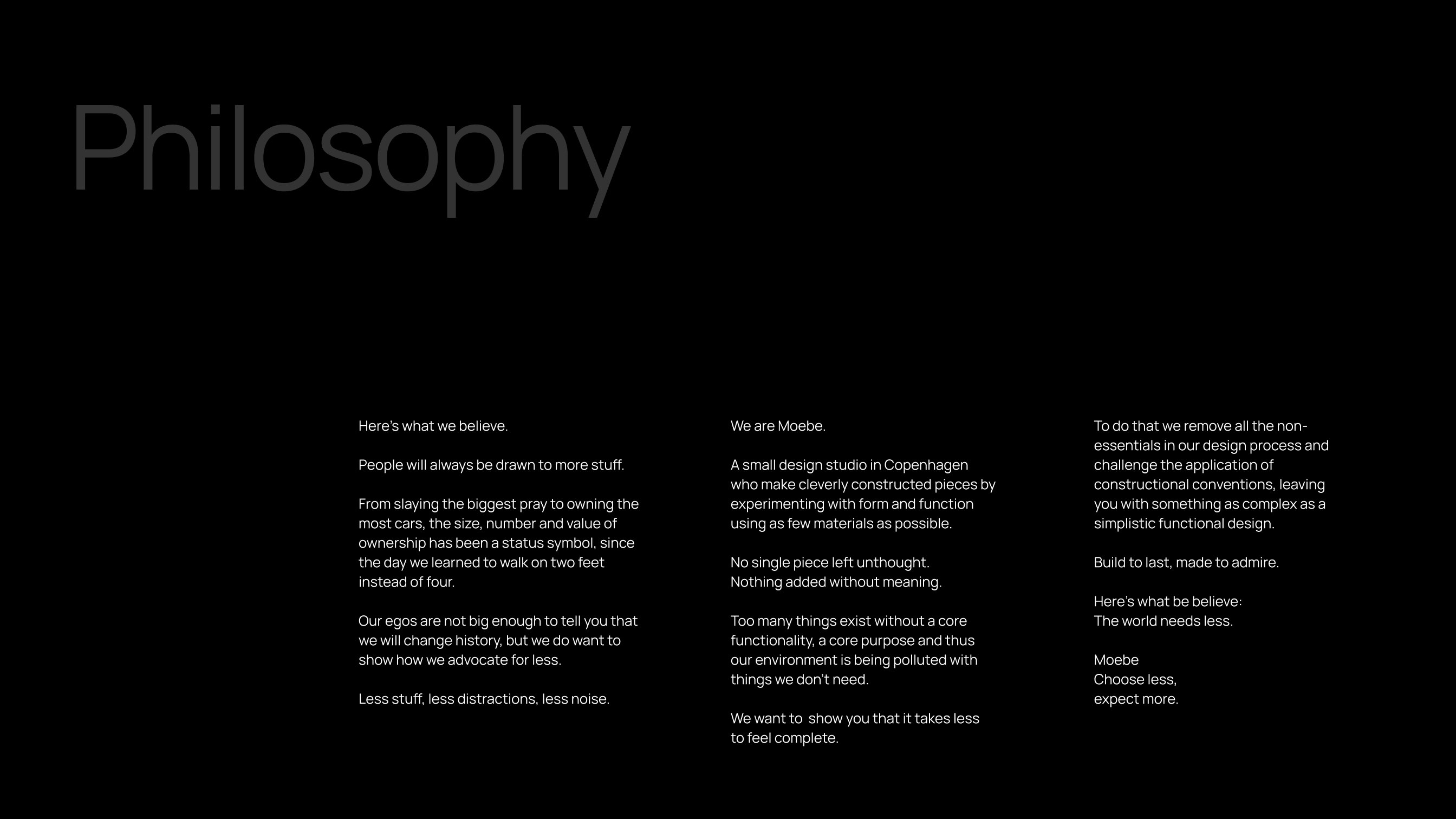
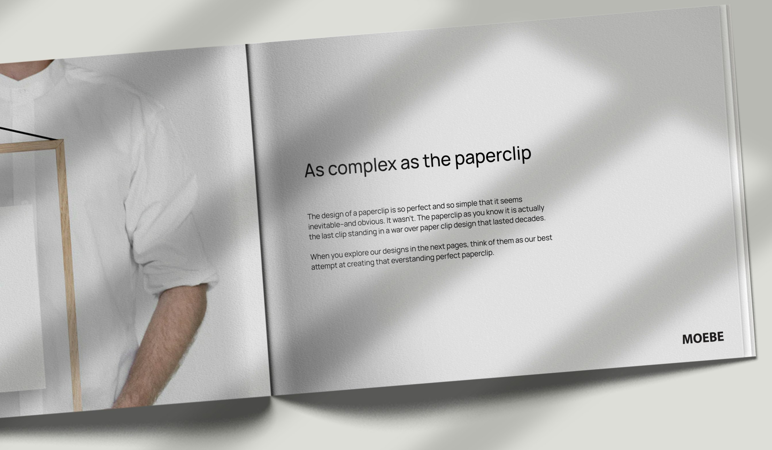
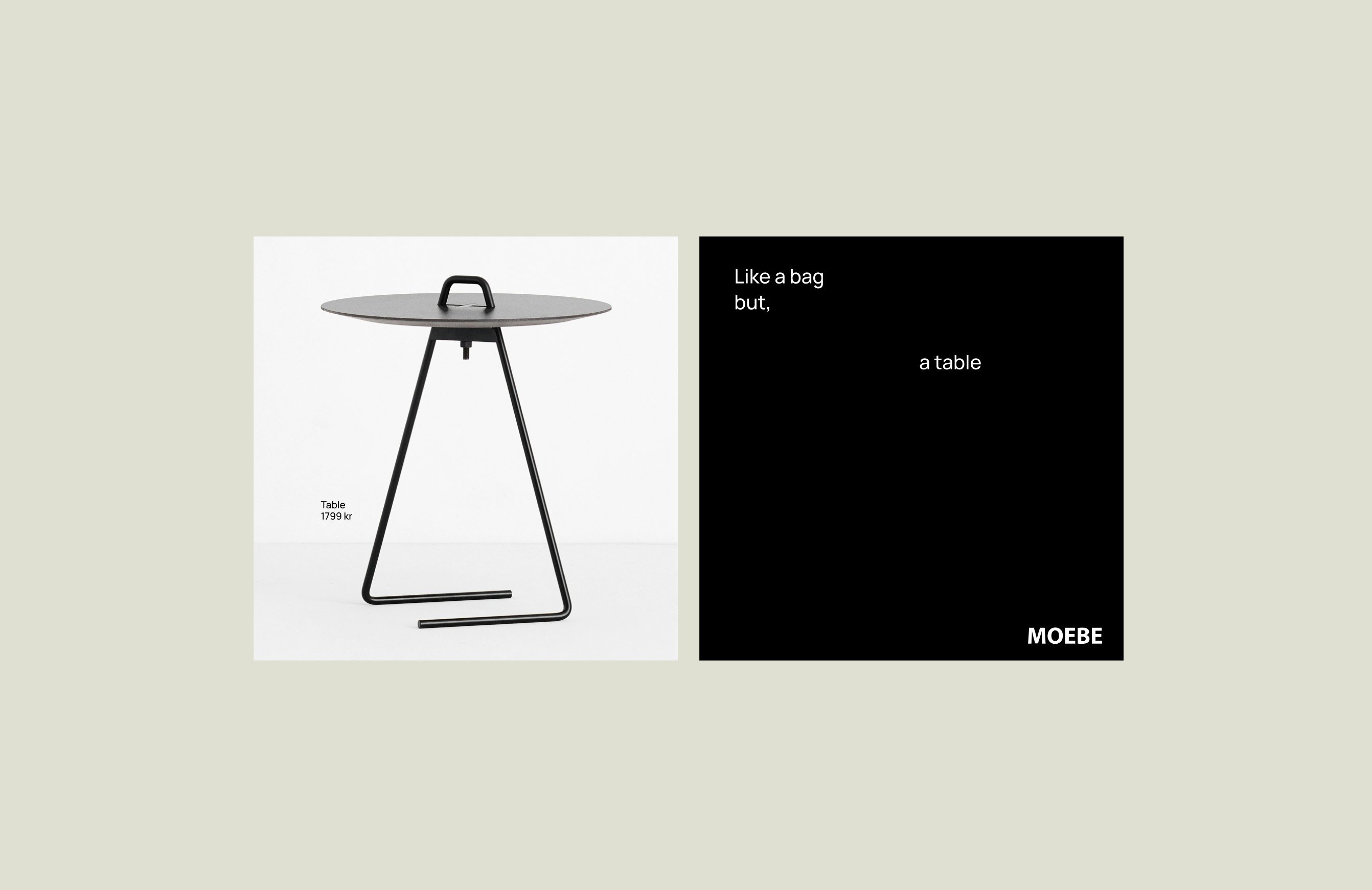
For design studio, Moebe, simplicity and function reign king. Their consciously constructed design items leave no room for excess, and their branding requires the same thoughtfulness. In navigating the tension between minimal and distinct in their digital presence, striking that balance was a key challenge in upgrading their brand platform and identity.
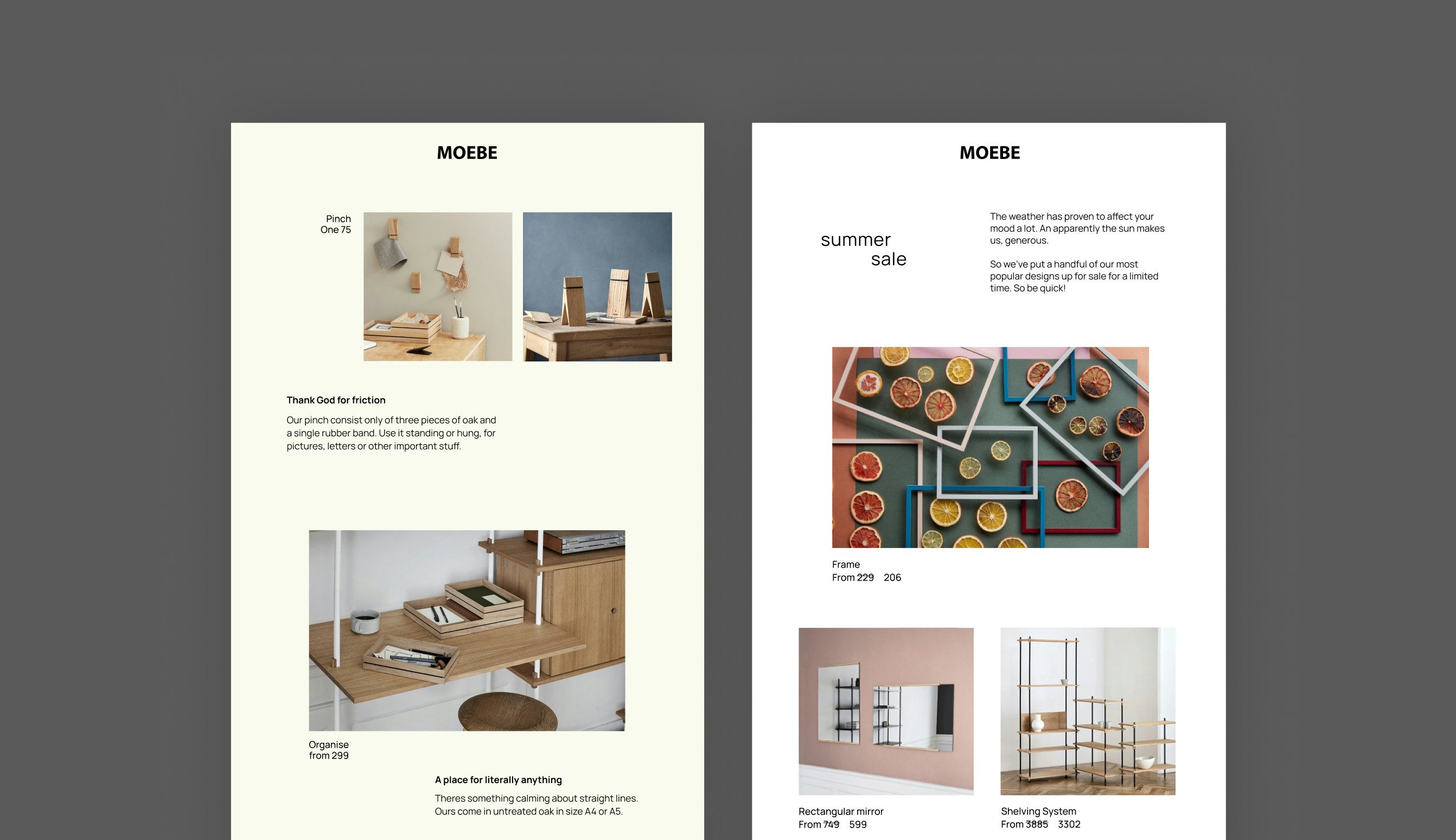
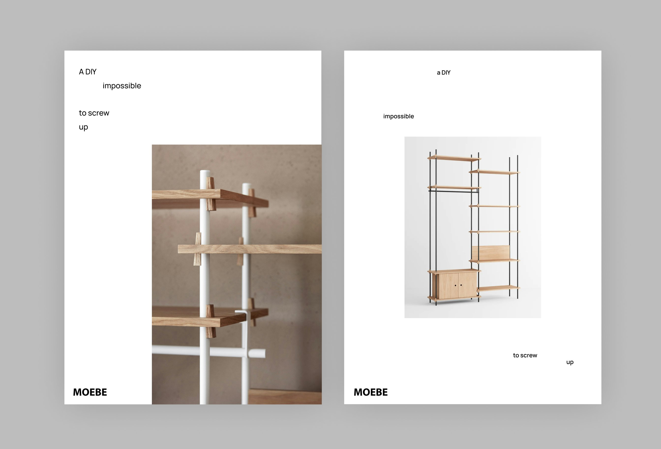
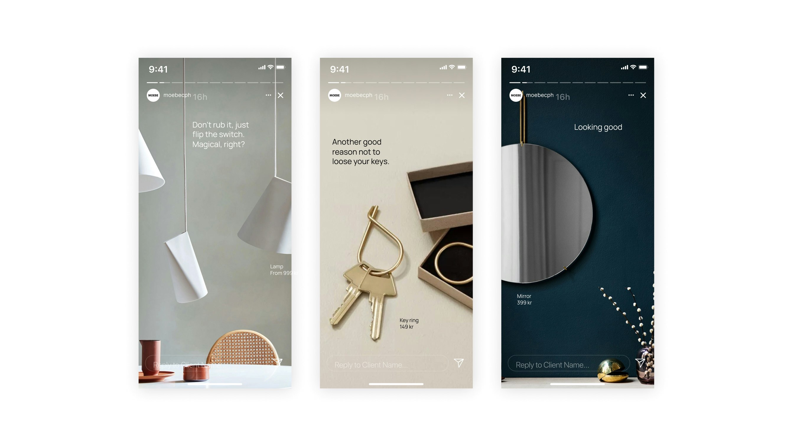
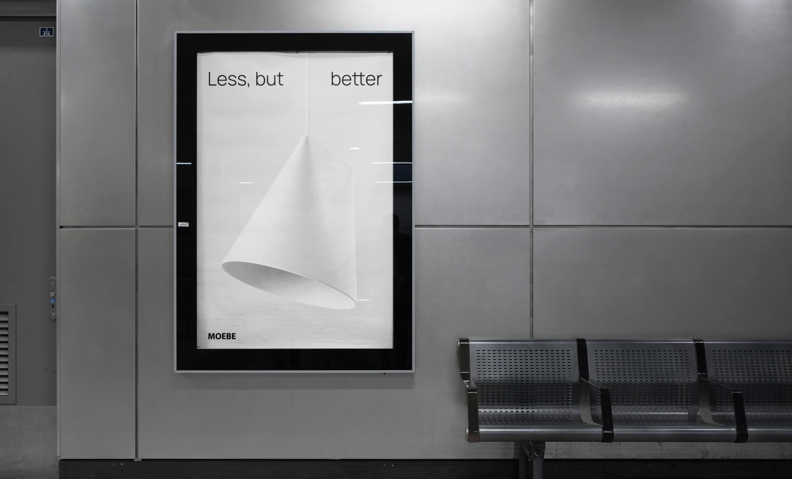
The result is a brand that uses playful touches to reveal added meaning behind every word and visual – making more out of less.
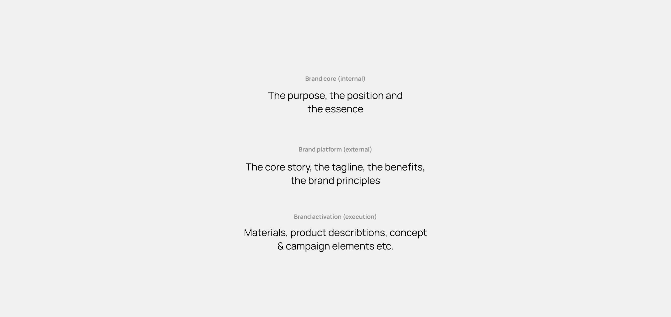
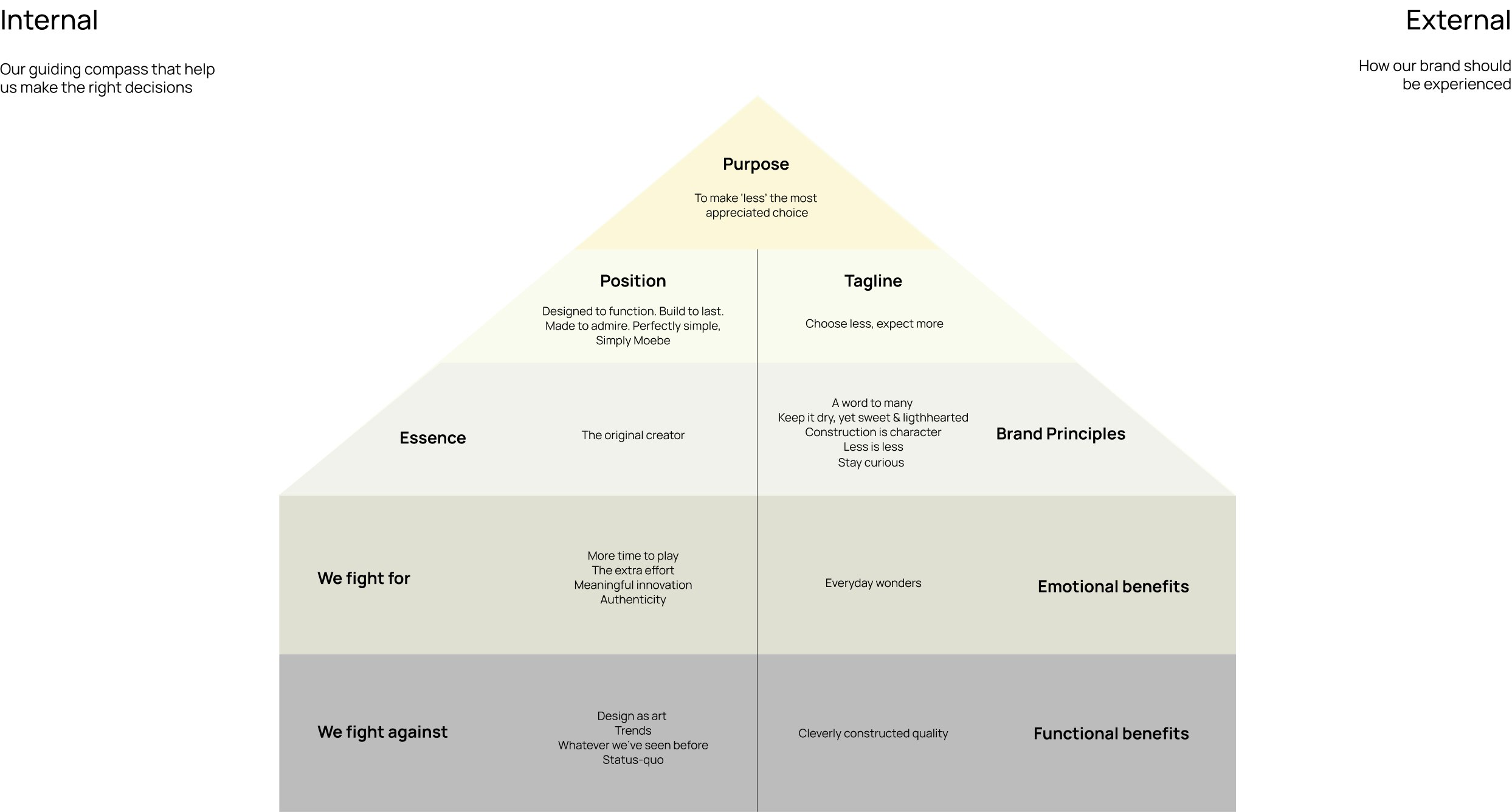
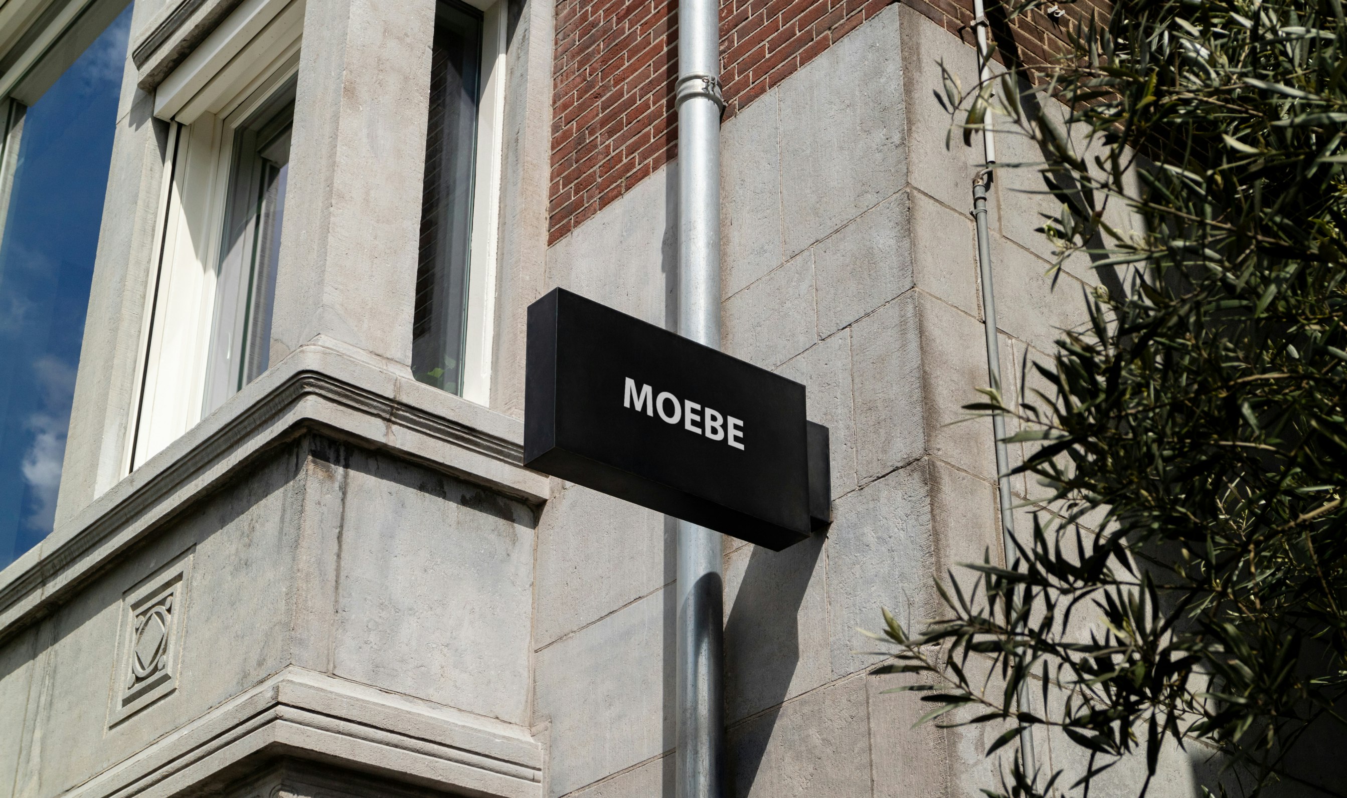
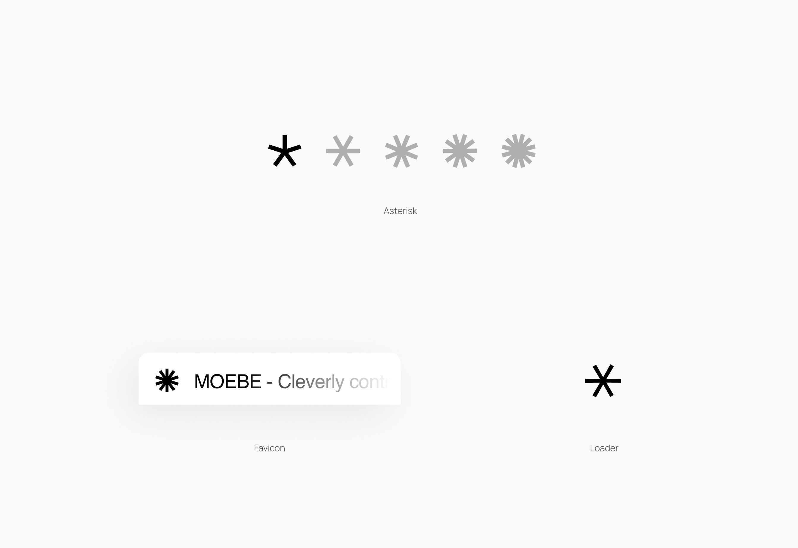
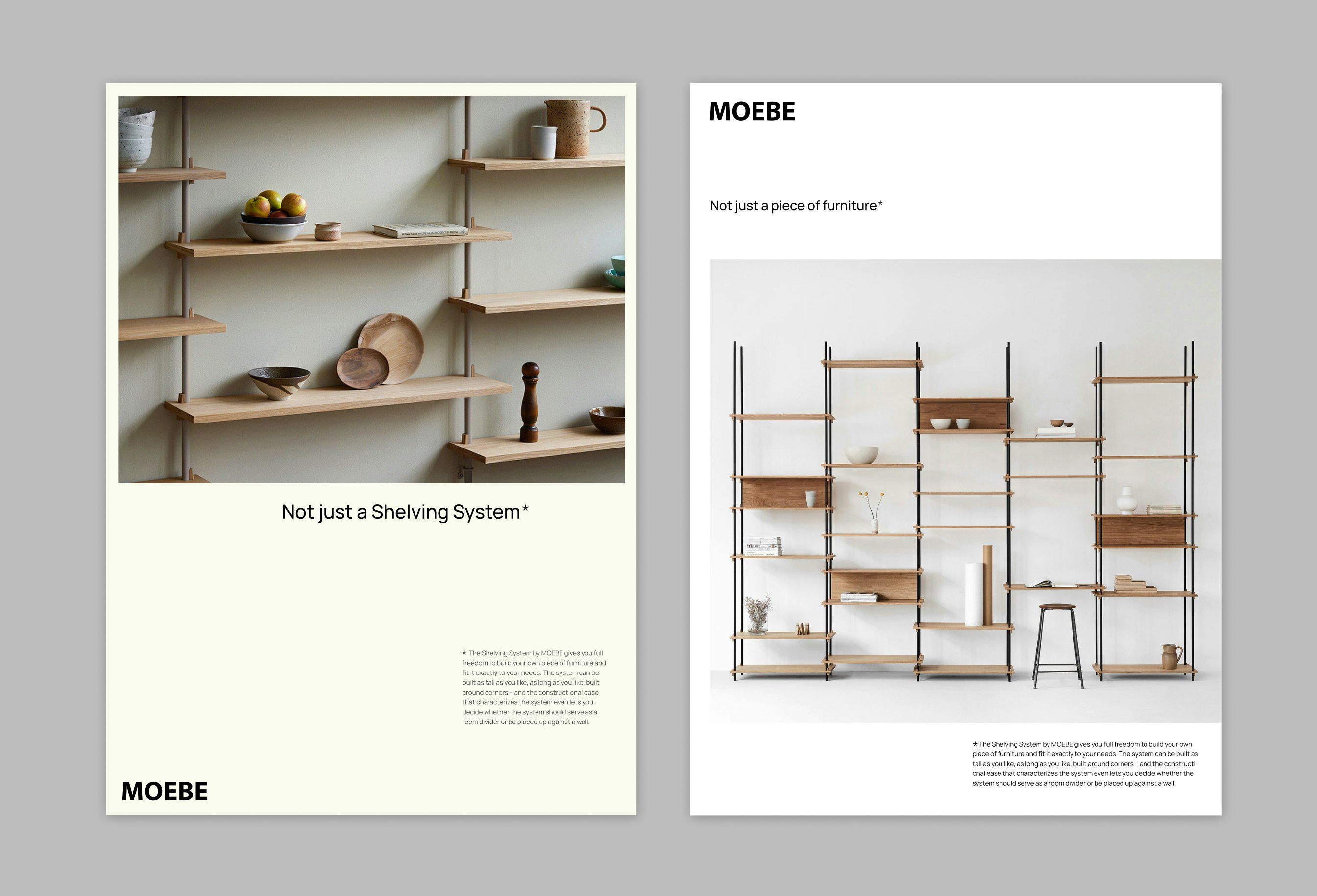
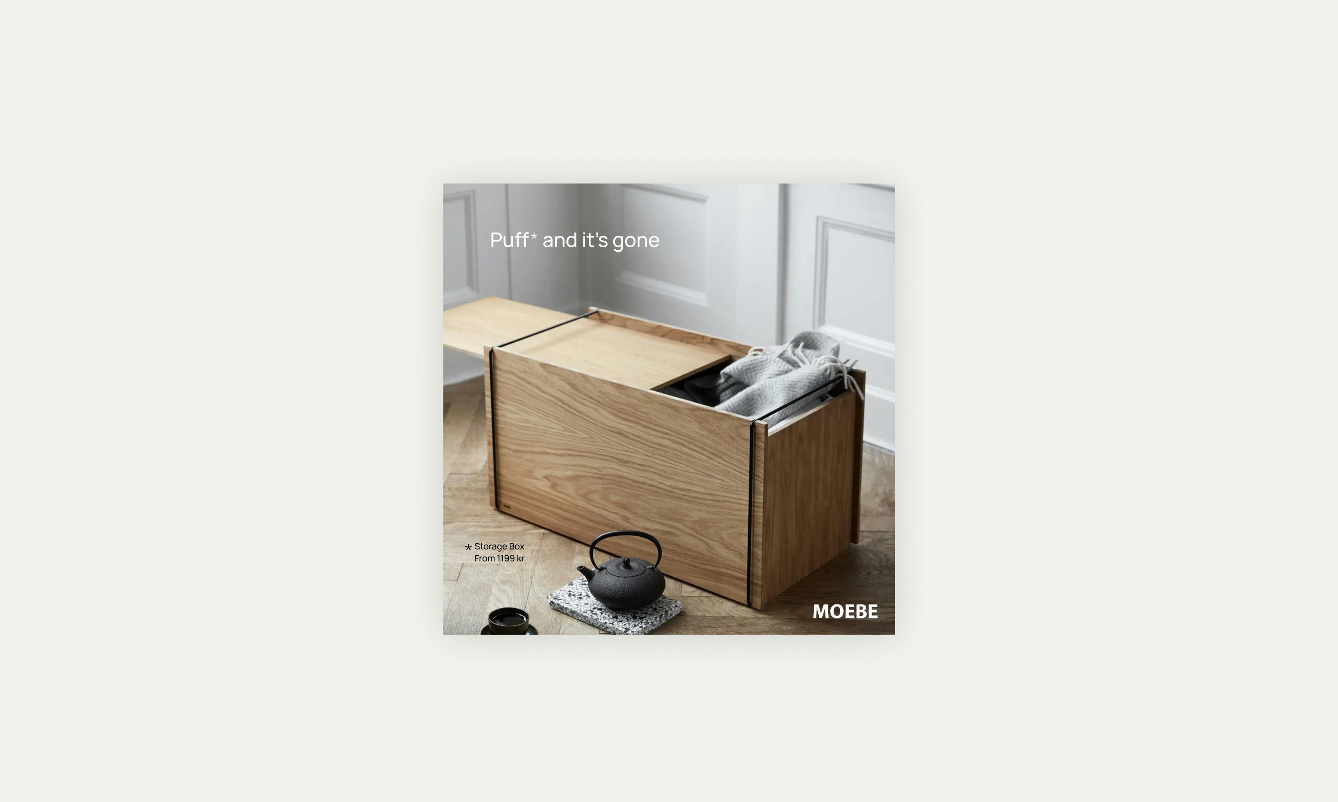
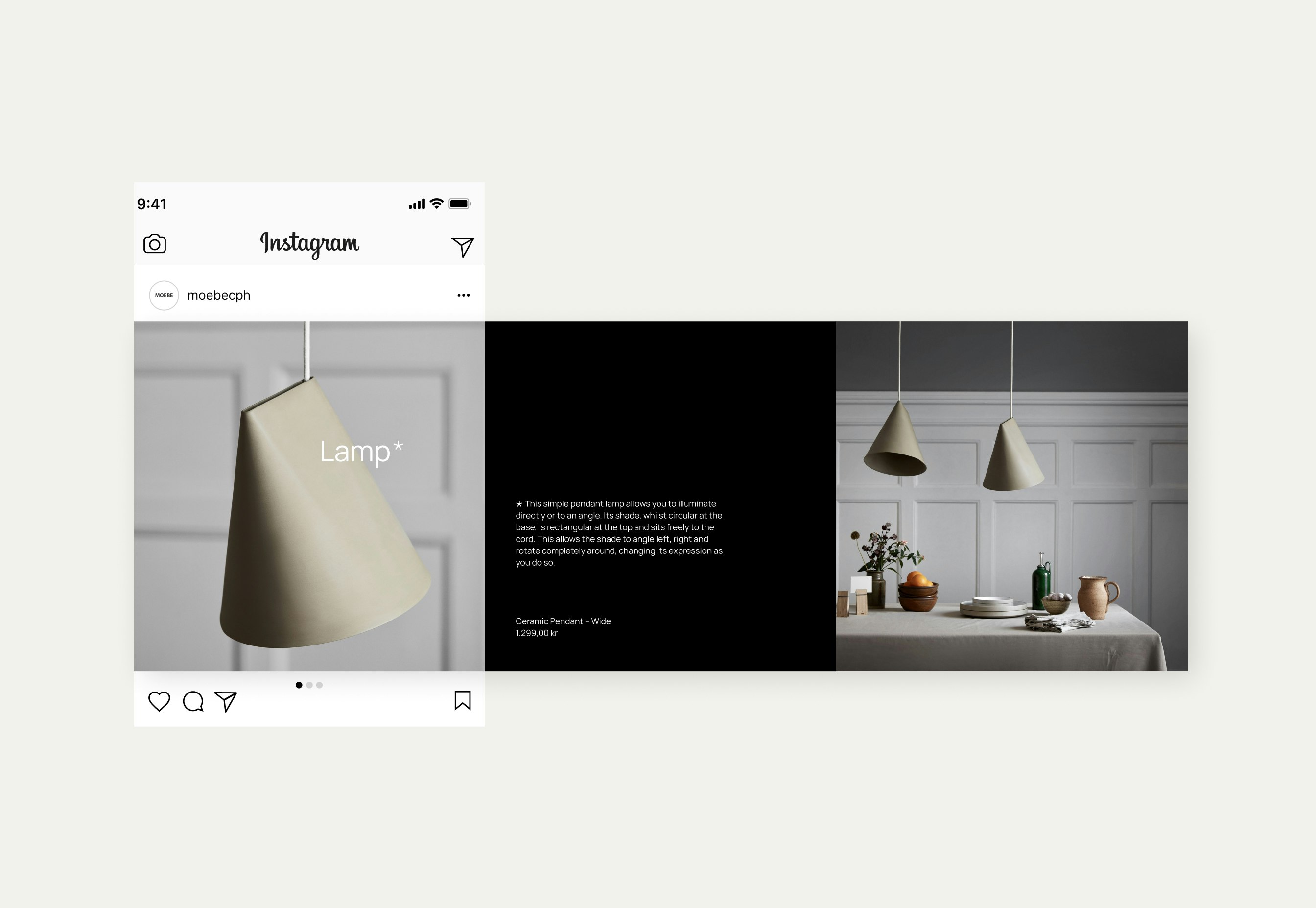
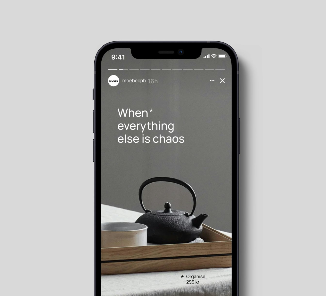
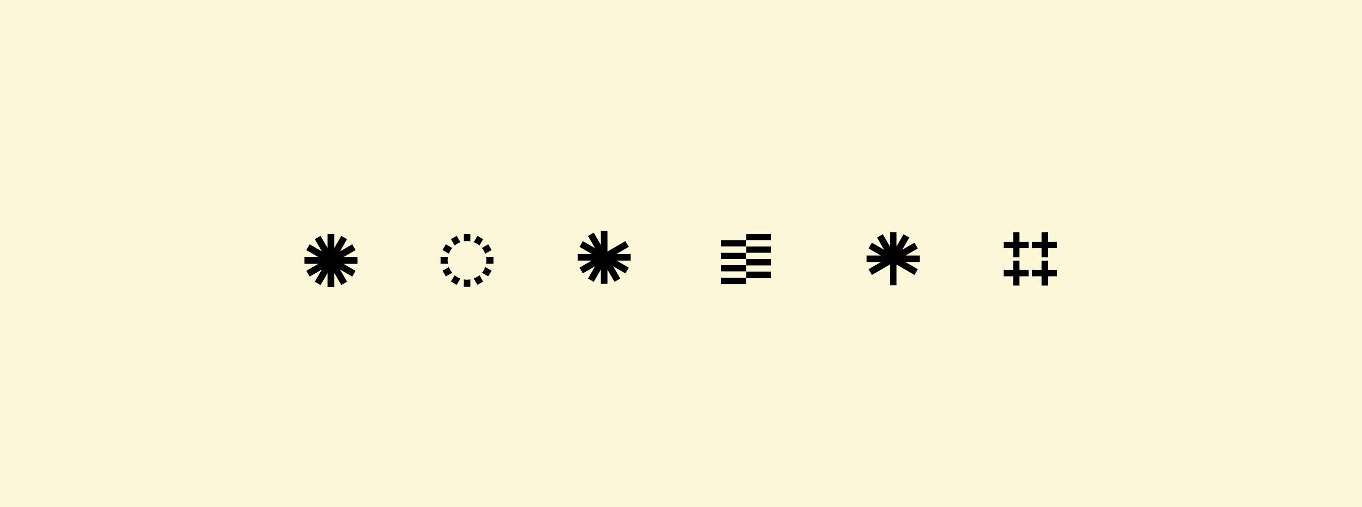
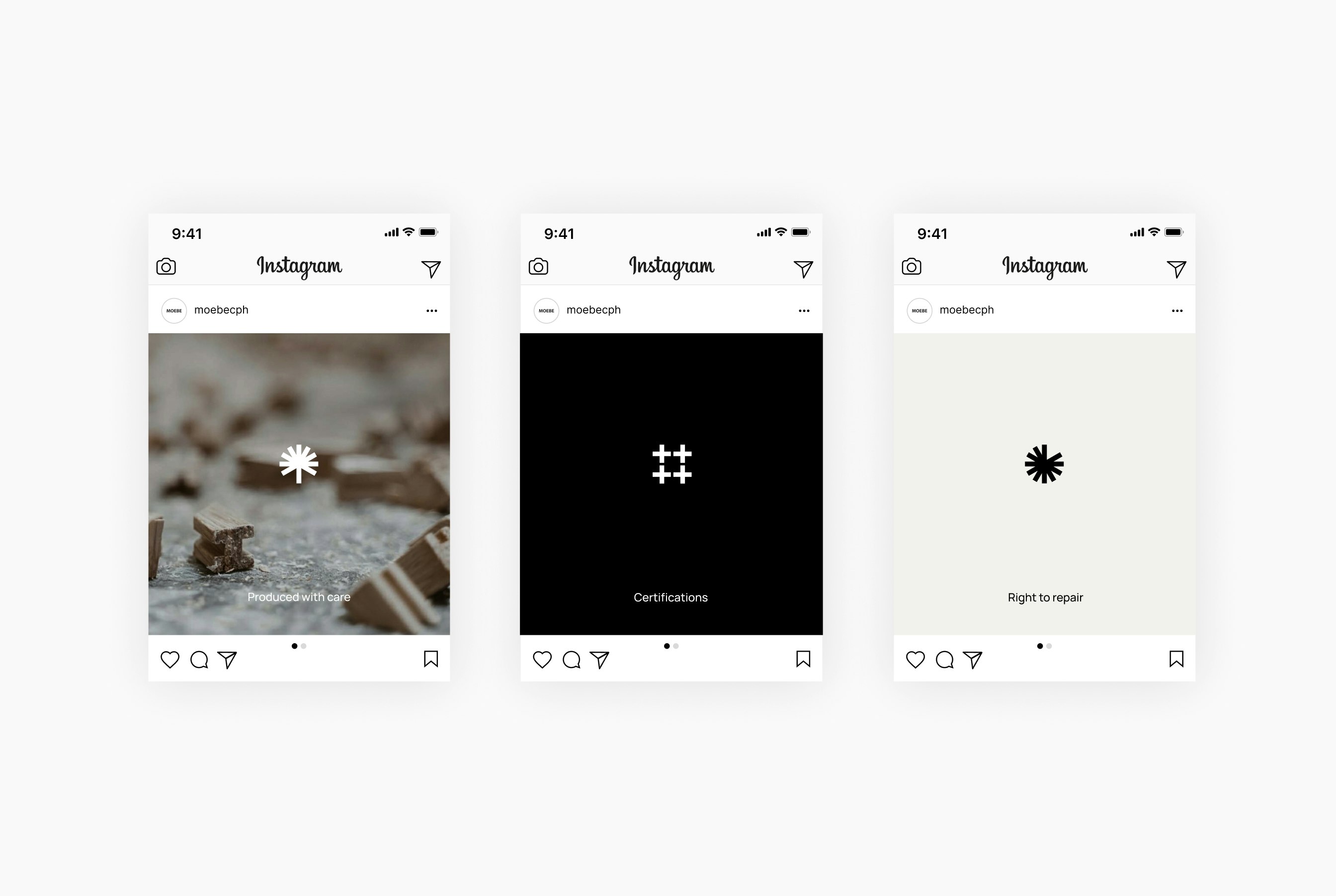
Small symbols are used to reveal more details about a product – helping to ensure there is not a word too many.
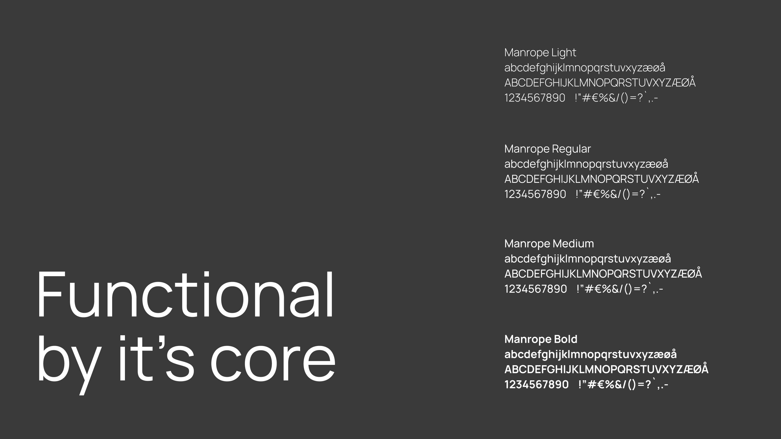
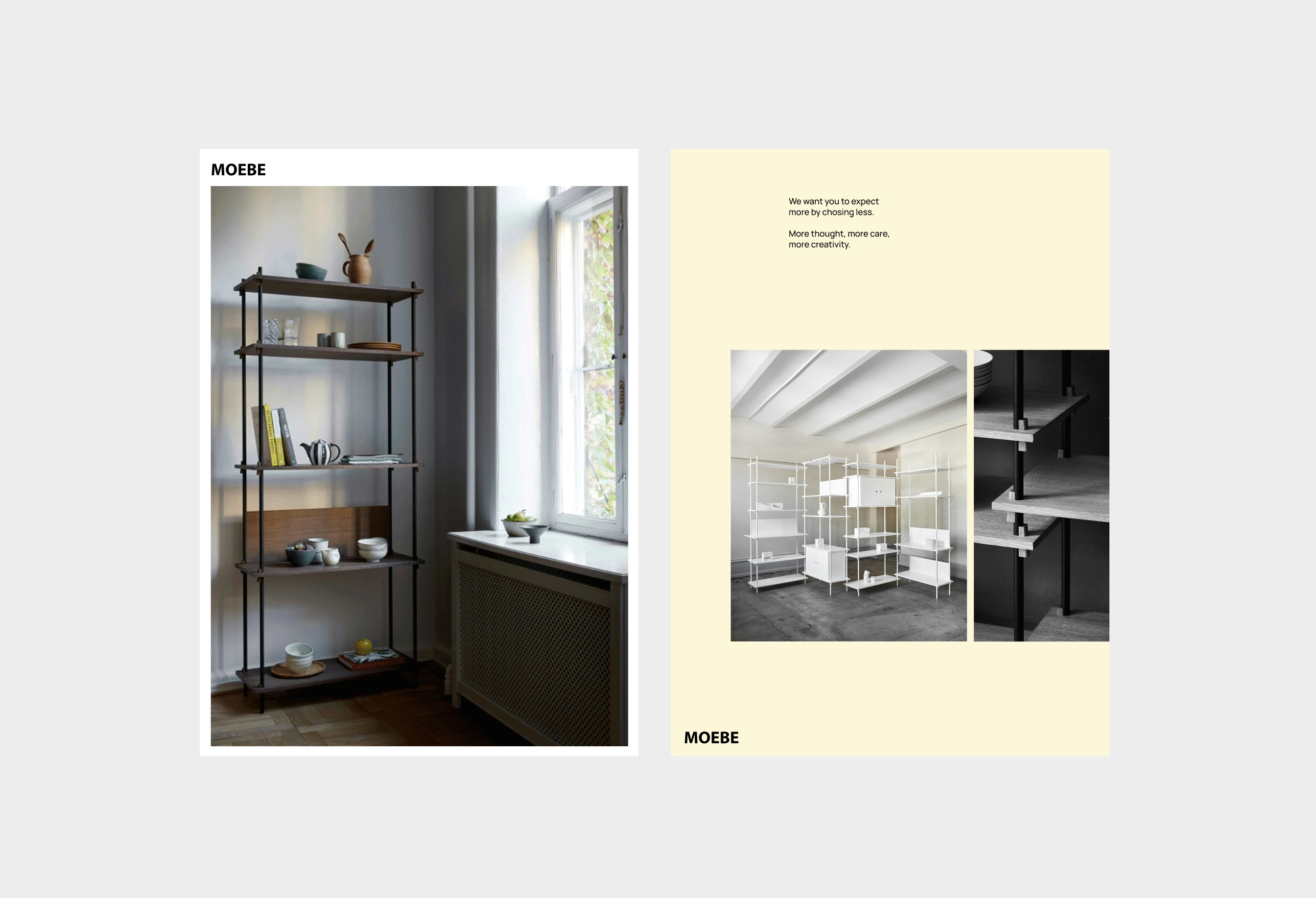
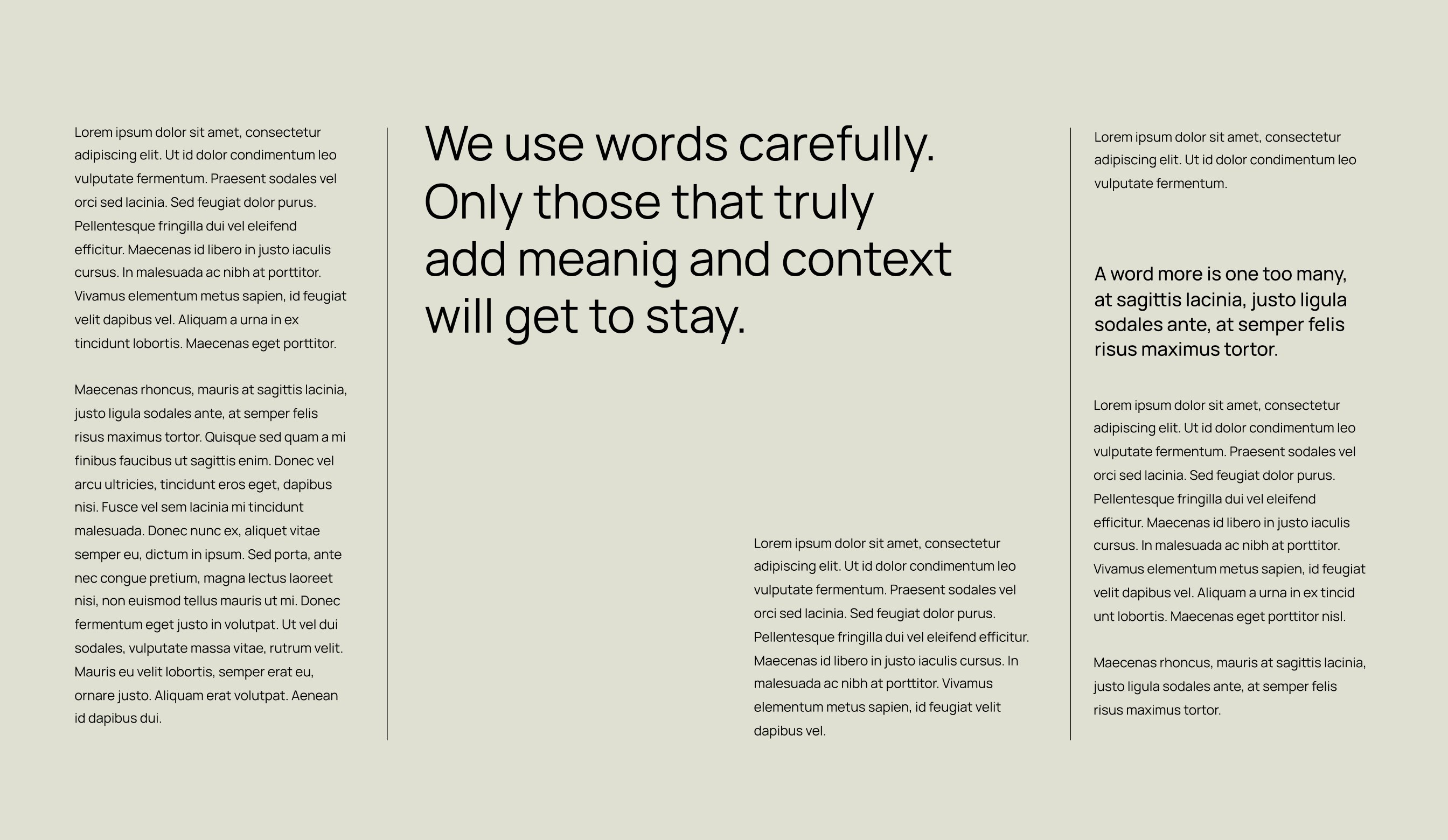
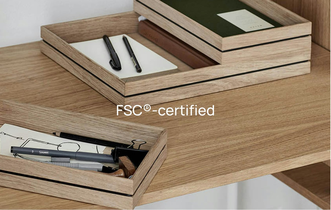
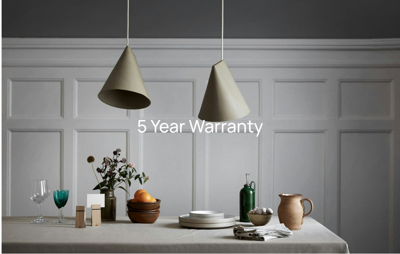
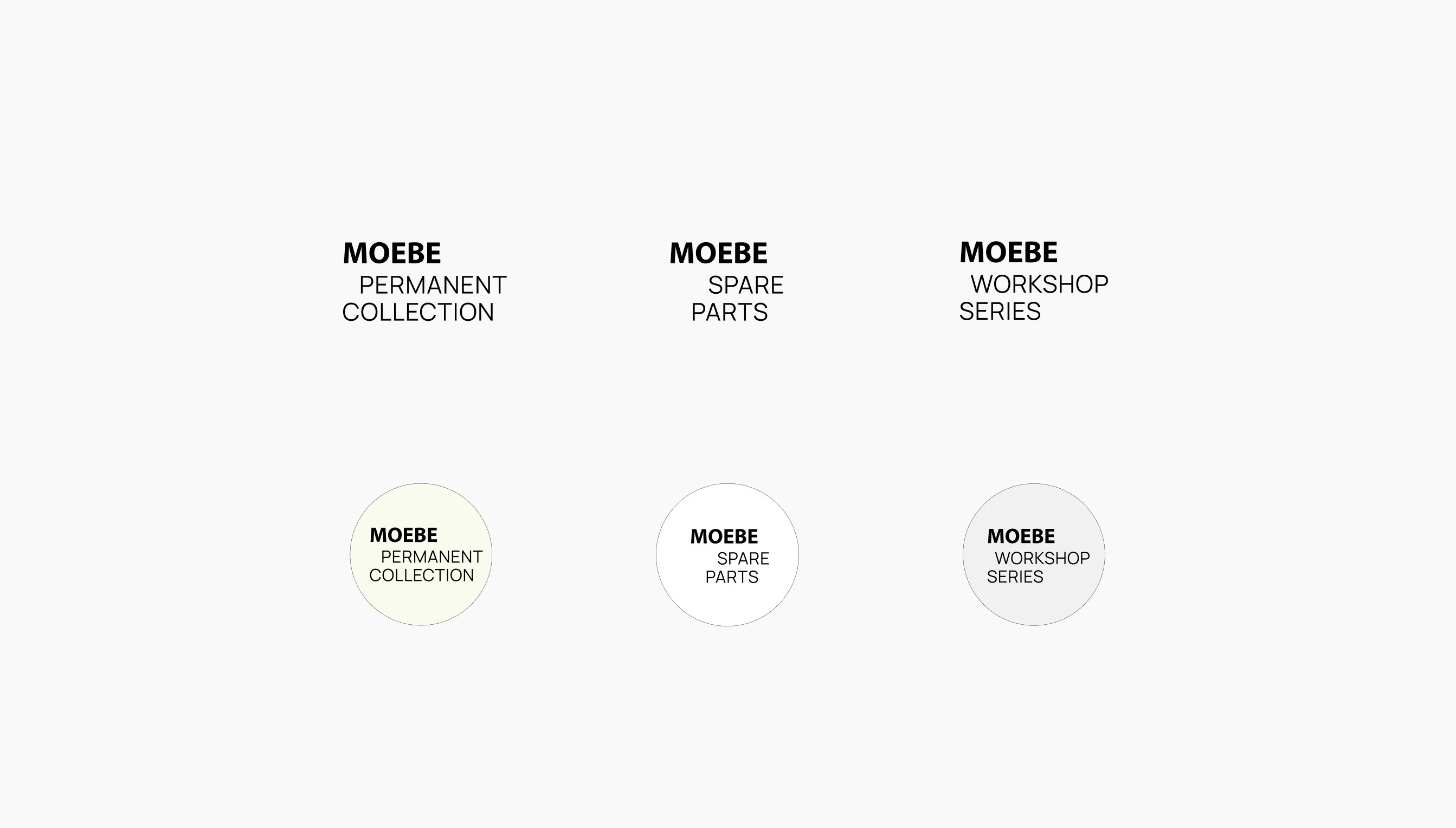
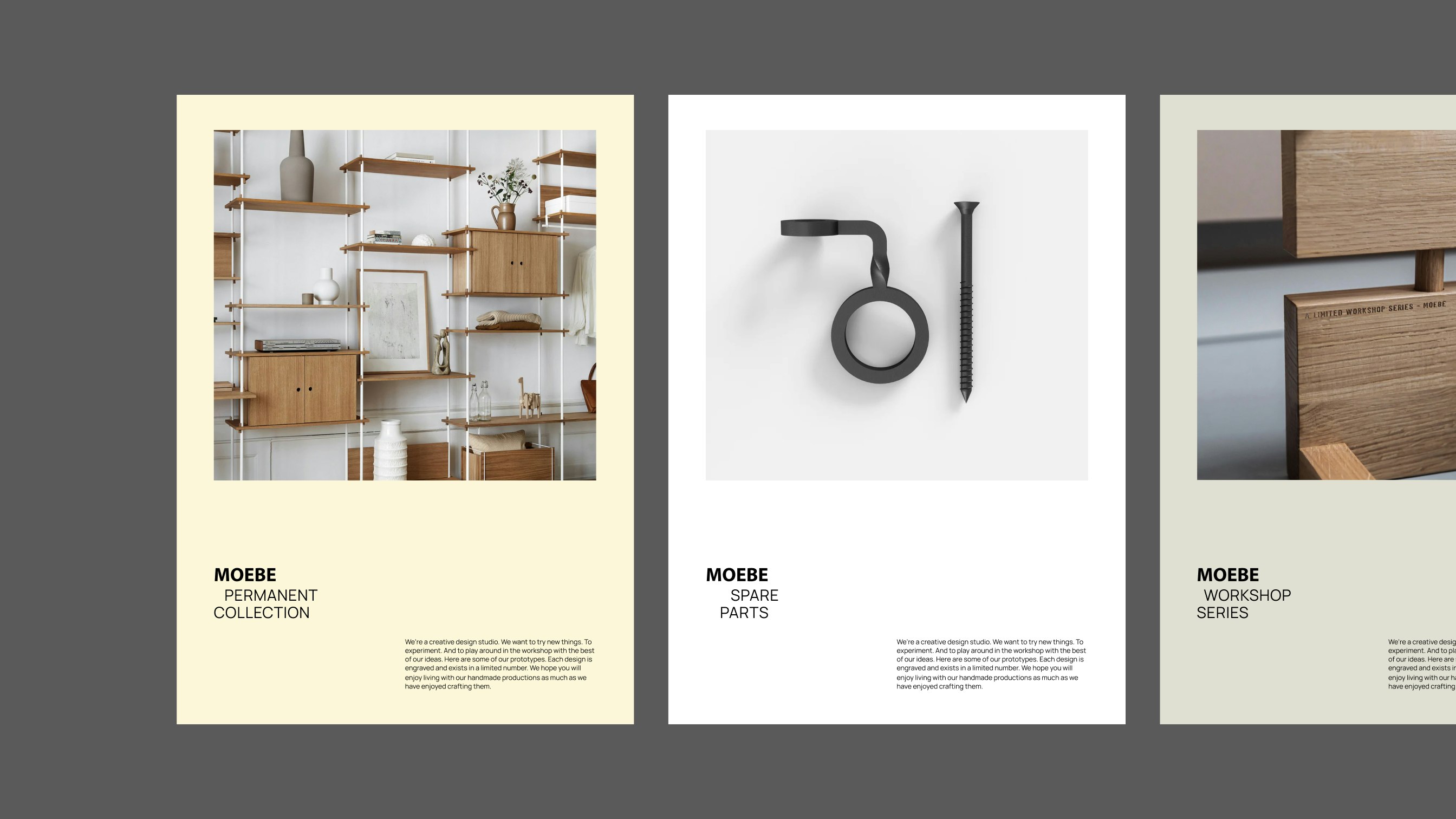
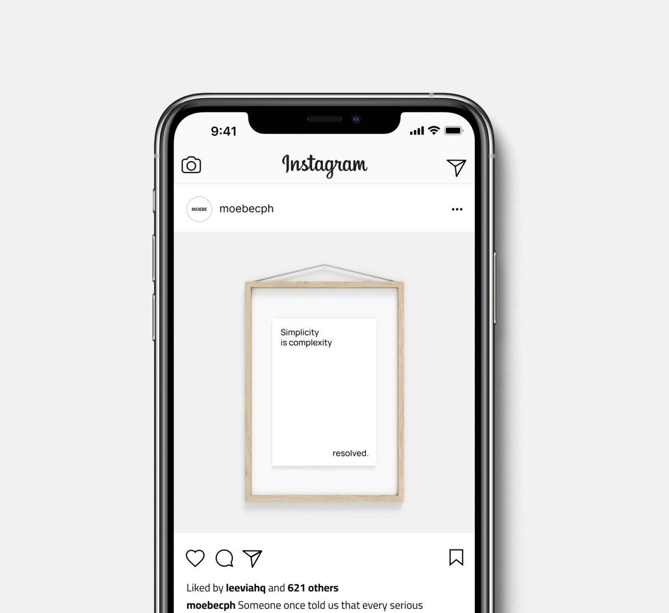
The design is inspired by their functional aesthetic, where excess fluff is exchanged for meaningful additions.
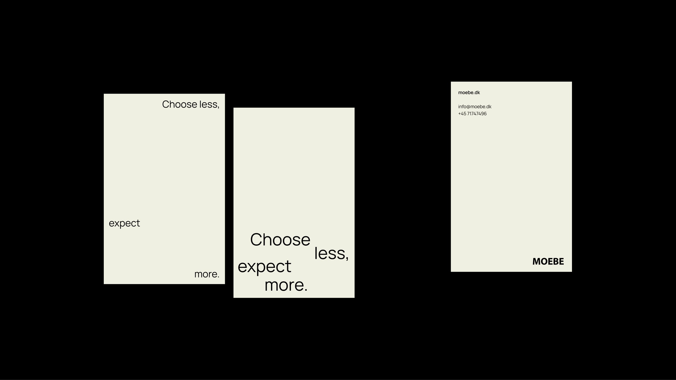
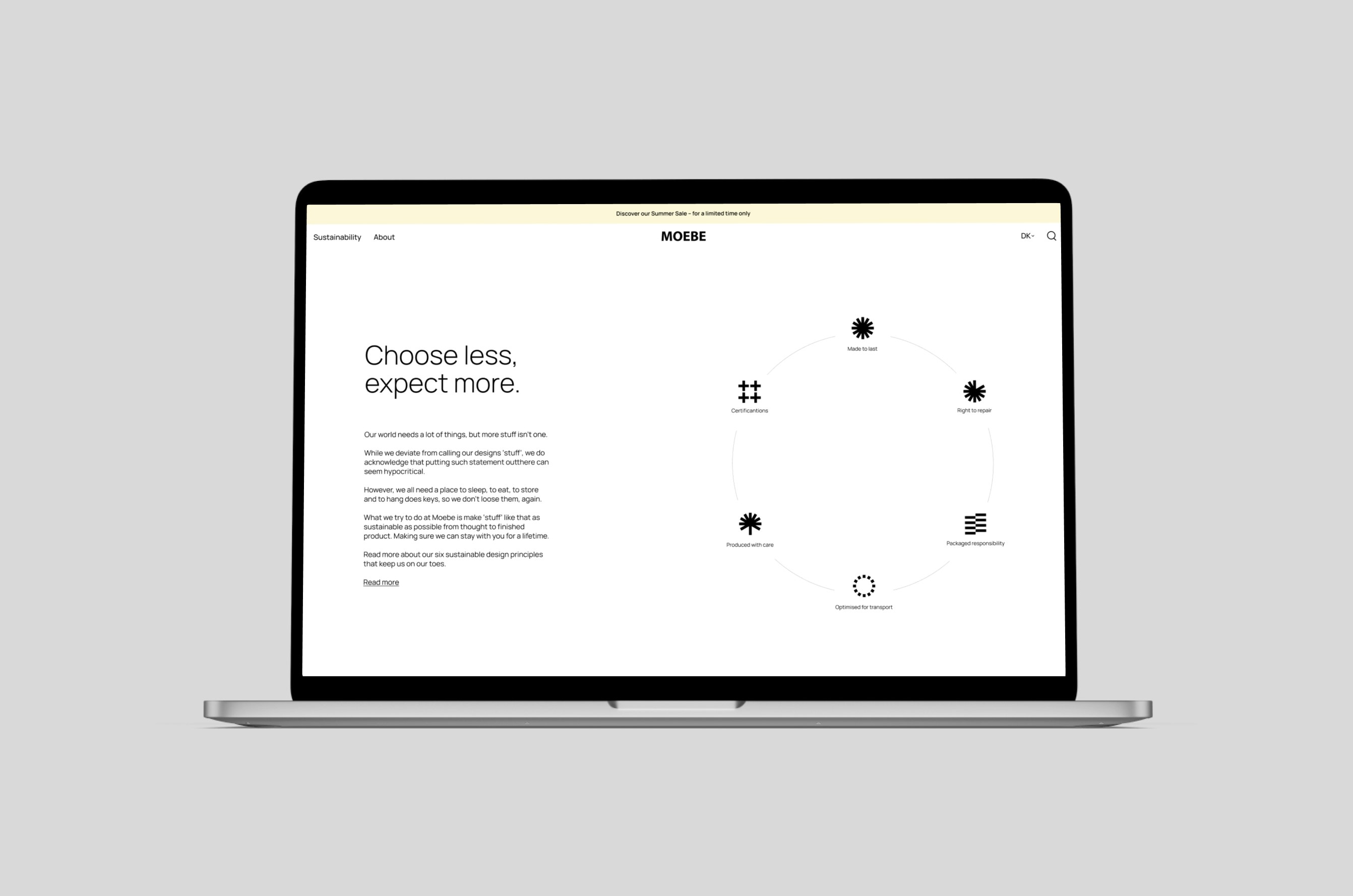
Kudos to
Client Lead / Mads Kjærgaard
Strategy Lead / Sofie Henriksen
Brand Design / Trine Rønsholdt
Related work
Sundhed.dk
Scalable design system
Client: Sundhed.dk
Partnership Lead: Søren Schrøder
Key Focus: UI Design
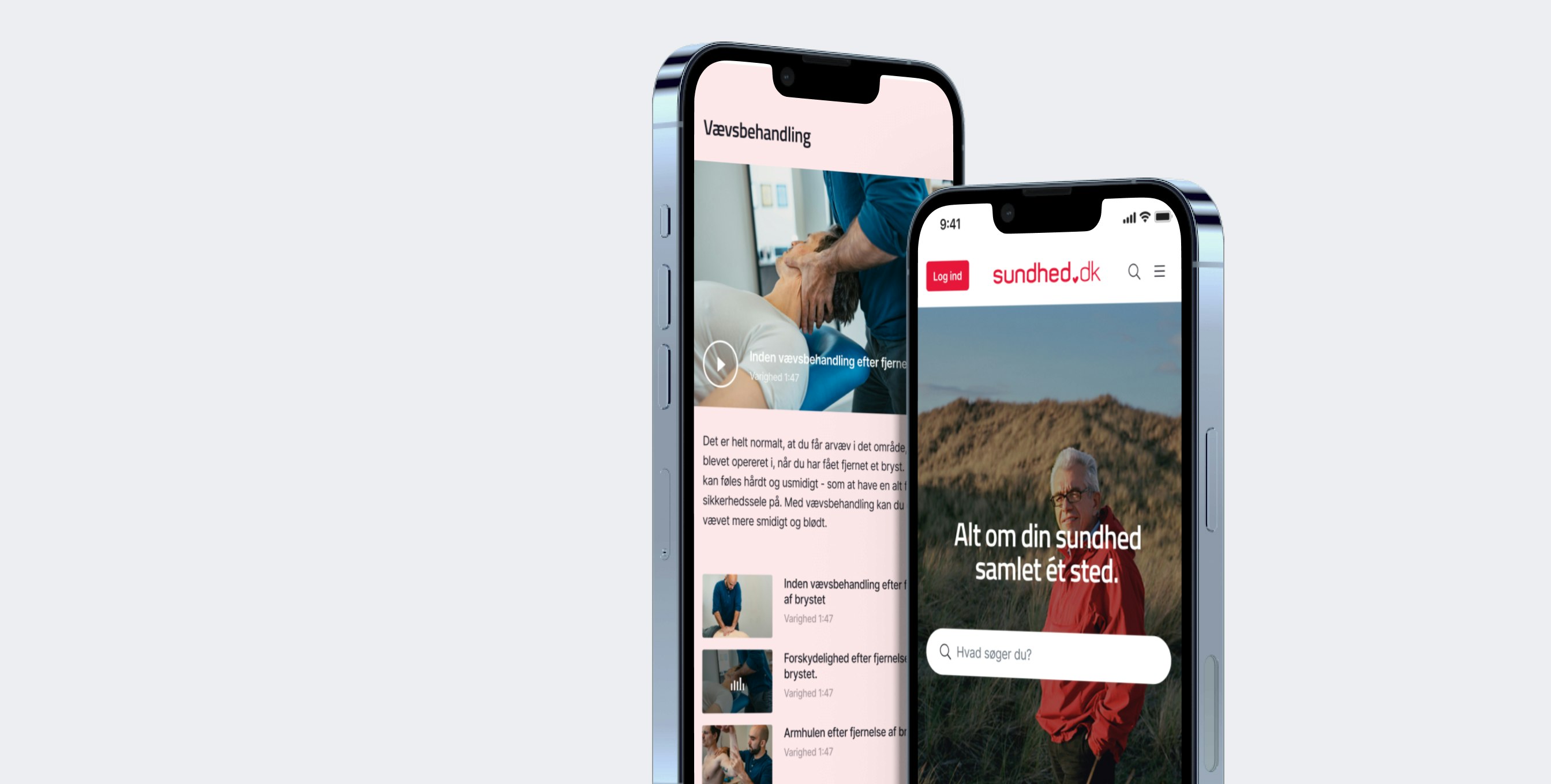
During the pandemic, sundhed.dk played a vital role in Danes' lives: capturing an overview of one's health data. With the surge of new visitors, the website rolled out additional features, and the design system became stretched beyond its limits, creating a platform difficult to scale.
To create a consistent design across all digital touchpoints, sundhed.dk got an elevated contemporary design that does not compromise the recognizability of the platform, as well as an updated UX and navigation structure that enables a more intuitive user experience. Everything was then wrapped up into a comprehensive design system for easy creation of new pages.